All you have to do is create a page based on our sketch below, and add a link to your creation to our inlinkz collection at the end of this post by the 30th of September.
To ease you in to your Autumn scrapping, the sketch is deliberately straight forward this month, giving you an idea of photo and title placement......but the rest is open to your complete interpretation!
Here's what the Design Team came up with:
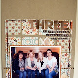
I decided to make a focal point of the circles along the horizontal strip by creating a negative space with a large punch, which became frames for little clusters of embellishments:
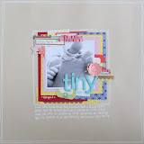
Helen flipped the sketch horizontally, and used the arrows in the sketch as inspiration for a fun band of colourful hexagons underneath her photo mats.
Ifa cleverly added a second picture into her design to add more details to her story:
Jen G went to town with banner shapes for her fun layout with an epic picture and journalling to match:
The arrows in the sketch provided the perfect spot for journalling on Jen N's sun-shiney summery page:
Vanessa rotated the sketch 90 degrees for her autumnal-toned design:
Tracy added some negative space along her horizontal strip, adding texture and interest whilst guiding your eye around the layout:
Tracie's used the sketch to scrap a feathered friend:


No comments:
Post a Comment