Good morning, it's Laura here and today I am going to share with you a couple of tips (and links to handy products that Sarah's Cards stock!) to help you add little details to your scrapbook pages. I have created three pages using the same supplies. As you will see the pages are all very different to each other but the same supplies keep popping up adding details through all three pages.
Sarah's Cards stock so many gorgeous products that some times it can be overwhelming knowing what to choose so I like products that will work again and again across lots of different pages. This means that they offer great value for money and there is nothing more satsifying for me that using up stash! I absoluntely love getting to the end of a sticker sheet or using up a whole piece of paper... after all this means we can just buy more right?!
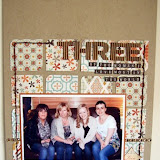
So firstly... a family layout. This page shows 4 generations of my side of the family. We all have the name Ann. Well it's my grandmother's first name and since then all the first born daughters have had Ann as a middle name. This page documents this link between us all.
One of my favourite ways to add details to a page is to create a "sub title" in another part of your page. For this I tend to use a smaller alphabet that I used for the main title and in this example I used a mixture of two small alphabets and a word sticker.
The Authentique range have some great sticker sheets that combine both word stickers and small alphabets, perfect for adding sub title details.
I love these tiny alphas, including a couple from the new Studio Calico releases, but I tend to find them too small for main titles on 12x12 pages... but they are perfect for sub-titles!
I also used the smaller alphabets to construct my main title, the smaller sized letters are perfect for creating a longer title or squeezing more words into a tighter space. Of course this technique is also handy when you discover at the last minute that you don't have the right letters left on your thicker sheet to create the whole title in one font!
Yes I am always guilty of that! So often I end up adding a title to a page but finding that, due to poor planning, I have not got the right letters left. ahhhh. But then I change my approach, create a mixed alphabet title and no one needs know that it wasn't on purpose!
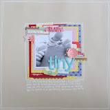
This second page documents my wonderful husband and his new role as daddy. He is a great hands on Dad and will (mostly happily) help with baby duties.
Another great value way to add details to your pages is to look for patterned papers that you can cut down to create paper embellishments. This sheet by Studio Calico is perfect for that.
I cut the polaroid shapes out and used them to create the background for embellishment clusters. Can you see the word stickers and small letter stickers that have re-appeared. Here they add detail and interest. Small letter stickers are also perfect for adding smaller details to your pages, such as the date or details such as people's names or the location of your photos.
Stickers... my all time favourite supply. I think this is mostly due to the fact that they are so quick and simple to add to pages. I am quick scrapbooker and I am not sure what came first... Am I a quick scrapbooker as I like to use quick style embellishments like stickers or do I use quick style embellishments because I am a quick scrapbooker?!?
Anyway little stickers like these star shapes from Studio Calico is that they are perfect for a quick addition to your page, they fill a gap and provide the perfect bit of additional detail to your pages. I have used a foma piece underneath to add dimension.
Another perfect piece of patterned paper to chop up and use to add details to your pages is this one from Echo Park's 'Note to Self' range. You can see that I have used various elements of this piece of paper across all three of my pages this month. I particulary like the arrows and hands to point or highlight a certain piece of journalling on your page or direct the viewer to a particular detail.
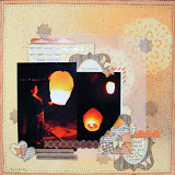
My third and final page... featuring my darling daughter at her 6 month photo shoot! As you can use I used two pieces from this sheet to create the title to this page. The number border combined with the arrow to highlight the number 6.
I also used another one of my favourite tiny alphabets with the calender element of the paper to create a block of embellishments in the top left hand corner of the page.
Tiny letter stickers plus the calendar piece provide not only an embellishment cluster but also the opportunity to record a key piece of important information... the date that the photos were taken.
I know that adding dates to layouts is really important. We all want to be able to look back through our albums and know exactly when the event we are reading about took place, so fairly frequently I add the date to my layouts in more than one place! This means that it won't be missed, plus I think its often an excuse to use another method to add detail to the design. My current favourite is a regular date stamp.
This Dear Lizzy stamp is just gorgeous and at the moment seems to be being used on almost all of my layouts!
I hope these little ideas have given you some inspiration for adding details to your pages. Check out the links below for the items I have used and talked about in this post!