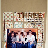
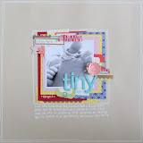
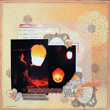
This first page features a picture of my son looking at my phone - he is around 18 months old in this photo, yet he can already use a few function of the phone such as switching it on and off, and opening and closing apps. This fact amazes me! He has been born into the technology generation, and finds it fascinating at such a young age!. I'm sure he will look back in years to come at this photo, and wonder what antiquated device it is that he's holding. I wonder what technologies will be like when his children are born!
The first way that I used negatives on this page was in the photo surround. Instead of matting my photo, I placed it behind a window in the mat. I cut the kraft paper to size and then drew around my photo on the back of the piece, cutting a little way inside the lines to create a negative area in which my photo could sit. I mounted the border on top of the photo using foam pads to give a small amount of distance and depth between photo and mat.
To create the circle embellishments I used a similar technique. I punched three different sizes of circle from scrap card, and used them as templates to draw around and then cut out. I used each several times, creating a roughly diagonal line of circles across my page. This made my background cardstock somewhat resemble swiss cheese! I then mounted various pieces of patterned paper behind the holes. Here's what the back of my page looks like, just to give you an idea of how to build the page up!
It's a subtle technique, but gives just a slightly different look and feel compared to punched circles stuck to the top of the cardstock.


5 comments:
Gorgeous layout and such an effective idea! Will be trying this!
Gorgeous page Jen. Spooky, I've just done two layouts using almost exactly the same technique for my blog post for later this month, great minds eh?. I'll have to try to change it a bit.
It looks gorgeous, fab idea xx
Fab page Jen xxx
Lovely page x
Post a Comment