Who doesn't love patterned paper? It's one of the things that drew me to scrapbooking: all of those pretty patterns! When I was at university, one of my housemates was obsessed with wrapping paper and had a collection of her favourite designs and patterns. At the time I never thought that I would have a house full of sheets of pretty paper! As much as I love patterned paper though, I find that I don't use an awful lot of it. I may use a sheet as a background or cut strips and bits from it to add to my page. So, after seeing all of the stickers, die cuts and tape in the new releases from My Mind's Eye, I challenged myself to create a set of layouts without using any patterned papers, relying on other embellishments and coming up with some techniques to add colour to my pages. Each page was made on a neutral card background; either white, kraft or my new favourite staple, dark kraft.
Layout 1: Fun in the Sun.
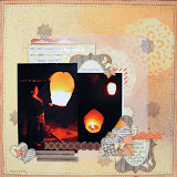
We recently spent a week camping in South Wales and I wanted to record my favourite day of the holiday which was spent at Rhossili Bay. I used strips of washi tape to create borders on my page, drawing the eye towards the photo in the middle. I trimmed down one of the card die-cuts before adding a strip of the yellow tape to form a base for the title. The title was made using some of the tiny word stickers which are an absolute bargain for the amount of words that you get on a sheet for only 89p.
To add some more interest to the bottom border strip, I used my small heart punch to make three holes through the it. I then took another strip of the pink tape, stuck it to a piece of white card and attached it behind the background sheet so that the hearts became pink through the holes. Not one for waste, I added the extra white hearts around the page.
More colour was added to the page through the stitched sunburst design. I pierced holes 0.5cm apart marking out along a ruler and chose some coordinating threads to sew with.
Layout 2:Sun, sea and sand.
The design for this page began with me placing the photo collage onto the page and playing around with the 'happy' banner-shaped journaling card. Once, I was happy with it laying underneath the photo, I added the yellow aticker and made a couple of washi tape banners to balance the strip. If you fold the tape back on itself it makes a really flexible and non sticky material to work with which I then cut the banner shape from before stapling to the page.
I went back to using tape as a page border but decided to add the yellow tape around the whole page. To make a neat join at the corners, I stuck the two strip on top of each before peeling back from the cardstock and cutting a mitred corner diagonally from the outside tip to the inside join. As the tape is so easy to use and peel off, I could take away the excess tape to leave a neat join which I smoothed back down to the page.
My typed journaling strips were glued on top of this area, going all around the edge of the page.
Another way that I used the tapes was again to fold it back on itself. I realised that by doing so I could then easily punch out shapes from it. The little tape hearts that I made were added to the page as embellishments.
Layout 3: The best of Friends
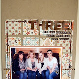
My daughter has a very special relationship with our friends' son. They hadn't seen each other for two years until we went away with them on holiday during August but it was as though they had never been apart.
I again used the white lace tape as a page border but, after realising that the pattern isn't particularly clear when placed on a kraft background, I stuck it to some white card first: this really shows off the pretty pattern on the tape.
I again used the white lace tape as a page border but, after realising that the pattern isn't particularly clear when placed on a kraft background, I stuck it to some white card first: this really shows off the pretty pattern on the tape.
After playing with the punched washi tape hearts on the previous layout, I decided to create an area on this page that would be filled with these shapes. I firstly stuck down a chipboard heart with some temporary adhesive and then pierced holes all around the edge which left me with an outline ready to sew around.
To fill the shape, I covered the area in mod podge and scattered some of the hearts on. I then added some more glue to ares where there were gaps and laid more of the shapes on, thinking about where different colours were needed as well to make it look even.
Another embellishment that I made was this little tag. Toby wrote Evie a little love note which I wanted to record but it was too big to actually fit onto the page. So instead, I scanned it, resized and printed it onto some kraft card which I then cut into a tag shape. The effect is quite subtle on the kraft card.
The title quote, which I found on Pinterest, reads: True friendship is not being inseparable, it's being separated and nothing changes. I typed and printed this onto some white card which I then trimmed down to size and used a border punch to edge it which had a similar lacy pattern to the white washi tape.
Layout 4: One Year in Year One
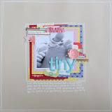
Somehow, Evie has managed to complete another year at school: where does the time go?! My starting point for this page was knowing that I wanted to cut out the title using my Craft Robo and create a filled effect by backing the negative space with washi tape strips. I chose yellow, grey and blue accents for this layout to match her school uniform colours. To the white background I added some splats of black mist/ink to tie in with the school theme and then I began to build the page.
Evie added her own jounaling which details who her teacher was, her friend's names and her favourite part of Year One. Using Nat's recent blog post idea, I dressed a little girl wood veneer shape using tape, again in her school uniform colours.
I picked out some of the MME word stickers to place along the bottom of the photograph using words which describe her attitude and feelings towards learning and school.
If you look closely at the bottom left of the page you will see that I used a date stamp to add the beginning and end of the school year. However, after happily checking and setting the dates and stamping onto the background, I realised that I'd put Septemeber 2012 instead of 2011. One of the tiny tab stickers was the perfect size to cover up this mistake and the surface even took the distress ink without smudging.
Layout 5: Playtime
This page was put together very quickly using mainly the stickers from the larger MME sheets and some bits of tape and a Studio Calico die cut of children playing with a ball. The small photo was placed behind a polaroid-shaped sticker from one of the sheets which also contains a selection of phrases written along the bottom of it. I doodled a border around the page and kept it journaling-free as the phrases on the stickers pretty much sum up my thoughts about this photgraph of my 3 children playing out together.
(Edited to add this final layout which I'd forgotten that I'd done!)
6. All About Me
I wanted to focus of this layout to again be the photo. So after placing the picture on the card with the 'all about me' die cut next to it, I played around with building a grid using stickers and tape. Because of the amount of white space left on the page, I machine stitched around the edge to create a frame.
As it was the summer holidays, I had plenty of scrapping time and got a little carried away with making pages for this post but I what I hope to have shown you is just how versatile tape and stickers can be and given you some ideas for making layouts without using any patterned paper at all for those occasions when you can't find the right papers or for when you just fancy doing something different.
My supplies:


6 comments:
Love all these pages - really great little details like all the hearts and the heart confetti which I am totally going to try. I often scrap with kraft rather than patterned paper as i like having a blank canvas.
Fab pages as always Helen :) Loads of fab techniques - I really love the idea of scanning a drawing or note and printing it on to Kraft to include on a page. A fantastic way to preserve a little treasure, and it looks great too xx
Fantastic pages and techniques helen. I love the scanning a note idea too - must do that one. :) x
Great pages - love them all :)
Fantastic layouts Helen and some great ideas!!
Fab work as always Helen. I love all the different techniques you've used.
xxx
Post a Comment