Saturday, 29 September 2012

Reviving an old trend

Hello.  How are you ?  Back into the swing of things ? I am just about settled into my new routine, transporting my boys to school.
This month I worked with the papers from Studio Calico Heyday and Crafter's Workshop mask, the reverse chicken wire...how I jumped up and down when I saw that Sarah and Lianne has started stocking more masks.
I have used the mask very lightly on both layouts. This requires a lot of precision so the normal misting is not going to work so I opted for some Distress Stain.

The first layout features a photo of my guys walking towards to entrance of the Harry Potter Studio Tour. I remember my excitement outside, spotting large pictures on the wall, the tour bus, inside the first of the flying car, the sweets in the shop...It was a magical day, for sure! 
I have included a couple of owls on my layout.  Owls used to be big 4-5 years ago but I wasn't mad keen on them then.  But a Harry Potter layout has got to feature an owl or two, no ? They are quite easy to draw...a few circles, ears, wings and feet. I drew them out on patterned paper that I then cut out. I added a few other "magical" items...the broom, the hat, the couldron to the mix to make my own unique Harry Potter scene.

The next layout features a photo of my son on his first day of school.  The headmaster described the middle school years as orbiting the moon and going on the dark side.  How true...the grunting has started.  The night scene with the moon is perfectly adorned with some owls, I thought. I added three to a branch on this layout. Even if nothing to do with the moon, the owls are wise and perfect for a school layout, don't you think ?

What do you think of my owls ? Will you have a go at drawing a few ? If you don't like to draw, you might even have an old stamp set.  Have I persuaded you to dig it out ? Might even work for a few Halloween layouts. Tweet Twoo...

Tuesday, 25 September 2012

501

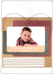
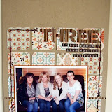
Hi all. Happy 501st post! Jen G here with a few pages to share with you. Last month my siblings and I treated our parents to a big family photo shoot for their 70th birthdays. We now have 100 professional photos to celebrate our family as it is right now. Don't worry; I haven't scrapped all 100....yet! Some of the photographs were just of my boys, so I have started to scrap those. I was a bit worried about scrapping professional photos - I didn't want to "ruin" them, if you understand what I mean. I always want the focus to be on the photo in my layouts, not any techniques, but in this case I felt it was even more important. I decided to find some papers that were very unfussy - barely patterned papers. Simple Stories hit the jackpot for me. In each of their ranges they have a "Simple Basics" pack. These papers tend to have a grid or lined pattern on one side and a very subtle pattern on the reverse. The papers can also be bought singly but I have linked the packs for you below. I have created 4 pages so far and I have another work in progress on my desk which I will try to add to the blog when in is finished.

Sam

 My Boys
Here I used American Crafts DIY Thickers covered in the same paper that I stuck them onto. The 3D quality of the thickers makes the title stand out without taking over.
 James
 Josh
This time I covered the DIY Thickers with glitter.

As always thanks for looking. Leave me a comment with a link to any professional photos you have scrapped. I'd love to come and have a nosey!

Monday, 24 September 2012

* * Scrapping with Instagrams * *

Hello and welcome to the 500th blog post on Sarah's Cards blog! A HUGE thank you to all of our readers, we really value all of you.  Thank you for those of you who comment on our posts, we love to hear your comments and feedback. 
 
Today I want to share one of my favourite things to scrapbook... instagram photos.  In case you are not aware, instagram is an app that you can download to your smart phone and it allows you to add filters and borders to square images that you can then share with your friends. 
 
I know that several of you will use this app and these photos make a lovely change to scrap instead of your regular 6x4s.  I love the little square prints and there is a really easy way to get them printed with the rest of your photos.  You can upload your instagram images to any of the photo printing websites (photobox is my personal favourite). 

Once you have uploaded, check your prints and ensure that you click the "shrink to fit" option as shown above.  As you can see from the middle photo, the square image has been pulled to the middle of the print and white borders have been added either side. 
 
When your photos arrive they will look like these ones above. 


So all you need to do is trim off those excess borders and you are left with a perfect 4x4 image ready to scrap. 
 
Today I have two pages to share with you that I made using instagram photos.  Firstly a single image.  The small 4x4 photos are perfect for sitting on top of a stack of patterned papers.  This draws the focus of the page to your image.  I added some confetti pieces of paper using a regular office hole punch!
 
The papers here are all from the gorgeous Echo Park "Everyday Eclectic" range.  See below for all the links!

 
And the other great thing about the sqaure images is that they fit together to make a perfect square grid, meaning that scrapping a set of 4 images is super easy!


Here I balanced out my block of images with some journalling on the right and a spilt title.
 
I hope this has given you some inspiration to get those instagrams printed and into your scrapbooks!

Friday, 21 September 2012

Great minds think 'negatively'.

Hi Tracy here. Earlier this month Jen posted a gorgeous page demonstrating how  to use negatives on your layouts. I was totally spooked, as I had also done two layouts for my post this month featuring exactly that technique. Neither of us knew what the other was doing this month, but it was too late for me to change them, so apologies now for the repeat of this technique this month. As you'll see, although the technique is the same our pages are totally different.

The supplies I've used this month are all from the new Echo Park - Everyday Eclectic collection pack.

My first page was actually inspired by the class that Jen taught at our retreat back in March this year. My negative shape is a large heart , I cut it out with my Cricut, but it would  be just as easy to draw the shape and cut it out using a craft knife. I also used the positive as a mat for my photos.


Here's how I made a feature of the negative shape.

After cutting out the heart, I machine stitched around both the positive and negative.


Just as Jen did in her retreat class, I drew the sunburst design onto a piece of scrap card slightly bigger than the heart, and cut into individual segments. I also numbered each piece so I knew which order to stick them to form the pattern.


 Then I used the pieces as templates to cut pieces from patterned papers.


 I arranged and stuck the pieces onto a piece of kraft, the same size as the piece I used for the templates, and machine stitched along one side of each piece.


 Finally I attached the sun burst pattern behind the heart shaped window using 3D foam pads to add depth.


On my next page I used the same method as Jen did here, but I cut the circles through the blue paper as well as the base white cardstock. I also used some of the circles I'd cut out too.


I hope you didn't mind the repeat use of this technique this month. 


Wednesday, 19 September 2012

Basic Grey.. My new best friend

I was so upset when Sarah told me Sassafras was gone, they were one of my favourite manufacturers.
But wait along comes SOLIEL from Basic Grey and even better they have collaborated with Sassafras to make this awesome collection.

I don't mind admitting I begged Sarah to stock it the shop, so you need to buy it now or I'm going to feel awful if no body else like it.

This month I armed myself with the whole collection pack as I couldn't choose between the papers and I knew I needed them all to play with.

Whilst I had my collection of papers spread out lovingly on my craft table, I was pondering over what to do this month when I noticed a box of drinking straws the kids had taken out of the kitchen cupboard, the colours matched my papers beautifully.. It's not hard to find a little inspiration if you just look around your surroundings.

So here is my first layout, my son proudly showing off his new goggles - I love the random Alphas in this collection which can be purchased alone with out the collection here. I also loved the border and sticker sheet that comes with the collection and made good use of them on this page.
The pins and tags embellishments are fantastic, I really like the little safety pins supplied to hang the tags on, so much easier than messing with cotton and threads.

I randomly cut my straws into approx lengths of 0.5 to 1inch and used them to frame my photograph. I like the texture they have created on my page.


The second layout is a very rare photograph, infact I think it's the only one I have of myself and my sister who recently got married.

Again I used my collection pack to make this page with the Border and alpha stickers. The flowers are metal and a must have they are from the My Minds Eye - Indie Chic collection. I have added a few brads from the Basic Grey Soliel mixed brads pack.


Monday, 17 September 2012

Studio Calico Ephemera

I often surf my way though products in the shop, and hover over an interesting-looking embellishment product but decide not to add it to my virtual basket as it's hard to be exactly sure what is included in the packet from the little thumbnail released by the manufacturers. This month though, such curiosity got the better of me, and I ordered myself a pack of the Ephemera from Studio Calico's Heyday range. I wasn't sure what to expect, but was really pleased when the packet arrived, and excitedly set to playing with my new goodies, so thought I'd share with you what I created.

I was pleased that, at £3.99, the pack was excellent value for money. It was teaming with lots of really usable die cuts that could work with lots of recent ranges from a variety of manufacturers. I coupled my pack with the gorgeous new Soleil release from Basic Grey, and some new Everyday Eclectic and For The Record Documented from Echo Park, all of which were perfect for recording some summer evening memories; but I can see that the oranges, pinks and turquoises working equally well with any of the pastel/brights releases we have seen over the past few seasons. This makes the pack a perfect, purse-friendly answer for a spot of stash busting - something new to add a twist to your existing papers.

Being the good Samaritan that I am, here's a scanned close up of the Heyday Ephemera packaging to give you a good idea of what is included, a whopping 71 pieces in all:
It was a pleasing surprise to find that you actually get two of each of the resin flower brads, and five of each of the pearlescent butterfly sequins.

Here's my first page:

I used one of the journalling tags as a mat for my title, but to ensure that the MLS newsprint alpha stickers showed clearly I added a trip of grey MME washi tape and some of the pretty new teal striped tap from Bella Blvd:
I completed my title with some mini alphas, and the little "photo" tag from the Ephemera. Another tag from the pack nestled above it to add another layer of texture and interest.

I find it hard to create a page that doesn't have a cluster of embellishments of some sort, and here some different washi tapes from MME, Bella Blvd and Queen and Co and a scalloped circle and strip tag (that I added some journalling to with a Slick Writer pen), make the base for some pins, two of the flower brads and some wood veneer shapes.
Returning to the pack of ephemera, I added a couple of the cloud shapes to the top of my photos, anchoring them with a spot of faux stitching, and layered one of the butterfly sequins on top of a diecut one before slipping it under a corner.

My second page contains some snaps from the fun fair:
 
With my pictures/theme in mind, I was instantly drawn to this off-kilter pink diecut, and decided to utilise it as a mat for my title; using the diagonal pattern as a guide for placing the Newsprint alphas. 
I always find it hard to break against some deep, inexplicable need to create straight-lined designs when I scrap, but was able to convince myself that as it fitted the topsy-turvy funfair ride theme, I could do it.......(maybe just this once though *twitch twitch*) 
To make the whole thing stand out further, I nestled on top of three of the banner tags, strung together with some grey twine:

I found the perfect journalling spot in the pack - the red and yellow circle design seen here reminded me of the flashing bulb lights on the mechanical arms of the ride, as did the star and arrow die cuts that I added next to it..........

For the final touch, I added the girls' initials to two of the balloon diecuts, and popped them in the top left hand corner of the page, and an image of two little children holding hands in the bottom right.

I really dug into the pack and added them quite liberally to my two pages here, but still have a whole load of embellishments left to use again. The pack really is versatile and excellent value for money - and I have a feeling that my days of deliberating are over and I may find myself going with that urge to "click" rather than "hover" again in the future - try it, you may be pleasantly surprised!

My supplies included: