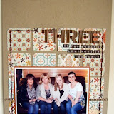
My first page I would probably describe as having a vintage or shabby chic style, which these papers initially put me in mind of.
For this page I have used a piece of the patterned paper as my background and layered up some of the others, using distress inks to age the edges. I did a little fussy cutting of the flowers for the cluster on the bottom left of the photo.
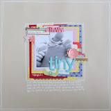
As you can see by my second page, just by using a few different products from the same collection, you could just as easily create a clean and simple style of layout with lots of white space.
For this page I used mostly Washi tape and stickers, and cut my title on my Cricut.
Remember you can click on the photo's for a closer view.
I hope I've inspired you to look at the way in which you can take a paper range you maybe wouldn't usually choose, and still make it suit your style.
As always all the products I've used are linked at the bottom of this post.


4 comments:
Love them both Tracy but that second one is more "me". Just shows how different pages can be with similar products.
xxx
LOVE both of your LOs Tracy. I often look at papers and think "YUK - why did I buy that?" When I eventually get around to using them they can sometimes turn into some of favorite LOs!
I'm with Jenga on this, both great layouts and so different but I lurv the second one. Just goes to show what can be done though, thanks for enlighting us.
love em both Tracy! it's funny cos the second One is my fave too, but I'd be more likely to end up with a page more like the first one as i find it hard to go easy with patterned paper lol xxx
Post a Comment