Thursday, 29 November 2012

O'Christmas Tree

Hello ladies.  It is Ifa with you today.  I hope you are having a nice day and gearing up to your Christmas preparations.  If you are thinking about Christmas layouts, I might be able to help with some little Christmas trees.

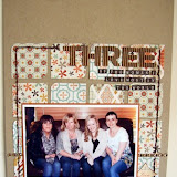
I have been rumaging through some old photos. The first layout I am sharing with you features photos from 1999, when my son was just one.

 
The photos were from before I scrapbook.  I wish I did scrapbook in those days so I might have written down what he got for Christmas but I didn't.  In one of the photos, he was holding a monkey soft toy so I am guessing that was one of his present so my journalling went along this line.
 
I have decorated the layout with three little Christmas trees that I made with papers from Crate Paper Acorn Avenue. I know, not the traditional Christmassy papers but I like to be contrary.
 
I made the trees by punching out 1 1/2" squares...I used the little one from the twin Creative Memories Punch which I cut into 2 triangles.  I stacked them up and added some brown paper for the trunk. I then lightly glue the pieces so it is easier to handle.  I say lightly because I don't want too much glue clogging up my sewing machine.
 
 
I then stitched around the edges on my sewing machine.


I made a few and added them to my page.  I also embellish them with some pearls.

 
The second layout follows pretty much the same recipe, to create this layout. My albums are in chronological order and as the photos are from different periods, nobody is going to notice the similarity.


I hope you like them. Have a very good Christmas and I hope Santa brings you some crafting goodies. 

Tuesday, 27 November 2012

Same but different.

Hi Tracy here with my blog post for this month. Have you ever looked a paper range, and thought to yourself that they wouldn't work with your personnel style of scrapping? Well this month I'm going to show you two totally different styles of layout using the same photo, and products from My Minds Eye - Lost & Found III - Oliver, range.

My first page I would probably describe as having a vintage or shabby chic style, which these papers initially put me in mind of.
 For this page I have used a piece of the patterned paper as my background and layered up some of the others, using distress inks to age the edges. I did a little fussy cutting of the flowers for the cluster on the bottom left of the photo.


As you can see by my second page, just by using a few different  products from the same collection, you could just as easily create a clean and simple style of layout with lots of white space.
For this page I used mostly Washi tape and stickers, and cut my title on my Cricut.

 
Remember you can click on the photo's for a closer view.

I hope I've inspired you to look at the way in which you can take a paper range you maybe wouldn't usually choose, and still make it suit your style.

As always all the products I've used are linked at the bottom of this post.


Saturday, 24 November 2012

I Screwed Up...


... literally. I screwed up Washi Tape. The stuff is so amazing that even after it has been screwed up into a ball it will unravel and still be useable. Here's the proof:
 
This:
 and this:
were used on this LO:
The screwed up Washi adds lovely texture to the page.

On this page I had originally placed the washi in a flat strip vertically on the right of the patterned paper. Usually you can pull washi tape off a page easily but I think I was a bit too vigorous with it and it ripped the paper. It turned out to be a happy accident though, as I liked the effect. I used the screwed up effect with the washi tape again - adding texture to this page too.

Try screwing up like me then post us a link to your pages.


P.S.
Along with the Witch Hazel 8x8 pad I used the "Tidbits" pack. I was happy to discover that each "Tidbit" was double sided with wording on one side, but blank on the other. This means that all of the left overs from the pack can easily be used on non-Halloween layouts.


Thursday, 22 November 2012

Stars!

Its almost Christmas again!  I'm not normally one for using Christmas papers, I usually like to scrap Christmas layouts using non-Christmas papers and challenge myself to use Christmas papers for non-Christmassy layouts.

Today is no exception. As soon as my beady eye locked on the new Fair Skies papers by The Farmhouse Paper Company, I loved them and although they're nothing to do with the Festive season, that's what I wanted to do.

Firstly, my layout uses a collage photo created in Picasa (if you look back, Helen has done demos in the past).


The large star and stocking are hand drawn (well traced from pictures in magazines).  I've used the twine to do a bit of simple handstitching around the edge of the shapes.  The Thickers are covered in the extra fine glitter, which goes lovely with these papers and gives them a real Christmassy feel.


The little stars on the stocking are punched from an old small hole punch and then covered with glitter mixed with glossy accents.

I love making other little crafty projects and gifts, not just scrapbook pages.  The Christmas card below features the lovely bird stamp from the MME All is Bright collection, I've wrapped the star in the twine and used the glitter and glossy accents again.


And finally, a little gift wrapped with tag.  


A lovely little gift set. :)

Thanks for looking. :) 


Monday, 19 November 2012

Playing with Crate

Oh yes.. This month I got the beautiful Crate Paper On Trend to play with and I just adore this collection. It is pretty, bright, funky and very very usable.

I also chose a Very funky stamp from October Afternoon - Pinwheel to use on my papers.

Here are the layouts I have created;


For this funfair layout, I stamped very faintly with black ink just so i could see the outline of the image, I then sketched around the outline with a white pen and added red pearl drops to try and create the effect of lights at the fairground and the same with my title.


Fro this page, I went for pretty using the smae stamp and technique, i stamped using a pale chalk ink in a colour that complimented my layout and added white pearl drops around the outline.


Saturday, 17 November 2012

Freedom Scrapping!

I'll admit I am not one to jump on a bandwagon of any kind, and it can take me a while to get my head around any current trends in all aspects of my life - I think there's a little part of me deep inside that like to be different; whether it's a form of rebellion or pure stubbornness I don't know!

One such scrapbooking trend that has passed me by is the week by week/month by month multi-sized scrapping in a single, pocketed protector. I think it looks absolutely fabulous and I love the work I see by all the talented scrapbookers out there, and the idea of having a detailed photographic account of daily life is so cool for the future - but it's just not for me at the moment. I scrapbook in a nature that I can only affectionately refer to as "shambolically" ( I scrap whatever I fancy whenever inspiration grabs me, it could be an old photo of a special occasion from when I was a child, or a mobile shot that I snapped the day before) which perfectly suits the limited time I have to enjoy my hobby. And to paraphrase a famous scrapbooker from across the pond, I'm ok with that. I just go with it.

Unfortunately for me though, sitting back from this trend does mean that I'm less inclined to look at products which are designed with this style of memory preservation in mind, as I pressume they won't work with "what I do".........so it's just as well that, being an Echo Park fan, I decided to check out their brand new Photo Freedom range, and I was really excited by what I saw! The 12x12 sheets are primarily intended for multi-sized scrapping projects, with their designs split into journaling cards that are perfectly sized for that method. But I was drawn to the beautiful colours and patterns of two of the releases, and we all know I can't refuse a nice bit of patterned paper, so I snapped some up and set about working with them - A4 style!

Here's is my first page, using products from the "Today's Story" release:
Using a piece of grey chevron paper as my base (don't forget you can find links to all the products in the shop at the end of the post!),  I set about utilising a single sheet from the range to provide all the other colour and pattern I needed.

First, the bright, geometric "Love" journaling card made the perfect anchor for my design to flow from, and with a sticker from the amazing value-for-money matching Elements Sheet (the 12x12 sheets are absolutely jam packed with really useful stickers and elements and costs just £2.99!!) layered on top, provided a title:
Next, I used a selection of other journaling cards from the same sheet to cut pretty hexagons to use as a mat for my photo. I added interest to them by cutting away/adding heart shapes to them, and adding a doodled border to give them all a uniform feel.
A further journaling card from the sheet, decorated with ampersands, provided a perfect base for a note of who was in the pic and a little embellishment cluster.

The very generous Element sheet was laden with stickers that I found hard to choose from - I have loads left, including tags, arrows and alphas that are super useable and I'm looking forward to popping them on future pages. You can see here how I made a little cluster at the top of my page using a few:
and here how a couple were the perfect match for each other to add a bit of interest to what was just a random silly photo:

For my second page - I decided to see how far I could push the Elements stickers from the "Happy Moments" range.....would I, a patterned paper addict, be able to create a page I loved using mainly stickers?!

This time a sheet from Lily Bee's Persnickety formed my base, and a journaling card from the "Moments" 12x12 sheet helped form my title, along with some of the cute alphas from the stickers sheet.
I used lots of stickers to form my compulsory embellishment cluster - pretty border stickers were chopped down to size in place of patterned paper, and given the doodling treatment before being adorned with photo corners, arrows, starburst stickers layered together to make a flower, and a couple of washi flags!
To the right, more stickers from the sheet provided a date, and some of the fab speech bubble stickers made ideal spots for my journaling.
I popped a pretty frame sticker in the bottom corner of my page, and filled it with more from the sheet, layering them with 3D foam to add a bit of depth and interest.
Again, I used doodling around my page and around the elements to bring them all together.

I have lots of stash left over after making these two pages - I was really surprised and pleased at how far the supplies went, even when used in a "traditional scrapbooking" manner. The colours and patterns of designs also work easily with other things I already own so I'll look forward to mixing these in on future projects. Both pages also came together really quickly too by my usual standards; and even limiting myself to just one 12x12 sheet and the elements stickers from each range still gave me plenty of scope to create a page without wasting time scrabbling around for extra supplies.

So, whether you're a Project Lifer, a Document 2012er or an "old fashioned" scrapper like myself - be sure to check out the Photo Freedom ranges and see how they could be incorporated into the way you preserve your memories :)