Wednesday 30 November 2011

Spice it up and a dash of ketchup.

How did the title of this post grab you ? I hope it got you interested. I love thinking up far fetched titles for my layouts. Why settle for generic titles like Smile and Dream when you could have "Your beautiful smile", "Your enigmatic smile" or even "Your cheesy smile".

My layout today is nothing to do with a smile but about our day out to Aarhus in Denmark. It is called "Drum boat, wedding ring and the exploding ketchup".

We went to see the Tollund man at Silkerborg museum but that is a story for another day. On the way back, we wanted to stop somewhere for lunch so we pointed the car in the direction of the nearest city, in this case Aarhus. It was a quick walk around town, pick a restaurant and lunch followed. We took a quick photo after lunch and then we left.But that's all very boring, right ? How do I spin this tale a bit more ?

When we arrived we saw some young people towing a boat in the river...they have also decorated it with all manner of twigs and branches. During our lunch, they started going up and down river, drumming madly. I am not sure what for. Then we were stopped by a young lady who wanted to see my wedding ring. A young chap was also very interested in my son's yellow t-shirt. It turned out they were students. They were playing a game where they have to find an assortment of things around the city. Rag week, I expect.

What about the ketchup ? Well, by now we are in the restaurant. A lady at another table opened a ketchup bottle and the content shot out everywhere, up the wall, on the floor, on the dear lady and her companion...luckily we were out of firing range.

Finally, here's the layout. Hope you have also enjoyed the story time.


I would love to know if you have done something similar. Please do share the titles of some of your wildest adventure. If you haven't, how about giving this a go...a day out needn't just be a day out! Let's get the ball rolling. I am planning, four swept by tornado (the water slide is called tornado) and escapades across islands (fly drive!).

I have used papers and stickers from October Afternoon Sidewalk collection.

Monday 28 November 2011

Mistables from Pink Paislee


Along with the gorgeous Pink Paislee - Vintage Vogue, this month I also decided to get some Pink Paislee - Mistables.

The Mistable products from Pink Paislee are designed with materials and textures that will accept misting sprays, inks and even markers. You convert the blank surfaces into unique designs by simply adding your chosen colour.  

The Journal tags come blank, just like this....


You simply mist the tag with a mist or medium of your choice...


And you can create a fantastic embellishment or journalling spot that will perfectly co-ordinate with your layout or card.... 


I decided to use two of mine on two simple cards created using the same range as I used in yesterday's blog post, the Pink Paislee - Vintage Vogue collection....


 I think the product is fantastic! The fact you can mist them in any colour or mixture of colours means they truly are versatile as you can co-ordinate them with any range of papers. I can't wait to try out some of the other Mistable products too, why not go check them out! 

Once again the products used in the cards above are shown below, simply click on the thumbnail to take you to the product in the shop. 

Thanks as always for stopping by and come let us know if you decide to have a go of the Mistables x


Sunday 27 November 2011

In Vogue with Pink Paislee's - Vintage Vogue

Hi all :) Gems here. 

This month I got to play with the gorgeous Pink Paislee - Vintage Vogue. The girly tones are perfect for scrapping photos of my daughter and I got to work straight away on the first of my layouts....

[A love of Words]

[Please Click to View Larger] 

Ashton is an avid reader and can often be found with her nose inside a book. One afternoon I popped into the kitchen and found her reading the Secret Garden and decided to snap some photos to record her love of reading. 

Purple is a colour I usually avoid in scrapbooking as I find it difficult to work with, but I challenged myself to create a layout using purple as one of the main colours, and I absolutely loved the challenge I set myself, and I am happy with the results. 


My second layout I created using the range was....

[In her Element]


[Please Click to View Larger]

Ashton was a flowergirl for my Brother-in-law's wedding back in July and I thought these pretty, feminine papers were perfect for photos taken on the day. 

I will be back tomorrow with a couple of cards I created using the same range and a gorgeous, extremely versatile product I adored using! 

Below are the products I used.......(Simply click on the picture to take you to the product in the shop) 


Thursday 24 November 2011

* * Scrapping with Studio Calico * *

Hello all

It's Laura here today and I have been playing with a couple of the new Studio Calico goodies that can be found at Sarah's Cards.


Here are the goodies that I started with and I wanted to scrap three layouts out of this little selection.  I want to talk today about repeating elements across several pages as a way to help speed up your scrapping process.  

So this is what I started with ...

A few sheets of patterned paper from the Autumn Press collection by Studio Calico
(I picked the papers that were/contained pink on one side)

A couple of grey sheets from the Classic Calico collection by Studio Calico

A couple of sheets of grey and black cardstock by American Crafts

The alphabets were Sunny glitter foam thickers by American Crafts alongside a sticker sheet from the Happy Days range by Echo Park (not shown)

And for the embellishments I used Studio Calico butterflies from the Autumn Press collection, alongside some grey star rub ons from the Classic Calico collection.  I also used the sunburst Martha Stewart punch to create elements on my pages with some pink bling thrown in for good measure!

Not shown in the photo above, but I added in were some word stickers from the Blissful range by Authentique

I used a couple of no traditionally sized photos for these layouts which helps to keep them all looking and feeling different even though they all use the same supplies.  Firstly a 6x12 image ordered from Photobox. This is my hubby and our brand new little one! The set of three circles to the left of the photo is the embelishement set that I have repeated trhoughout my three layouts.

They are simply a circle of black card with a star rub on and a couple of pieces of bling.  They are all raised from the page with a 3D foam pad.  Sets of three work well in design and in this case they were placed vertically alongside my photo.  I created this page first and really liked the effect of these three circles, so I choose to repeat this cluster in my next two pages, meaning that these two were much quicker to scrap.  A complete bonus when you have a six week old baby demanding much of your time! : )

Speaking of said baby.. this layout includes lots of journalling about how I feel in my new role as "Mum".  This is actually an iphone photo printed up as a 4x4 pic.  Again I uploaded to Photobox and printed from there.  I have found that the best way to create a 4x4 photo is to upload your iphone picture in the normal way, order as a 6x4 photo and then select the box "shrink to fit" when you check your prints at checkout.  This will centre your 4x4 photo in the middle of a 6x4 print.  So when it arrives you can trim off the excess!

As you can see the three circle elements were created in exactly the same way but this time placed horizontially at the bottom of the page on a mat of patterned paper.  This embellishment cluster is the same width as the photo/paper cluster at the top of the page and provides a perfect frame to add some journalling in.

And finally a close up of the young lady herself! A larger than normal photo this time meaning that you have less page to fill and this can be the perfect way to create a page using just scraps of your papers. 

This time the three circle embellishment set followed on from the title to draw your eye down to the journalling block below. 

Three pages from the same supplies, using the same embellishments but all looking totally different! why not have a go yourself... select some stash, pick three photos and create three layouts using the same design feature on each... I bet yours all turn out different too! But I also bet that you scrap them all quicker than normal!


Saturday 19 November 2011

One for the boys !

Hello all..

This month I got to play with the fab and funky American Crafts Chap range, and I love it!! For this layout I used the sketch challenge from our recent retreat (I will post a copy of this up for you ASAP).


The thickers to match this range are very different, but match the papers perfectly and come in a few different colourways. I distressed mine a little to create the effect on my page.

The flowers on my layout I made using a fantastic border punch by EK Success Gerbera Daisy. I punched three strips for each flower and simply rolled the strip around a pencil, glued and then bent over the petals to create the flower. I also added small drops of pearl drops to the edges of the petals to make them stand out more.


Here is my supply list; EK Success Gerbera Daisy Punch
American Crafts Papers Chap - Jim, Dave, Mike & Ben.
American Crafts Chap - Remarks Sticker Book
American Crafts Chap - Brads
American Crafts Chap - Ribbons Chap Foil Thickers in Red
Tim Holtz Journalling Tickets


Have a fab Weekend


Wednesday 16 November 2011

Mixing it some more!

Welcome to day two of my little jaunt into mixing papers from different manufacturers. Today I'm back with a girly layout....although given the photo I used, that is debatable I suppose ;)

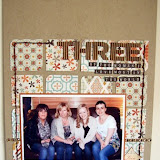
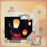
Here's my completed page:
Please click on any pictures to view a larger, detailed image
The Spiffy Mustache paper from the gorgeous new Times & Seasons line from Echo Park was the instant inspiration for my page - as soon as I saw it I remembered this pic of Lou and I getting a bit hairy at the March retreat, and had to scrap it! That being my starting point,  I wanted to create a page with contrasting male/female feel to reflect the ladies in 'taches (!) theme, so in addition to the vintagey bold black print I went riffling through my pile of recently purchased stash with one thing on my mind - pink!!

After pulling out about 12 sheets of paper form various manufacturers, I settled on this little lot:

1. Spiffy Mustache - I misted it with a spritz of Maya's Pomegranate Pink.

2. "Special" from Authentique's Uncommon range-
The muted pink tone had a perfect vintagey quality to it, and the cream spots with typed print inside them worked well with the background of the Mustache paper.

3. "Handpicked " from Crate's Farmhouse line-
This paper had a range of pink colours in its design, which helped balance the darkest tones on my page through to the lightest.

4. "Farmers Market " also from Crate's Farmhouse line-
The strong red pattern is a good mate for the bold black colours in the Mustache paper, helping to balance my design by adding additional deep colour.

5. "Rose bud" from Studio Calico's Autumn Press range - 
This pretty paper's pale background and red flora balances out the range of pinks and red already chosen, as well as adding a pretty, feminine stamp to contrast the mustache images. The shape of the rose buds themselves echo the mustache shapes too - both are roughly triangular in design.

As well as colour, one other factor led me to choose these papers as my final line up from the also look at pattern contenders I pulled out from my stash. If you study each of the papers, they are all made of a diagonal pattern. This is obvious on the two Crate designs, but if you look at the arrangement of the mustaches, rose buds and printed circles on the other papers, you will notice each row of the pattern it offset from the one before, creating a subtle diagonal effect. So in addition to matching mixed papers by colour as we saw yesterday, I have also teamed them up by pattern.

Of course, it is totally fine marry up papers that aren't simply all pink or all red (it just so happens that that's how my particular pages here turned out). The important thing to look for in such a case would be a small element of recurring colour (maybe using embellishment to tie the colour scheme together or one multicoloured patterned paper that can tie several other to it), a similar pattern (e.g. polka dotted paper paired with other spotted/circular designs) or matching by hue (e.g. all soft warm colours, all vintagey hues, all bright colours).

Finally, here's how I created some of the details on my page:

I made the little scalloped border of mustaches by punching out several from the patterned paper, and then sticking them to a spare strip of card (I used the little name strip from the bottom of a sheet of 12x12 - not only was it to hand and the perfect size, but hey, reduce, reuse, recycle people!)
I inked the edges that would be visible to give it a uniform look, and tucked it under one of the papers on my layout to just the bottom half of the circles show, thus giving the scalloped effect.

I wanted to use a mix-mash of overtly feminine embellishments mixed with very bold, black ones, and decided to create the ultimate combination of these two ideas by making a "pretty mustache". I did so by stamping and heat embossing a lacy design in white powder on to some black card as seen below,

before hand cutting a mustache shape from my custom cardstock:
Check out the huge collection of fab American crafts Zing embossing powders here.

I created my handmade flower by punching circles of various sizes from some of my papers already used, and snipping between the scallops to make petals:
I layered them together and away I went:
I also used a variety of stickers, including Authentique Uncommon Diction Mini Word Stickers to create amusing journalling, a gorgeous Jenni Bowlin Bow embellishment and a film strip sticker from the Crate Portrait Border Stickers.

I hope that if it's something you are usually wary of, you'll give mixing up your papers a try! It really is enjoyable and satisfying :)

Tuesday 15 November 2011

Mixing it Up!

One of the initial draws for me to scrapbooking was all the wonderful colours and patterns of paper available to mix and match together. Although the manufacturers make it super easy for us to pick well-matched papers by providing coordinating ranges and lines, my favourite part of scrapbooking is sometimes breaking loose from this and playing around by mixing papers from different companies on the same page. And with a few simple things to look out for, which I'll share with you today and tomorrow, I find it an easy and enjoyable approach to creating my pages.

Here's the completed page I'm sharing today, documenting a recent new hobby of ours - cycling! This particular trip was a grueling (for us two-wheel newbies) up hill country trek to a beautiful reservoir during that recent lovely spate of October sunshine.

please click on any picture to see a larger, detailed image

I took the cue for my colour scheme from my photos, the red bike stuck out vividly, and due to the vintage Polaroid app I used to snap the pics on my phone, the photos had a warm red tone to them too. So my priority for matching papers together for this page became a red colour scheme.
 
Here are the papers I mixed from three different manufacturers, and why I picked them:
(from left to right):
1. "Measure Up" from Fancy Pants Off To School range -
I'm always drawn to using grid paper as a background for my pages as they give just the right balance of pattern without becoming overwhelming, and this particular sheet had the ideal brownish tones to compliment my pictures. I also spritzed it with a quick burst of Studio Calico's white Mister Huey.

2. "Numbers Grid" from My Minds Eye's Love Me range -
Undeterred by the fact that this is intended to be a valentines range (Pah! If it matches my page, it matches my page!), I loved the fact that the number "2" was printed in red every time it occurs in the pattern - matching the themes of two wheels and the red bike, as well as representing my boyfriend and I and our love for our new activity together. The greyish-brown print of the grid and numbers also matched my first piece of paper nicely.

3. "Hearts" from  My Minds Eye's Love Me range -
The hexagonal pattern on the back of the hearts paper gave a fantastic shot of bold red colour for my page, and the blocky heagons have a masculine feel.

4. "Scarf" from Studio Calico's Autumn Press range - 
A bit of a curve ball this one, as not only is it polka-dotty, but some of those polka dots are pink -  however
overall it fits: the strong red colour is consistant with the rest of the page, and the cream polka dots link to the cream background on the Numbers Grid paper. The circular dots compliment my round embellishment theme (more about that later).

And so by concentrating mainly on colour, I mixed three manufacturors papers on one page.

I personally find the easiest starting point is to flick through my (vast!) paper collection and just pull out pieces that I think may match and put them in a pile, for instance with this layout I went through my stash looking for red and neutral papers. I usually stop when I have got about six or eight pieces, and then spend a few minutes narrowing them down by moving them about next to each other and matching them up to my photos.

Selecting paper in this way is often useful for using up older paper that you might have forgotten about  - there is nothing more satisfying for me than mixing an older piece of paper in with my latest purchases for a really unique look. Plus if I've used an old piece of stash, surely I have earned the right to go purchase a new piece of paper to take its place, right?!

To embellish my page, I chose a few bike-inspired items, such as the mix tape from Amy Tangerine,
and the bicycle stamp in this gorgeous pack from My Minds Eye,

I continued the idea of wheels by using circular embellishment such as buttons and a printed chipboard circle (seen above) from My Minds Eye Funday collection.

For my title, I combined some fab new super-skinny Thickers with some round Jenni Bowlin mini alphas.

My final embellishment was the bunting banner, which was made using a combination of one of the stamps from the My Minds Eye set mentioned earlier, and some Jenni Bowlin flag stickers. To add interest to the stickers, I spaced them out on a piece of scrap card:
 Stamped the bicycle on to them (using Stazon so that the ink would not smudge on the shiny sticker surface),
 Before peeling them off the scrap card and alternating them on my page with the stamped banner shape. Some doodled stitching and a couple of buttons completed it.
Make sure you stop by tomorrow, as I'll be sharing a more girly layout combining papers from four different manufacturers....See you then!

Saturday 12 November 2011

Note it down

Hi all, Jen here, I hope everyone is having a lovely November so far! 

This month I'm stepping outside my usual realm of layouts a little to bring you a simple but fun & useful project. I often find I think of ideas for pages or techniques at the most inappropriate time, for example in the middle of the night, or when I'm just heading off to work in the morning! Occasionally I would jot an idea down on a piece of scrap paper, and more often than not that bit of paper would get lost, or thrown away, or eaten (both my little boy & my cat are rather fond of a piece of paper to chew on!). 
To try and get around this problem I decided that I needed a dedicated notebook in which to keep ideas for titles, page sketches, technique ideas & lists of products to try or buy. 

I started off with a journal from the Studio Calico Classic range. I chose the woodgrain journal, which is 4x8", but they also do an alphabet journal in 5x5" size.  These journal kits are perfect for this kind of project, since they come with two chipboard covers (one of which is beautifully embossed), and a pad of simple graph paper (approximately 60 sheets) to go inside.
Firstly I covered the two chipboard covers in two coats of a bright yellow acrylic paint - Paint Dabber in Sunshine Yellow - I brushed it on with a foam applicator rather than using the dabber function - this gives you a much thicker coat. 

Once that was completely dry I sprayed with an iridescent mist for a little bit of glimmer. 
I then added some strips of papers, a journalling card and some stickers, all from the October Afternoon Sidewalks collection.


I flicked some more mists over the whole cover - I used Maya Mists in Blue Agave & Pink Ginger. It's easy to get this 'splattered' effect from mists by simply unscrewing the lid from the misting bottle and flicking or tapping the thin plastic tube, rather than using the spray. 

I punched a few butterflies, and also added some letter stickers to the cover, and then covered the whole lot in Mod Podge to protect it.
I bound the whole journal using a Bind-it-all machine, and as a final touch tied four small pieces of ribbon to one of the spiral rings. 


So far this journal is working out well for me, and it's filling up with ideas for pages & projects. Now that I'm getting them down on paper & therefore remembering them, look out for some of those appearing on the blog soon!


Thursday 10 November 2011

November Challenge

It's time for a new challenge here at the Sarah's Cards blog - and an opportunity for you to win a £20 e-voucher to spend in the shop!

This month we would like you to try something that you are probably usually told to stop doing, but for November, us meanies on the Sarahs Cards team want you all to:

THINK NEGATIVE!!

This really is open to interpretation and we would leave to see what your take on that statement would be! 
To get your creative juices flowing, here's how members of the design team got on with thinking negatively!

Ifa chose to document something which really could have been a negative experience - her son injuring his arm during his first week back to school. However, they were able to turn that negative thinking around and were thankful that it was his left shoulder he fell on.
 
Gems also used the challenge to inspire the theme for her page - her beautiful little girl has been feeling negative about her height, so Gems took the opportunity to remind her that she may be short, but she is most definitely sweet, inside and out.


Helen used mists and masks to create her interpretation of negativity. Using the Studio Calico '&' mask, she firstly misted with cream and then moved the mask slightly and remisted with brown, creating a cream shadow, which she then roughly outlined with a black pen. Helen also punched out some small hearts from one of the patterned paper strips, leaving the hole, or negative shape.

Lou gave her fun Halloween layout a funky twist by turning the negative space inside her Thickers title into a pair of eyes!!

For my page I used a circle cutter to cut various sized circles in to a piece of card stock, and rather than using the circles as masks for misting I used the resulting negative piece of card stock as an overlay. I placed a misted sheet of card stock underneath, creating the effect of coloured soapy bubbles. I also used a punch to remove star shapes from some mini banner shapes cut from misted card.


Jen's beautiful page used Studio Calico masks & Maya mists to create the butterflies fluttering across the page, before embellishing the resulting negative spaces left on the page by threading twine and dotting liquid enamel around the edges.

So if you fancy the chance of making that £20 e-voucher yours - leave us a link here to your take on "Thinking Negatively" by the 30th of November! Winner will be announced on the blog on the 8th of December!
Happy creating :)
Photobucket