Hello all
It's Laura here today and I have been playing with a couple of the new Studio Calico goodies that can be found at Sarah's Cards.
Here are the goodies that I started with and I wanted to scrap three layouts out of this little selection. I want to talk today about repeating elements across several pages as a way to help speed up your scrapping process.
So this is what I started with ...
A few sheets of patterned paper from the Autumn Press collection by Studio Calico
(I picked the papers that were/contained pink on one side)
A couple of grey sheets from the Classic Calico collection by Studio Calico
A couple of sheets of grey and black cardstock by American Crafts
The alphabets were Sunny glitter foam thickers by American Crafts alongside a sticker sheet from the Happy Days range by Echo Park (not shown)
And for the embellishments I used Studio Calico butterflies from the Autumn Press collection, alongside some grey star rub ons from the Classic Calico collection. I also used the sunburst Martha Stewart punch to create elements on my pages with some pink bling thrown in for good measure!
Not shown in the photo above, but I added in were some word stickers from the Blissful range by Authentique
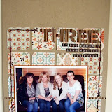
I used a couple of no traditionally sized photos for these layouts which helps to keep them all looking and feeling different even though they all use the same supplies. Firstly a 6x12 image ordered from Photobox. This is my hubby and our brand new little one! The set of three circles to the left of the photo is the embelishement set that I have repeated trhoughout my three layouts.
They are simply a circle of black card with a star rub on and a couple of pieces of bling. They are all raised from the page with a 3D foam pad. Sets of three work well in design and in this case they were placed vertically alongside my photo. I created this page first and really liked the effect of these three circles, so I choose to repeat this cluster in my next two pages, meaning that these two were much quicker to scrap. A complete bonus when you have a six week old baby demanding much of your time! : )
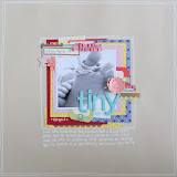
Speaking of said baby.. this layout includes lots of journalling about how I feel in my new role as "Mum". This is actually an iphone photo printed up as a 4x4 pic. Again I uploaded to Photobox and printed from there. I have found that the best way to create a 4x4 photo is to upload your iphone picture in the normal way, order as a 6x4 photo and then select the box "shrink to fit" when you check your prints at checkout. This will centre your 4x4 photo in the middle of a 6x4 print. So when it arrives you can trim off the excess!
As you can see the three circle elements were created in exactly the same way but this time placed horizontially at the bottom of the page on a mat of patterned paper. This embellishment cluster is the same width as the photo/paper cluster at the top of the page and provides a perfect frame to add some journalling in.
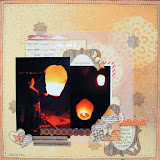
And finally a close up of the young lady herself! A larger than normal photo this time meaning that you have less page to fill and this can be the perfect way to create a page using just scraps of your papers.
This time the three circle embellishment set followed on from the title to draw your eye down to the journalling block below.
Three pages from the same supplies, using the same embellishments but all looking totally different! why not have a go yourself... select some stash, pick three photos and create three layouts using the same design feature on each... I bet yours all turn out different too! But I also bet that you scrap them all quicker than normal!


6 comments:
Fabulous pages Laura, off to pull some papers now and give your technique a try!
Gorgeous layouts, I especially love the first one! Great post, I'll have to give that technique a try! X
Lovely pages Laura :) And some great tips too xx
Love the photo size in the first LO. I've not scrapped big for ages, but this has inspired me to have a go at it again. Love the mix of pink and grey with a touch of black too.
Gorgeous layouts Laura - love the non-traditional sized photo.
Vanessa x
I love your pages!
And Abigail is soooooo cute!
Post a Comment