Hi everyone, Jen here! I hope you are enjoying the all new blog - so much inspiration & so many fantastic projects already, and we are only 12 days in! This isn't just a one month special DT takeover either, this is a permanent change so keep checking back for more fantastic pages and off the page projects from all the team.
This month I've gone monochromatic! I love the look of a page all in shades of one colour, but you don't see it that often. Maybe it's because we aren't sure how many different shades we can get away with, or we don't think it's interesting enough, or there are too many colours in our photos! I've looked at all of those issues, and I think I've found a way around them all!
My Minds Eye have come out with a range of products recently which are great for creating monochromatic layouts. I chose a selection of MME Lush in Turquoise as the basis for my pages - the papers are wonderfully luxurious, especially the flocked designs, which add great texture to a page.
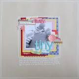
This first page - progression of a baby boy bump - uses photos that I took throughout my pregnancy. I actually took a photo every single week from 5 weeks right through to 41 weeks, but I think I'd struggle to fit them all on one 12x12" layout! Instead I used pictures from 10, 20, 30 & 40 weeks to demonstrate the growth of my bump. We didn't know we were having a boy, so in these photos I'm stood in front of a blue wallpaper, which would have been a perfect match, but I'm wearing pink! To stop the pink from interfering with my monochromatic scheme (and from looking a bit odd on a page all about baby being a boy!) I turned my photos to black and white.Even using just one shade, you can add so many different textures to a page to stop it being dull - I used flocked papers, puffy thickers, foam, chipboard. glazed brads, pearl brads, velvet ribbon and twine to add lots of 'touchy feely' elements to the page.

I used a variety of alphabets for my title, including a handwritten (using my new favourite pen - Ranger Inkessentials white pen) element on chipboard, lily bee ABC stickers, american crafts thickers - Rainboots in powder and Rockabye in white. The white thickers were just too white for this page, which is a background of vanilla card stock, so I misted them with Maya Road mist in Blue Agave, and blotted with tissue so that the colour was not too intense.
I find it really amusing looking back on the earlier bump photos - I felt huge at 20 weeks, but that really was nothing compared to my humongous bump later on in the pregnancy! This chipboard piece from Bella Blvd Sophisticates was just right to document my bump love (I don't even mind the stretch marks - they are my mummy marks!), along with some bakers twine, which you may notice I'm a little bit addicted to at the moment for adding cute details to a page.
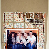
So we've got around the 'boring' preconception by adding loads of texture, and I also used black and white photos to prevent to problem of clashing colours. This next page also uses black and white photos, but the main photo is in colour. None of the pictures had particularly distracting colours in them, but they are all in different lights and tones, so I changed them to black and white to tie them all in together. I kept my focus photo in colour, since it matched my scheme well, and I really like using a mixture of colour & black and white shots on a page.
Anyone familiar with the US show 'The Big Bang Theory' will recognise my super long title as a little song that is sung by one of the characters - I've been wanting to use it for a while in some way, and actually I have to credit my husband with coming up with the idea of having a photo for each part of the song, clever man! The Lily Bee alpha stickers are perfect for adding long titles like this because you get loads of letters on a 12x12 sheet - 8 sets of alphabets in all!
Monochromatic pages look great on neutral background like vanilla, white and kraft, but for this page I wanted something a bit different so I chose a bright sheet for my background. I used the back of one of the MME papers to make sure that the colour was just right, but you could also use a sheet of coordinating card stock. I sprayed a little white mist to tone the colour down a little and add some interest to an otherwise very solid block of colour.
In both of these close ups you can see that I've added glazed brads on top of chipboard for a layered effect - you can do this easily by folding back the prongs of the brad and cutting the protruding ends off with scissors (watch out, they'll fly everywhere!), then use foam pads to attach the brad top to your chipboard.
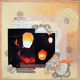
Next up, using lots of different tones on one page. It's true, sticking a navy blue piece on the next page would have looked out of place, but in general you can add several differents shades of a colour without clashing. Using a colour wheel can help - if you stick to colours next to each other (eg. teal and cyan) or use colours up and down within one block, you can't really go wrong. I used several shades of aqua and teal all together on this layout.
I used a mixture of papers for this page - the MME lush papers along with a sheet of Sassafrass and some pieces from Echo Park's Summer Days range. This is a great page design for using up scraps - just rifle through that stash and pick out a few pieces of paper in similar tones.The little wooden circles were a local find - one is misted and one is embossed with Zing! in Aqua. I added little clusters of brads and gems to give a watery feel, some of my favourite bakers twine and a title with sassafrass stickers. I even added my journalling in a coordinating colour!
I used a simple misting technique for some of the circles on this page that I wanted to share with you.
Firstly, mark out with pencil roughly where you want your misted elements to be - I used 3 misted circles (when in doubt I find 3 is always a good number!).
Punch your circle (or other shape - this looks great with stars!) into a sheet of card stock and place it over your first pencil mark.
If you misted it like that you'd end up with lots of mist where you don't want it, so use other pieces of scrap card stock or paper to cover up the rest of your background. I just placed the card stock down, as I didn't mind slightly rough edges to my circle. If you want a very defined edge, you'll need to stick the mask down with repositionable adhesive.
Now mist your circle! Using mist on dotted swiss card stock gives a lovely effect if you blot with tissue while the mist is still wet to allow the raised dots to show through. Alternatively you can lightly sand over the top of the misted element once it's dry to give a similar effect. Then just move onto the next circle and so on.
Wow, well that's me done for this month - I don't think I've ever written such a long blog post!
I hope you've enjoyed it, and I'd love to see your monochromatic pages, so please do share in the comments section.
Check back in a few days time for Nat's first post on the blog!
Jen x
Jen x


13 comments:
Gorgeous pages Jen and I love your bump photos, your Benjamin bump was huge at the end!
I haven't ever done a monochrome layout but think I should give it a go :)
Wow, love this blog post. The monochromatic LOs are stunning, and each so different even though they all use the same colours.
Will defo be getting some of those Lush papers to play with now
x
What great pages Jen! Just love those papers. Jill x
jesus jen how on earth did you stand up at 40 weeks LOL love the lo's and the colours, will be needing to have a go at this now :)
Fabulous pages Jen. Love the monochrome look. Will deffo be giving this ago. Thanks!!!
OOoh fabulous layouts!! Great pics too!! :)
Will have to give this a try methinks! x
Wow Jen - fab technique. I'll be giving that a go soon :)
Brilliant pages Jen!
Uhooi,,
Waw, It works very good and creative,,
Uhooi.blogspot.com
Gorgeous Jen - great tips on creating masks for misting and thanks for the colour wheel too - very handy! xxx
lovely lo and great tips too
Thanks
:-D
Lovely pages Jen. I'm loving the monochrome look.
Love the pages and think I will have to try that misting technique on the dotted card :)
Post a Comment