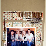
However, on flicking through my digital folder of "must scrap" pictures, I realised I must get around to scrapping Mr T's birthday photo....keen to use my new stash I was pleased to see that, if I focused on the cool blue and grey patterns from both lines, I could easily use them to create a masculine page that Mr T would not be embarrassed of! ;)
First of all, I made the basis of my page - I felt the bold chevrons stopped the pretty lace patterns from getting to girlie on my masculine page:
A little "blooper reel" here for you! I decided that plain chipboard letters suited the colourscheme ofmy page, but thought about customising them somehow, and remembered these fab grey Studio Calico rubons I'd had for ages. I got them out of the pack and quickly and gently laid them on top of my letters to see what they'd look like, but decided it may be too distracting after all as my letters were already sitting on a lot of patterns.So when I took the rubons back off, I discovered that one of the sticky little blighters had partly attached itself to my photo! Grrrrrrr! Disaster! "Just print off another" I hear you say - but the computer and printer were both all switched off, and as it was a very dark mobile phone pic taken in a polaroid-effect app, so I'd spent a while lightening it up and balancing the colours out in Photoshop - but of course, as it was only a mobile phone pic as I wouldn't need to print it for anything again, I didn't save my changes! I couldn't be bothered to do it all again!
So instead I created a cluster of embellishments of buttons, stickers and punched circles to cover up as much of it as I could. Taking inspiration from Jen's post, I pushed some numbers from a mostly-used Thickers pack and pushed them on to pins; an alternative to the pearly and sparkly stick pins I love using on my pages.
I created the rest of my title using the really cute Sticky Keys alphas from the October Afternoon Farmhouse range. I wanted my title to be aligned to the right hand side, and when I find I need my title to line up in this way or fit in a given space, I always start with the last letter first, working backwards, as you can see on the word "Toms" below:
Lastly, I wanted some brief bullet style journaling, which I knew I wanted in the bottom right corner where the grey gingham pattern was, but I felt that my journaling wouldn't be legible on this pattern, and didn't really want to add any further elements like journaling spots or more patterned paper in this area to compromise the balance of my design. So I decided to slip a large circle punch under the paper and use the resulting negative space as a spot to journal within, straight onto the pale chevron background paper. And the punched circle didn't go to waste - if you look back carefully at the cluster of embellishments cover the rubon disaster, it's nestled in there nicely :)So the moral of the story is don't shy away from purchasing papers that at first glance seem feminine if you have more "manly" project in mind or have boys to scrap - and if you want to see how rubons may look on your page before committing, cut them away on the backing paper from the rest of the sheet first!!!
And just in case you are not already a fan of the Sarah's Cards page on Facebook, now is a great time to check it out as Sarah & Lianne are holding a fabulous giveaway.....
Go check it out! Go! Now!!
I will be back over the next few days with a couple more pages showcasing some of the Crate Paperheart and October Afternoon Farmhouse range - check out the links right at the end of the post for the supplies I used.
My supplies included:


4 comments:
Fab page hun. I get that "can't be bothered to reprint" attitude too and end up covering mishaps! Nicely done ;) x
Wow Nat, just love that page! Jill x
Love the page. I always like to see how people create masculine pages wth 'girly' stash.
Fab blooper cover up too ;)
I love that you've done a manly page with pretty papers and your cover up works wonderfully. :) Vanessa xx
Post a Comment