I have also used Farmhouse this month but my Farmhouse range is by Crate Paper.
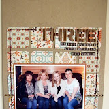
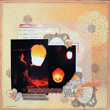
I am not usually concerned with using the right theme paper for the right occassion so here are three "nothing-to-do-with-a-farm" layouts using Crate Paper Farmhouse range.
I hope you agree that the Farmhouse range does work on these layouts. Besides the items listed below, I have also used the borders from this range that came with our kit in November.
Wednesday, 29 February 2012
Tuesday, 28 February 2012
{Give it some Zing!} Part 2
I have another layout to share with you today, featuring some other ways to use Zing embossing powders on your layouts. (Again, apologies for the lower standard of photos, my camera is still unusable!)
Having had a little boy, a lot of my pages now feature slightly more manly colour combinations, so sometimes I like to go back to my 'pre-baby' photo drawer and pick out something else to scrap! I relish the opportunity to do a girly page now & again, and our wedding photos are the perfect chance to do just that.
I chose this time to write about my choice of perfume for the big day - it took quite a few testers and a lot of sniffing to pick out the perfect one! Unlike some people who have a 'signature scent', I have a whole basket full of different perfumes, so I wanted a new one for our wedding. Eventually I chose this one - 'Romance' by Ralph Lauren. I love that whenever I wear it now, the smell takes me back to that day, and that was something I wanted to document.
I've used Zing! powders on a little wooden heart shape under my title here - this time I went for the silver glitter finish, which gives a beautiful subtle sparkle to the piece, perfect for this page. I also used white and blush powders with stamps above and below my paper block. First I stamped the image with Versamark, and embossed using the white opaque powder - I love this finish - glossy and a nice crisp white. To add a bit of interest I then went over a few of the dots with a versamark pen, and embossed over the top of the white with 'Blush' - a pale pink. The versamark pens are great for allowing you to add a bit of colour to exactly where you want it, you could even emboss your own handwriting!
Don't forget you've only got until tomorrow to get your entries in for this month's blog challenge - you could win a £20 voucher for the shop so what are you waiting for?!
Monday, 27 February 2012
{Give it some Zing!} Part 1
Hi all, Jen here!
I apologise in advance for the poor quality of the photos in this post - my beloved camera took a tumble off the kitchen worktop (courtesy of an inquisitive little boy!) and is now in camera hospital. I am crossing my fingers that it can & will be fixed soon! In the meantime I am having to make do with my phone, and a rather old point & shoot camera, but I wanted to show you these pages anyway.
This month I've been playing with Zing? embossing powders from American Crafts. Over the last several months I have been building up a collection of these, and use them a lot. I love using them to jazz up a page, and wanted to share a few different ways of using the powders on your layouts.
You can find Zing! powders in the shop here:
American Crafts Zing! Embossing Powders
They come in opaque, glitter, metallic and flourescent finishes, and loads of different colours to try out!
You can find Zing! powders in the shop here:
American Crafts Zing! Embossing Powders
They come in opaque, glitter, metallic and flourescent finishes, and loads of different colours to try out!
First up is this page, featuring a photo from my son's first birthday, and documenting what a wonderful year it's been since he arrived into our lives and made our duo a trio!
This page features a really easy way to add colour and zing to your pages by simply embossing chipboard shapes. I used a star shape, which I embossed with Mustard Zing, and some asterisks, which were embossed using Rouge Zing both of which have an opaque finish. To do this, simply press the shape into a versamark ink pad, shake the powder all over the now sticky shape and tap off the excess. Heat with a heat gun until the embossing powder does that somewhat magical and mesmerising transformation! I tend to hold my shape with a pair of tweezers by the edges because otherwise they do fly across the room! Because I wanted a really bold look for this page I embossed each shape twice with the same colour, which gives a really good glossy finish without any gaps in it.
Friday, 24 February 2012
* * Oh Dear Lizzy * *
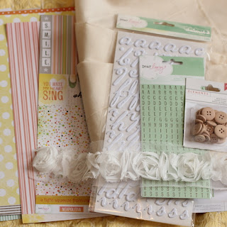
Hello, it's Laura here and dare I say that it is starting to look like spring outside? It's so exciting that the new CHA arrivals are hitting the shop at Sarah's Cards and this Dear Lizzy range is beautiful, pretty and spring like with it's delicate pinks and subtle greens.
I want to show you a couple of my creations with the new Dear Lizzy range and how I incoperated fabric, ribbon and textures into my layouts. At Sarah's Cards there are some fab fabric and sewing items in the store and I used some beautiful calico fabric that matches this range wonderfully.
I used the fabric like a piece of patterned paper and incoperated in into my layering. Instead of trying to glue or fix it to my layout I sewed it directly in place and then with additional patterned papers and my photo that was laid on top, I sewed these on too. This ensures that the fabric says put, your layout is lovely and stable plus the stitching adds gorgeous texture and dimension to your work.
Here is my layout, as you can see the fabric has been layered with a piece of patterned paper and my photo. These were both sewed into position. I also added a gorgeous piece of fabric ribbon that I also sewed in place.
Another great tip if you find that your thickers are not staying in place or in the example of this layout are placed directly on fabric then sew these in place too! (Can you see a theme emerging here!)
I ran a running stitch through my title using plain white thread and with the other fabric elements of the layouts it looks right in place.
To add the buttons I sewed these in place with some embroidery floss. Not only does this help them stay in exactly the right place but I don't think buttons look "finished" unless they have some thread pulled through them.
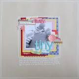
I did another layout using the same technique but this time the fabric was layered directly underneath my photo and then an additional scrap of fabric under my title. I deliberately kept the edges of the fabric "rough" and un-hemed as I love this look and I figure if you do it deliberately then it's ok!
Again the thickers were stitched right in place. I found that my sewing machine coped with this really well. These dear Lizzy thickers are puffy so they are lovely and soft so didn't give my machine any problem at all!
Both these layouts were a change to scrapbook some newborn pics of my baby girl. She is already almost 5 months old so these photos already feel like a lifetime ago!
Check out the links below for all the supplies used in this post!
Subscribe to:
Comments (Atom)


