So without further ado, I present you with the sketch for June 2013:
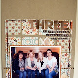
The design team have been busy creating a variety of example pages this month. I used three landscape 6x4" photos to form the vertical strip, and chose a gorgeous flowery background paper, slide frame and tags from Crate Paper's 'The Pier' collection to document our team getaway last November celebrating Sarah's big 4-0.
Helen has converted the sketch to A4 for this lovely beach photo, and adapted the vertical element to include one portrait photo with patterned paper above and below. Don't you love those little wood veneer people?! There are all sorts of shapes available and they make the perfect finishing touch.
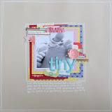
Ifa has used lots of white space and 4 smaller photos in a stack to create this wonderful page. I love the big wooden button as a feature. You can find lots of buttons of all shapes and sizes in the shop.
Tracy G has showcased her gorgeous photo alongside My Mind's Eye 'Boy Crazy' range. Like Helen, Tracy has adapted the sketch for one photo and used the space above and below to really show off some lovely paper designs.
Another great adaptation of the sketch into A4 size, this time from Lou who has used such a fun selection of papers on her page. For a bold, stand-out title like Lou's, you can't beat American Crafts Thickers - take a look at the huge selection of colours and styles available.
The design team love seeing your pages come in throughout the month, and we are looking forward to seeing your interpretation of this month's sketch. Get scrapping!


3 comments:
Great simple sketch, love the DT pages as always :) xx
Love the sketch :-)
Not sure if links to my UKS gallery are OK as I've not (yet) blogged about my page. Hope so - it's here in case Mr Linky doesn't work! Thanks for the sketch - I especially love Ifa's interpretation of it - may have to scraplift separately!
Post a Comment