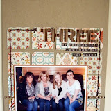
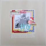
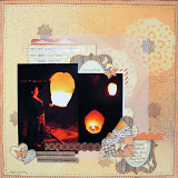
This time I chose a page from my 2011 album to use as inspiration. There were several things about the page that I liked - the basic design, the misting & masking technique, and the use of butterflies, which is something I haven't really used for a while.
The first thing I did was to create a quick sketch from the page. Sketches are my favourite way to take inspiration, as they can be flipped, rotated and altered so that no two pages look the same.
The first page I made used the sketch rotated 90 degrees counter-clockwise. This allowed me to use a portrait photo rather than landscape, and immediately gives the page it's own look. I layered up papers (Lily Bee Sweet Shoppe Candy Stick, Jillibean Soup Chilled Cucumber Peeled Cucumber) and cut-apart pieces (Elle's Studio Serendipity, Basic Grey Mint Julep Snippets) along with stickers (Lily Bee Sweet Shoppe Labels, Jillibean Soup Hexies), vellum die-cuts (Studio Calico Atlantic) and washi tape (Bella Blvd Grey Chevron, WRMK washi paper). I really liked the diagonal element of the original page, so once the page was almost done I added the final touches - I splattered some teal metallic mist, and then sprinkled on some sequins from a deconstructed Webster's Pages Polka Dots, and lastly some tiny stars punched from American Crafts Glitter Tape in Spinach. I was suprised how well the tape punched, as it's quite thick, but my punch went through it no problem.
Next up I used the sketch again, but this time I didn't stick quite so closely to it as I adapted it to include two photos. The page looks totally different from the original, but I think if you look you can still see the sketch fairly clearly - there's a vertical element on the left (this time the full height of the page) with photos stacked on top, title to the right and three embellishment areas. Along with the layout sketch I also took inspiration from the butterfly motifs - these were cut from the Jillibean Soup Chilled Cucumber Peeled Cucumber paper, and I wrapped twine around them to give a similar look to those on the original page. The background paper is Lily Bee Sweet Shoppe Marshmellow, and I've added some strips from Heidi Swapp Serendipity Lovey Dovey and Basic Grey Mint Julep Carolina. That yellow strip across the bottom is the gorgeous WRMK washi paper again - just like the name suggests this is a 12x12 sheet of washi, which means that it gives you the same semi-transparent look as washi tape, but can be cut or punched to any shape or size. I just bought the one sheet this time to try, but I'll definitely be buying some more! I've used cut-apart pieces (Elle's Studio Serendipity, Basic Grey Mint Julep Snippets) along with stickers (Lily Bee Sweet Shoppe Labels, Jillibean Soup Hexies) from the same sheets as the page above, I just stuck to the pink, yellow & grey shades for this page and the green, blue & grey for the first page. As a final finishing touch I used a thin paintbrush to draw a line all the way around the page using a pink mist.
My third page is loosly based on a rotated version of the sketch too, but the main point of inspiration for this page came from the misting and masking that was done in the corner. This time I used stars instead of butterflies - I punched two different sized stars from scrap paper, laid them out on my blank 12x12 sheet and then misted over the top. I concentrated the mist into the top left corner, and then dabbed over the whole misted area with tissue to get rid of the "splotches" and give a softer look. I added a few stars punched from the WRMK washi paper also. My papers and embellishments were layered up in a similar way to my previous pages, with a few pieces on foam squares to give a little extra dimesion to the page. I love tiny strips of American Crafts Glitter Tape and some sequins cut from Webster's Pages Polka Dots as a finishing touch for just a hint of glitz!


2 comments:
Fab LO's Jen, I love them all!
Great pages. I did a similar thing a couple of weeks ago. Chose one of my first (pretty awful) layouts and rescrapped it!!!
Post a Comment