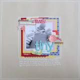
Today I am going to share two layouts using Basic Grey Mint Julep. I haven't worked with Basic Grey for a while but I was strangely drawn to the pastel and pretty colours of this range. Could be the retro fabric feel to it...
I ordered a few sheets of patterned paper and the Chipboard Shapes. I added to this the alphabets from Basic Grey True Love collection ( pretty in pink, but no longer in stock ), a sheet of Jillibean Word Stickers and a packet of Studio Calico Heart and Arrow Wood Veneer. The wood veneer is unfortunately showing out of stock again. I remember snapping it up when I saw it arrived in store early this month.
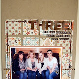
I love to "jazz" up the titles on my layouts. My titles, almost always, are heavily layered with some personal touches. I never just write happy or day out or travel. To start with, my chipboard or letter stickers are never stuck down straight...they always jostle and fight for space, like so.
Notice how the T is over the H and the first E is over the second. They also, don't line up! I used to stress about everything being straight that the result was, they never ended up straight. I abandoned the ruler and I am happier for it.
Another trick I used is to replace the O in company with some wood veneer hearts. I know, they don't look anything like O but they look kinda cute all bunched up like that, no ? When you read it, your brain makes up the missing letter anyway. If you'd prefer, you can use something round like a button for O instead.
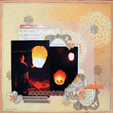
In the second layout, I replaced V in Levenham with a heart. Better looking V, don't you agree ? And perhaps a more acceptable replacement for V for many people, than three hearts to make an O.
For both titles, I layered the chipboard letters over some patterned papers. I also added some chipboard shapes from the Mint Julep collection. My next invention is some quilled scrolls. These are so easy to do and provides another way of using patterned paper on your layout. I won't go into how I made these scrolls as I provided a step by step on my own blog a couple of months ago.
I couldn't resist adding a home made badge to a layout. Now you know, the Badge It Machine is no longer sitting idle and is being put to good use.
Here is Three's Company.
I know. The saying should be Two's Company but H ( and us ) loves going for days out. It makes up for the time when he declines to go for a meal out.
Next is Beautiful Lavenham. I love all those Tudor houses painted different colours. I was surprised to read that originally all the black visible beams would have been plastered over. The exposed beams look is actually a modern invention. I hope the exposure to the element will not deteriorate the beams too much and these houses will stay up another 500 years. I am hopeful!


6 comments:
Stunning ifa.
Love the idea of layering your title - will have to try this!
Some great ideas here.
Loving these lo's Ifa, thankyou for sharing.
Lovely LO's as usual Ifa
Adorable layouts as always Ifa x
Post a Comment