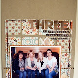
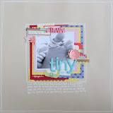
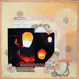
This style of scrapbooking needn't just be for Project Life style albums either. Divided pages can work really well alongside full sized pages, especially for events for which you have lots of photos, but don't necessarily want to dedicate loads of 12x12 pages to.
For each spread of pages that I do, I make myself up a supply kit of products. I find this step really speeds up the process for me, as I'm then not choosing from all of my papers & embellishments for every little detail. First up, I choose a colour scheme, and papers to go with that. I tend to choose one or two multicoloured papers first, and then select a few single or dual tone sheets that match. I pick a few full sheets from my newer papers (on the left) and then dig into my scraps basket and pull out some older pieces to mix in (on the right).
This selection includes papers from Basic Grey Knee Highs & Bow Ties, Dear Lizzy Lucky Charm, My Minds Eye The Sweetest Thing, Fancy Pants Park Bench & Simple Stories Vintage Bliss. I first chose the yellow and aqua flower print from Fancy Pants, and the aqua with yellow hearts from Dear Lizzy which were similar colours.
Once I've got my papers I pick out some alphabets and embellishments to use with them. I tend to select one set of Thickers for my title card, and a few smaller alpha stickers to use on other cards. I always choose some small word stickers, labels, one colour of twine and 4-5 rolls of washi tape. For this particular spread I have also added in some American Crafts Glitter Tape and American Crafts Zazz glitter glue for added sparkle. Stamps from Elle's Studio and American Crafts, along with my trusty wood veneer box complete the kit.
I do always pick out more than I will actually use, as I like a bit of choice & variation on the cards - you could definitely get away with a smaller kit with just one small alpha and one washi tape for example.
I cut all the pieces first, and lay them out on the table to decided where I want each piece, adding the photos and any ephemera I collected from the week or event. I tend to have a couple of photos that fill the whole slot, and the rest are backed onto papers. Throughout my album for the year I carry certain elements all the way through. This year I am using the top left 4x6 piece for my title (in this case the date) and the bottom two slots on the left to document my pregnancy.
One of the biggest challenges to creating divided pages is keeping it looking like one cohesive page, whilst having many separate elements. Working from a kit definitely helps with this, as does using repeated elements throughout the spread. You can see from the finished pages that I used certain elements a few times, like the luggage tags, the stars and the tapes.
The American Crafts Glitter Tape is a fairly new product and one I will definitely be buying more of! It's lovely & dense in colour, and has a clear peel off backing so on your page it looks exactly as it does on the roll. The glitter doesn't rub off either - I want the glitter on the page and not my hands so that's a definite bonus in my book!
Zazz glitter glues are another new product from American Crafts and come in a huge variety of colours. With a non clog applicator, they stand tip at the bottom so they are always ready to go, and you get loads for your money. Watch out for these appearing in the shop soon!
(Edit: these are now available in the shop - Zazz Glitter Glues)
So that you can get an idea of how some of my other page spreads come together, here are a few older pages from the beginning of the year.
My top tips for working with divided pages:
- Keep your supplies to a set amount. Work from a kit you put together - include papers, alphas, label stickers, tape, twine and flat-ish embellishments.
- Use repeated shapes or embellishments throughout the page or spread to keep the separate elements cohesive.
- Plan! Set out all your pieces first with your photos. Decide roughly where you want everything, and then work on one bit at a time.
- Keep it simple. Divided protectors are not the place for bulky additions as the smaller slots will warp.
- Try using a divided page on the opposing page to a 12x12 layout. Use your favourite photo from an event on a full 12x12 layout on the left, then use a divided protector on the right of the double page spread for some additional photos and journalling.


4 comments:
Great pages Jen
Great tips and great pages, Jen.
Thank you :)
Fab advice Jen as I wouldn't know where to get started with something like this! Love the idea of using a divided pocket opposite a full page for extra space, great tip xxx
I'll get around to trying this one day. Lovely pages x
Post a Comment