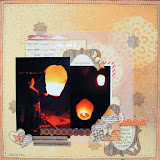
Today I am going to share a couple of layouts from my visit to Berlin last Christmas. Don't worry, they are not Christmas layouts but I am using Valentine's range. I try not to get too pigeon-holed by colours ( my boys love pink, didn't I tell you ? ) or specific icons such as heart. Ok, maybe Christmas baubles on non-christmassy layout will have you label me barmy! But I am not that bonkers, right ? Ok, let's get a move on and let you be the judge.
I have used the very lovely Love Notes by Crate Paper. I always have a soft spot for Crate Paper's Valentine's range. But to mix it up a bit, I have also used Crate Paper Close Knits for some more saturated colours.
I ordered the Love Notes chipboard {{aaah}}, stickers,badges and Thickers. It would appear that the chipboard is now out of stock in store but I hope some of you lucky ones have a pack.
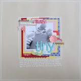
Can you see how sweet the chipboard and stickers are, mixed up here in my "Love Berlin" layout ?
For "Love Berlin", I started with the assortment of chipboards and stickers, straight down the middle. I added some papers underneath followed by the Thickers title. I added the photos directly above this pile of loveliness and wrote my journalling underneath. And the photos are intentionally haphazardly glued down to free my inner obsession with straight lines. {{and ps: that chipboard in the middle of journalling is covering up a mistake }}
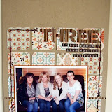
The next layout also features 3 photos from Berlin. Instead of it being about Berlin which I am sure many more other layouts will be, I wanted to document the fact that I enjoy spending time with my boys and dearest A.
I had some leftover paperclips from last month which became tiny frames this month. I had to use four paper clips because that is our family's magic number. They are framing little stickers labelled, me, you, you & you. Can you see in the close up ?
I used some Amy Tan alphabet stickers for the title. Because these letters are quite transparent, I love that the background print come through. Taking this further, I wrote my journalling over the top of the title. I had to use a black Sharpie to ensure that my journalling will dry over the shiny letters. Some old red letters date the photos and also tie in with the splash of reds echoed elsewhere in layout.
That's all from me this month. I hope I have inspired you to create this half term. See you next month.


No comments:
Post a Comment