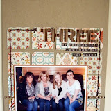
If like us, you can't get enough of labels on your scrapbooking and project life pages, you'll love these! Here's a little freebie printable for you, just to say thank you for being lovely. Download link below.
Download them here
Personal use only please x
Thursday, 27 February 2014
Wednesday, 26 February 2014
These are the dies I used,
Party banner and Calendar Components
I love the party banner and think it looks good on cards for all occasions.
Here I used the hearts to form a four leaf clover.
I made the cute little chick using a punched circle and 2 hearts for the wings, 2 stars for the feet and an asterisk for the 'hair', from the Calendar set.
Don't forget there's a couple of days left to enter our sketch challenge this month. You can find all the details here.
Monday, 17 February 2014
Three photos from Berlin with a little help from Crate Paper
Surprise! It is Ifa with you today. The DT had a reshuffle and I have a new slot. What are you up to this half term ? Put your feet up and rest, right ? I hope so but whatever you get up to, make sure you have fun.
Today I am going to share a couple of layouts from my visit to Berlin last Christmas. Don't worry, they are not Christmas layouts but I am using Valentine's range. I try not to get too pigeon-holed by colours ( my boys love pink, didn't I tell you ? ) or specific icons such as heart. Ok, maybe Christmas baubles on non-christmassy layout will have you label me barmy! But I am not that bonkers, right ? Ok, let's get a move on and let you be the judge.
I have used the very lovely Love Notes by Crate Paper. I always have a soft spot for Crate Paper's Valentine's range. But to mix it up a bit, I have also used Crate Paper Close Knits for some more saturated colours.
For "Love Berlin", I started with the assortment of chipboards and stickers, straight down the middle. I added some papers underneath followed by the Thickers title. I added the photos directly above this pile of loveliness and wrote my journalling underneath. And the photos are intentionally haphazardly glued down to free my inner obsession with straight lines. {{and ps: that chipboard in the middle of journalling is covering up a mistake }}
That's all from me this month. I hope I have inspired you to create this half term. See you next month.
Today I am going to share a couple of layouts from my visit to Berlin last Christmas. Don't worry, they are not Christmas layouts but I am using Valentine's range. I try not to get too pigeon-holed by colours ( my boys love pink, didn't I tell you ? ) or specific icons such as heart. Ok, maybe Christmas baubles on non-christmassy layout will have you label me barmy! But I am not that bonkers, right ? Ok, let's get a move on and let you be the judge.
I have used the very lovely Love Notes by Crate Paper. I always have a soft spot for Crate Paper's Valentine's range. But to mix it up a bit, I have also used Crate Paper Close Knits for some more saturated colours.
I ordered the Love Notes chipboard {{aaah}}, stickers,badges and Thickers. It would appear that the chipboard is now out of stock in store but I hope some of you lucky ones have a pack.
Can you see how sweet the chipboard and stickers are, mixed up here in my "Love Berlin" layout ?
For "Love Berlin", I started with the assortment of chipboards and stickers, straight down the middle. I added some papers underneath followed by the Thickers title. I added the photos directly above this pile of loveliness and wrote my journalling underneath. And the photos are intentionally haphazardly glued down to free my inner obsession with straight lines. {{and ps: that chipboard in the middle of journalling is covering up a mistake }}
The next layout also features 3 photos from Berlin. Instead of it being about Berlin which I am sure many more other layouts will be, I wanted to document the fact that I enjoy spending time with my boys and dearest A.
I had some leftover paperclips from last month which became tiny frames this month. I had to use four paper clips because that is our family's magic number. They are framing little stickers labelled, me, you, you & you. Can you see in the close up ?
I used some Amy Tan alphabet stickers for the title. Because these letters are quite transparent, I love that the background print come through. Taking this further, I wrote my journalling over the top of the title. I had to use a black Sharpie to ensure that my journalling will dry over the shiny letters. Some old red letters date the photos and also tie in with the splash of reds echoed elsewhere in layout.
That's all from me this month. I hope I have inspired you to create this half term. See you next month.
Saturday, 15 February 2014
Cameras at the Ready!!
If you're at all like me, it was your love of photography that led you to scrapbooking. As the craft revolves around photos and taking snaps, I often snap up any camera-themed embellishments and stickers as they are easy to work in to page, whatever your theme. It will be no surprise then, that when I spotted this Crafter's Workshop 12x12 template, I couldn't wait to get my mitts on it!
Once all layered up and stuck together, I'd add in pen details:
And my finished patterned camera would be ready to go on my layout!
They can look at bit strange and obscure during the piecing together stage,
but adding the black doodled outlines really brings it together and makes it look like a camera:
Here's my completed page, Reason to Smile. It tells the story of lovely Sally Anne, who was my soft bunny toy as early as I can remember. She used to go everywhere with me, as this photo circa 1984 shows, and I once nearly screamed an aeroplane out of the sky when I discovered she was not coming to Spain with us - the only thing that calmed me was the reassurance that she had stayed behind to help my Dad and Grandpa move everything to our new house while we were away! She had been gone (but not forgotten!) for years, so I was over the moon to find her in pretty good rooting, tooting, cow-girl condition in a bag in my mums attic when she moved house last year. Sally Anne and Natalie Anne were reunited!! She now sits pretty in my craft room, although does get treated to the odd day out - last Summer I held a Teddy Bear's Picnic for my class; each child brought their favourite Teddy, and I took Sally Anne in to meet them all!
I also used the template to make a quick birthday card; this time I popped a bit of 3D foam in between each layer to add a bit of depth.
I also added a pearl and a crystal to this one to add a bit of detail:
There are lots of lovely CHA arrivals in the shop at the moment - why not grab a template with some new papers to make your own embellishments to coordinate with your pages :)
I'd never really been drawn to the templates before as I'd always associated them with making backgrounds using messy pastes and mists and paints which, although always look fab, my backgrounds are usually patterned paper. However, when I saw this I knew I wanted to use it to make my own embellishments.
Here's how:
First I'd chose which camera I wanted to use, and trace it onto my chosen patterned paper:
I'd then begin to trace cut out the "detail" pieces of the camera from other patterns (great for using up scraps!)Once all layered up and stuck together, I'd add in pen details:
And my finished patterned camera would be ready to go on my layout!
They can look at bit strange and obscure during the piecing together stage,
but adding the black doodled outlines really brings it together and makes it look like a camera:
Here's my first page, documenting about how we can look forward to family bike rides and make use of the beautiful cycle track just across the road from our home now that my step daughter has mastered riding her bike without stabilisers.
For my second page, as well as making camera embellishments, I also used the template to make my own journalling card. I began by selecting my patterned paper and tracing one of the camera tempaltes using a brown AC Slick Writer pen.
I popped it into place on my page, and then drew journalling lines across it with a black pen:
Hey presto, one camera-shaped journalling card ready to go:Here's my completed page, Reason to Smile. It tells the story of lovely Sally Anne, who was my soft bunny toy as early as I can remember. She used to go everywhere with me, as this photo circa 1984 shows, and I once nearly screamed an aeroplane out of the sky when I discovered she was not coming to Spain with us - the only thing that calmed me was the reassurance that she had stayed behind to help my Dad and Grandpa move everything to our new house while we were away! She had been gone (but not forgotten!) for years, so I was over the moon to find her in pretty good rooting, tooting, cow-girl condition in a bag in my mums attic when she moved house last year. Sally Anne and Natalie Anne were reunited!! She now sits pretty in my craft room, although does get treated to the odd day out - last Summer I held a Teddy Bear's Picnic for my class; each child brought their favourite Teddy, and I took Sally Anne in to meet them all!
I also used the template to make a quick birthday card; this time I popped a bit of 3D foam in between each layer to add a bit of depth.
I also added a pearl and a crystal to this one to add a bit of detail:
There are lots of lovely CHA arrivals in the shop at the moment - why not grab a template with some new papers to make your own embellishments to coordinate with your pages :)
Labels:
Crafter's Workshop,
Natalie
Tuesday, 11 February 2014
February Sketch Challenge
Are you all ready for another sketch challenge?
This month I have made the sketch for you and the girls in the team have been making a few samples too.
February Sketch
This month I have made the sketch for you and the girls in the team have been making a few samples too.
February Sketch
Here is my layout please excuse poor quality lighting due to this terrible weather.
This card was created by Tracy Gough
This is Ifa's pretty layout
Tracie Oakes provided this striking page
and finally Jen Garrett made this lovely hand stitched page.
We are looking forward to seeing your creations this month have fun!!
Claire x
Challenge Winner for January
Hi all.
Thankyou for taking part in last months sketch challenge we have had some lovely entries but can only have one winner..
The winner of our January sketch challenge is Kerry Bruce with this fantastic layout.
Kerry please contact Sarah or Lianne to claim your prize :)
Thankyou for taking part in last months sketch challenge we have had some lovely entries but can only have one winner..
The winner of our January sketch challenge is Kerry Bruce with this fantastic layout.
Kerry please contact Sarah or Lianne to claim your prize :)
Saturday, 8 February 2014
Freckled Fawn
Hi all. Jen G here with a few pages to share using Freckled Fawn products. I have loved Freckled Fawn washi tapes and wood veneers for a while now. Somehow Sarah and Lianne sneaked Freckled Fawn products into the shop without me noticing. I kid you not, when I noticed them I squealed a happy squeal. I used the Pink Paislee Hey Kidd Kre8tive Kit for these layouts and embellished them with Freckled Fawn.
This first page has 3 little tape people on it. The tape has boys and girls on it but I tend to chop them up and use just the boys. I have a line of lonely girls stuck along the edge of my desk! Note to self - get working on some girl layouts.
I also used this road tape.
Just for Lou's benefit I will point out that my page is not about roads!!! (See her last post for her dig at me!)
Lastly I used the part of the days of the week washi with "Sat" on it as Sam's party was on a Saturday.
The Pink Paislee papers were perfect for this adorable photo of my little niece.
I added the hearts washi from Freckled Fawn along with their wood veneer embellishments.
On this last page I used the adorable wood grain washi that has little hearts within the grain.
The hearts are very subtle and very cute.
I also added a strip of the arrows washi.
I hope you love Freckled Fawn as much as I do. Leave us a link to your work using their products and the DT will pop over for a look.
TTFN
Subscribe to:
Comments (Atom)

.JPG)


