I used a variety of papers on my pages this month, including sheets from Studio Calico, My Minds Eye, American Crafts and Echo Park. You can find links to all of these at the bottom of the post. Most of the Thickers I've used are old stash that I've accumulated over the years!
First up, using numbers as a title.
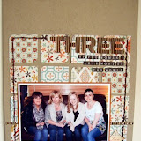
Sometimes the date of an event will suit the page as a title. Like here, for a picture of our wedding and journalling explaining the reason we got married on the date that we did. There was no deep meaningful reason for choosing that date, but we wanted a summer wedding, on a Saturday, and it so happened that midsummer's day met those criteria. It seemed fitting to celebrate our marriage on the longest day of the year. Although there's no "big story" here, it's still nice to have the information down on paper for preservation. I could have simply called this layout "The date" or something similar, but instead I used numbers to show what day it was.
Secondly, using numbers to highlight an age.
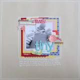
I wanted to document on this page the age that Benjamin was when I took the photo - eight months old, and just starting to get about by himself. Instead of just using an 8 to do that, I placed numbers in a line across the page, from 1 - 12, indicating the months. I used numbers in a pale grey for all apart from the one that was relevant to the photo, which I replaced with a teal coloured number eight and layered up on top of some punched paper & stickers to make it stand out of the line.
Lastly, use numbers for journalling.
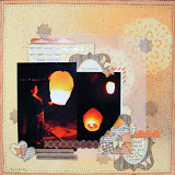
I've had this page in my head for ages now, but been unable to translate it to paper, until now! The photo is one of Benjamin's first pictures. I built up the photo block using lots of layered papers, and added three little embellishment blocks in a triangle around my photo, one of which contains my 'title' of sorts: 1 perfect son. I used twine to add a border to the page - simply pierce each corner of the paper and then thread twine through from corner to corner. I filled the rest of the page with numbers in lots of different fonts and colours to mnatch the papers I'd used. Each number represents an important part of Benjamin's arrival, such as the number of hours I was in labour for, how much he weighed, and the time he arrived. I added little bits of writing between the numbers to explain them a bit further. Although there is not a huge amount of writing on this page, the layout includes a *lot* of information.
Thanks for reading, I hope I've inspired you to use some numbers on your next page. As always please share any projects you make as a result of the posts here on the blog - we love seeing your work.


11 comments:
Great ideas and I absolutely love that last layout and may just have to pinch and copy :D
Some great ideas - I am in that same situation with the numbers! Will defo try some of these!
I love, love, LOVE that last one! Fab idea. Great LO's Jen :)
Great ideas for the numbers and I loved the twine frame too!
Love all your ideas - will definitely use them as inspiration :D
Fantastic idea Jen - I've got lots of spare numbers/letters! :) x
I always end up with loads of numbers and odd letter thickers! Great Ideas! Anna x
I LOVE your last LO more than I can express! It's just brilliant!
I'll be scraplifting that idea too, thanks for the inspiration x
I love, love, love that last LO too...it is just adorable!
Brilliant ideas Jen - I have too many packs of the "left over bits" of Thickers to admit to!! Really really love the last page, it's a fantastic idea and looks great :) xxx
OMG these are great layouts, thanks for sharing some great inspirations. x
Post a Comment