Saturday 27 August 2011

Creating using Crate Neighbourhood

Following all the new releases from CHA, the shop is bursting with gorgeous new goodies, have you been to check them out? In addition to the beautiful new lines to tempt you, I think it is important to not forget some of the older lines that are just as delicious! For this month's blog work I decided to play with the Crate Paper – Neighbourhood range. In addition to the papers from the Neighbourhood collection, I also used the lovely co-ordinating buttons, phrase stickers and border stickers, which can all be used to embellish.

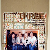
The first of my layouts, ‘In the Blink of an Eye’ features photos of my daughter once a year from her birth day to her most current birthday this year. I wanted to portray just how grown up my little girl is becoming. I will admit to shedding a few tears too whilst creating this layout, because as the title indicates the years seem to have flown by. 

[Please Click to View Larger]

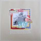
My second layout is a quick and easy about my two favourite girls, my daughter and my adorable little niece, Meghan.

[Please Click to View Larger]

The layout was super simple to create, and here is how I did it…..
1: I misted the background using Maya Road ‘Pomegranate Pink’ to add a little interest to the ‘Garden’ paper.
2: I then decided to create a border along each side using the hexagons on the ‘Friendly’ paper.
3: I mounted my photo onto two strips of papers, ‘Chores’ and ‘Visit’, before adhering my borders.
4: I added my embellishments below and to the bottom left hand corner of the photo using border stickers, phrase stickers and the eclectic buttons.
5: Lastly I added one of the border stickers to the top right hand corner and finished it off with a couple of pretty little adhesive gems.

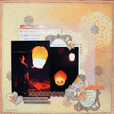
My last layout features our new tent, ‘Our Home away from Home’ as it were for the past two weeks we spent down in Devon. 

 [Please Click to View Larger]

The Crate Neighbourhood eclectic buttons are fantastic quality and co-ordinate perfectly and create a good deal of dimension to add to your layout. I chose to use the sweet little house shaped button and the blue checked button on this particular layout. 


As always thanks for looking, Gems xx


Thursday 25 August 2011

Roll Up, Roll Up!!

Following CHA, the shop is being flooded with exciting new products - it's hard to choose what to buy first!! But as soon as I saw the new releases in stock from My Little Shoebox, I immediately fell in love with the Roll Up Flower die cut sheets and new they'd be top of my purchase list!

The sheets consist of die cut shapes, which easily roll up to create fabulous flowers, as well as some bonus ultra-trendy cloud and pennant shapes to add to your pages too. There's a sheet for each of the five new lines released at CHA, including the Playtime & Destination lines pictured below, so there's  a colour way to match any project.


I decided to use the beautiful Audrey line to create a page; the feminine colours and bow motifs were a perfect match for an old photo of my Grandmother that I'd received the very same week as my goodies arrived.

The Roll Up die cut flowers couldn't be easier to create:
1. You start by popping your chosen shape out from the sheet and carefully separating the spiral (it's joined together in places by tiny little paper dots).

2. Begin rolling your flower up - starting from the outside working in to the centre. I found that rolling the paper around a cocktail stick helped to get me started and made it easier to hold while rolling it up.

3. As you roll, you should start to see the flower forming as you roll:
4. As you get towards the end, you will see that you are left with a disc shape that can't be rolled - add some adhesive here,

5. Then press your rolled paper onto your adhesive and admire your finished flower!
6. You'll see that the sheet also has some plain die-cut flowers, which can be used on their own or layered together with the Roll Ups to create custom designs, mixing and matching the colours and patterns however you wish:


Here's a selection of flowers I made with the Audrey sheet. When you consider I have half of the die cut sheet still left in the packet it really is excellent value for money at £2.99 - you have lots to play with!
When you begin to think about adding beads, buttons, and bling to the flowers too, the possibilities are endless. The completed flowers are really pretty and add a great deal of dimension to your projects, as you can see here:

I couldn't wait to use the flowers on a page, so together with some of the matching Audrey papers, created this:
Please click on any of the following photos to view a larger image

I chose to use the pretty Funny Face paper as a base for my page, and created clusters at the bottom corners of my photo using the Roll Up flowers, together with cameo faces and bows cut from the My Fair Lady and Breakfast at Tiffany's papers.


I used a clear glaze pen to add a glossy shine to the cameos and popped a small adhesive pearl in Bubblegum Pink to them to add more detail:


I handcut a border from the Breakfast at Tiffany's paper to run along the top of my photo, along with some more of the pearls and a pretty little Jenni Bowlin bow embellishment - which not only matched the bow motifs in the papers but I later realised echoed the bows on my Grandmother's pretty silk scarf in the photo - bonus!!

I created my title using Thickers which I popped on to die cut pennants from the Roll Up sheet, and strung them together using some pink Bakers Twine. I added a little pearlescent detail to the Thickers and punched butterflies (and all around the edge of the patterned paper to highlight the artisan-label shape), using Liquid Pearls...another product that is super useful and incredible value for money - it lasts for ages!

Thanks, as always, for stopping by xxx

Photobucket

Monday 22 August 2011

Coffee Break


Today I thought I’d show a little home project, again using the State Fair collection by Studio Calico.

I really like tile coasters and I’ve always been tempted to buy a few, but then I stop myself as I think – ultra thick embossing enamel - do your own!  Okay, not ceramics, but I thought I could get a similar look from revamping old cork backed coasters.  I’ve have some old dog-eared coasters that really need to be shown the bin, but I held onto them and finally, got to give them a make-over. 

Firstly, get your finger nails and a sharp knife to hand and have a good scrape at the covering peeling off as much of the top layer as you can.


Then, using a file (or sandpaper) sand it all down to smooth.  Spread the top with plenty of wet glue and adhere your chosen paper.  Leave to dry, trim the edges and then using your file/sandpaper, file the edges.

Once done, and dry, decorate as you wish, however, nothing too bulky as you want your cup to sit comfortably once done.  I’ve stamped, used extra cuts of paper, a journaling pen and rub ons.

Finally, using a clear pigment inkpad, stamp all over the top of the coaster and sprinkle a generous layer of clear ultra thick embossing enamel.  Repeat a second time.  This really brings out the colour in the papers and ink and gives a lovely, slightly uneven, glossy top.  Once this has dried, I did spray with clear radiator enamel to seal.


Sunday 21 August 2011

Musical Dudes


Hi, its Vanessa here and this month I’m carrying on with the State Fair Collection by Studio Calico. I’m also carrying on with the misting theme (my passion for the moment!) and I’ve created this page using a quick and simple misting technique, and a few quick techniques generally, which also give effective results.

Using a mask is a quick, simple and effective way of adding a splash of colour and interest to your page. Before doing anything else, I placed the mask (by Prima) in the bottom right corner of the page and then sprayed the mist at a slight angle. The mist is Butternut Squash orange.
I’ve done a little bit of stamping with the retro radio from the AC sing-a-long collection. Stamped onto patterned paper and cut out. As well as adding colour, I love to add definition to my pages and I find outlining the page and the elements with a black journaling pen works really well.


Supplies

Prima Lace G - Red
Studio Calico State Fair Collection - Right Step Up, Pie Contest & Guess Your Weight
Miscellaneous die cuts and frame
Maya Road mist - Butternut Squash Orange
American Crafts stamps - Peechy Keen - Sing-a-long
Ripped up Starbucks coffee cup holder
Organza Rose trim

Thanks and pop back tomorrow afternoon for a little home altered project using the same paper collection.

Vanessa x

Thursday 18 August 2011

Heritage/Vintage Layouts anyone?


This month I received some lovely old family photographs so I decided to focus my blog work on scrapping these.

I armed myself with the WHOLE COLLECTION PACK of Crate Portrait, it's full of lush papers, diecuts, stickers and borders :)

I also wanted wanted to add some stamping to my layout so I picked some lovely American Crafts border stamps from the shop - these are perfect for building your own frames and the corners really are pretty.


And a close up of the roses and stamping.


The background of my page is a dark cream cardstock I then used a wet T Bag to distress the page as I felt it was to clean looking. I have demonstrated this on white card while it's still wet so you can see it clearer. When it's dry it's much paler and softer.


To create the roses on my page I used 3 Circles, I simply used a pencil on my patterened paper of choice and drew around a mug and a flute type glass, (never measure anything).

Tear out the circles, I used two smaller circles to make the smaller roses and the larger circle to create the larger rose. Below I have done a step by step for you.


Click on the image to see a larger view.

Claire xx


Monday 15 August 2011

Meet our new Design Team members!

Last month we launched a design team call, and we wanted to share with you the new member of the Sarah's Cards Ltd design team. We're so excited to welcome four, yes, four new DT members! That means MORE kit layouts in your printed brochure each month and MORE fabulous projects on the blog each month!
So without further ado, a huge Sarah's Cards welcome to:
We want to thank everyone who took the time to enter an application to the DT call, it was really tough to decide on our new team members as the standard of submissions was really high. Check out the new DT members blogs, we're sure you'll agree that their work is stunning and we can't wait to see what they design for Sarah's Cards.

Friday 12 August 2011

{3 ways with a sketch}

I love working with sketches - they are a great way to kick start a layout if you are feelinga little bit 'mojo challenged'. But even if you are not, they can be a fantastic way to get those creative juices flowing. I often re-use sketches, because quite a lot of the time, by the end of the layout creating process you can't really tell that it came from a particular sketch. 

Here's a sketch that I drew a little while ago - I had ordered a few 12x5" photos from Photobox, so this sketch was created with those in mind. I'm going to show you three things that I've made using this one sketch.

I've used papers and embellishments from the lovely Margarita range from American Crafts for all the projects in this post.

First up, using one of the photos that I made the sketch specifically for. This is a photo I have scrapped before in a different format, but I really love it, so I don't mind scrapping it again, and this time it's in black and white and a different size/shape of photo. This layout sticks pretty faithfully to the sketch - it's one photo, and all the elements are where they are shown in the sketch. There's no doubting that the two go together, and that's fine with me!


 I added lots of journalling to this page in a strip to the right hand side of the photo - it tells of the adventure of motherhood, and how this photo was just the very beginning of the greatest adventure there is. It's pretty sentimental, and paired with the black and white photo this page could have easily gone down the pastels route, but I felt it needed brighter colours for a bit of pop! I like that although I'm talking about the fairly serious stuff about being a mum - the hard times and the intense love for a child, the page is also saying that being a mum is partly about fun!

My second layout also came from the sketch, although you may not notice the connection at first, but I promise you it did! This is a great example of how a sketch can be a jumping off point, and whilst it's fine to stick to it, it's also fine to let your creativity wander off in all sorts of directions. 

The background of this page is a sheet of glazed cardstock, misted and then wiped whilst still wet - the ink wipes clean off the glazed sections and creates a fun pattern . I rotated the sketch 90 degrees clockwise, and split the one big photo into 3 small photos, then I shrunk those down in size too. I still added the photo border with ribbon and a punched strip at the bottom. According to the sketch in this position, the title should be above the photo, but that didn't look right on these particular photos - no problem, just move it, at the bottom it goes. Instead of a block of patterned paper, I added a stream of cut out elements from a sheet of patterned paper, and layered them up for dimesion. The top right of my page looked a little bare. Again, technically according to the sketch there isn't an element placed there, but because I've fiddled around with things it was needed. 

I love how this page and the one before both started at the same point, but putting them next to each other you wouldn't know, that's how versatile sketches can be. 


Lastly, although I got into scrapbooking through cardmaking, I'm not much of a cardmaker! However, as I'm sure many of you also experience, as a 'crafter' in general, people come to expect a handmade card and I often struggle! Sketches are my saviour for cards. Pretty much any scrapbooking sketch can be easily adapted for a card. For this one I simply flipped the sketch round, replaced the photo with a block of patterned paper, and kept the elements as per the sketch, replacing the title with a sentiment. Et voila!


Wednesday 10 August 2011

August Challenge

Hi all its Rachel again, so it is my turn to host the monthly challenge. So this month what I would like you to do for a chance to win £20 e-voucher is to scrap using 5 patterned papers.

They can be different manufacturers but we need 5!

This is my page, using up some old Crate


So as you can see 5 patterned papers, i have used the backs of the papers but welcome to use anything you like.

This is what the rest of the DT got up to


Love this colour combo from Claire


Gems completely gorgeous little girl


Stunning wedding layout from lou


Nats is super loved up!

 You have until the 31st of August to get your entries in, just leave us a comment with a link to where your layout is and we will go and check it out.

Chance to win £20 to spend in the shop, for one layout!

Go on you know you want to

Rachel x


Monday 8 August 2011

Challenge winner.

We had loads of fabulous entries for July's sketch challenge, it was really difficult choosing a winner.
Thank you to everyone who played along with us.

The winner of the £20 e-voucher to spend in the shop is Jackie.
We all loved the grungy feel of the LO, so a big congratulations to Jackie. Contact Lianne to receive your voucher, and happy stash shopping!!!

Rachel will be back in a couple of days with the challenge for August.

Sunday 7 August 2011

Part 2- Lifting vs Stealing

Hi all, anyone out there on this rainy sunday? I thought i would come back and show you some more of the pages i have been doing on my little feature of lifting peoples work without directly copying.

 So as we all know copying is the biggest form of flattery right? well thats what my mother told me growing up.

I totally fell for this page when i saw it and quite just wanted it the same, everything in the same place etc

That is totally fine so long as you credit the 'designer' so here i went.


Pretty much the same right? i even used the title (titles are hard) it just so happens i had a sticker from Sassa that had love love love on it


I love the folded up paper bit


I also tend to use our R&R on loads of things.

So there you go, its pretty much just copying, though obviously i didnt have the same stuff as her.

I mainly used Sassa stuff, a bit of MME ahh cant think what that coloud paper is but its cute right?

So my final page is lifting Gems lovely page she did on our first round of 'new look' blog work


I loved the composition of this page, thats what i tend to see first rather than what people have used etc

So off i went to lift her work, again using mainly MME (cant get enough of it) bit of Crate and a bit of Sassa 


I started with these super cute bunny photos but it started to change and i thought a big one would be fun, this is exactly what lifting is about, taking a idea and changing it.


i kept the idea of a photo and a little one as a highlight


I liked the bit above the photos with the title so added a sub title to my page.

So you can see again how if you look you can kinda see where it originally came from.

So there you go that is me for now, i will be back in a few days actually as it is my turn to host the monthly challenge where a £20 gift voucher can be won.

Thanks to all the DT for having such wonderful work and letting my use it.

Thanks for stopping by, be sure to link up any work you are lifting and i will swing by and see

Rachel x