I love working with sketches - they are a great way to kick start a layout if you are feelinga little bit 'mojo challenged'. But even if you are not, they can be a fantastic way to get those creative juices flowing. I often re-use sketches, because quite a lot of the time, by the end of the layout creating process you can't really tell that it came from a particular sketch.
Here's a sketch that I drew a little while ago - I had ordered a few 12x5" photos from Photobox, so this sketch was created with those in mind. I'm going to show you three things that I've made using this one sketch.
I've used papers and embellishments from the lovely Margarita range from American Crafts for all the projects in this post.
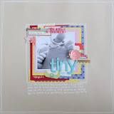
First up, using one of the photos that I made the sketch specifically for. This is a photo I have scrapped before in a different format, but I really love it, so I don't mind scrapping it again, and this time it's in black and white and a different size/shape of photo. This layout sticks pretty faithfully to the sketch - it's one photo, and all the elements are where they are shown in the sketch. There's no doubting that the two go together, and that's fine with me!
I added lots of journalling to this page in a strip to the right hand side of the photo - it tells of the adventure of motherhood, and how this photo was just the very beginning of the greatest adventure there is. It's pretty sentimental, and paired with the black and white photo this page could have easily gone down the pastels route, but I felt it needed brighter colours for a bit of pop! I like that although I'm talking about the fairly serious stuff about being a mum - the hard times and the intense love for a child, the page is also saying that being a mum is partly about fun!
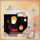
My second layout also came from the sketch, although you may not notice the connection at first, but I promise you it did! This is a great example of how a sketch can be a jumping off point, and whilst it's fine to stick to it, it's also fine to let your creativity wander off in all sorts of directions.
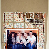
The background of this page is a sheet of glazed cardstock, misted and then wiped whilst still wet - the ink wipes clean off the glazed sections and creates a fun pattern . I rotated the sketch 90 degrees clockwise, and split the one big photo into 3 small photos, then I shrunk those down in size too. I still added the photo border with ribbon and a punched strip at the bottom. According to the sketch in this position, the title should be above the photo, but that didn't look right on these particular photos - no problem, just move it, at the bottom it goes. Instead of a block of patterned paper, I added a stream of cut out elements from a sheet of patterned paper, and layered them up for dimesion. The top right of my page looked a little bare. Again, technically according to the sketch there isn't an element placed there, but because I've fiddled around with things it was needed.
I love how this page and the one before both started at the same point, but putting them next to each other you wouldn't know, that's how versatile sketches can be.
Lastly, although I got into scrapbooking through cardmaking, I'm not much of a cardmaker! However, as I'm sure many of you also experience, as a 'crafter' in general, people come to expect a handmade card and I often struggle! Sketches are my saviour for cards. Pretty much any scrapbooking sketch can be easily adapted for a card. For this one I simply flipped the sketch round, replaced the photo with a block of patterned paper, and kept the elements as per the sketch, replacing the title with a sentiment. Et voila!


6 comments:
Love that first LO with the 12x5 photo :)
Lovely pages Jen, I like using sketches for cards too as I struggle with them xxx
Love the way you have used the sketch - looks so different each time! Jill x
I love the first layout with the enlargement too. I've been toying with the idea of using bigger photos too recently: need to get some ordered!
Ah what a great idea for a post, love your bump photos they do make me chuckle lol xx
Love the LO's and card. Especially the bump one! I really like the idea of using a full length photo. :) x
Post a Comment