Don't forget our January challenge, you still have until Monday to enter all the details can be found here.
Friday, 4 February 2011
Less Is More
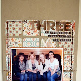
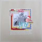
You don't always have to throw lots of embellishments and papers at a page to create a stunning layout, Lou has tried something different from her usual style and created this gorgeous page.
"I loved this white box photo of my friend Jen and her step daughter Abi, and when I saw the colours and patterns of the Classic Range by American Crafts I knew I just had to scrap it! I wanted to keep the page simple and decided to use the white card to tie in with the white background. I used the EK success double crochet lace punch to create rows of frills which added some interest but weren't too overpowering. A few subtle add ons were added here and there along with the title to finish the page."
Don't forget our January challenge, you still have until Monday to enter all the details can be found here.
Don't forget our January challenge, you still have until Monday to enter all the details can be found here.
Subscribe to:
Post Comments (Atom)


No comments:
Post a Comment