Sunday, 29 September 2013

Die-Namics Words for a Big Feastival

Hello Lovelies. It is Ifa with you today.  Hope you are having a relaxing Sunday ( or Monday or Tuesday...)

I spotted a new line in store that I am super excited about. Have you seen the Die-Namics dies? I bagged myself this set.

I also splashed out on a set of buttons by Fancy Pants. The bonus of this set, it is backed by a sheet of cork effect cardstock which came in handy for my layout.


I printed 12 photos on a sheet of A4 that I then cut out and arrange into a suitable arrangement. I glued them all together, to each other.  This will enable me to move them around the layout later without having to keep rearranging them.


I picked a background cardstock to used for this layout.  Shock horror, I know, it is not a white background this month but close.


I added a few Remember that I die cut from an assortment of patterned paper to the edges.


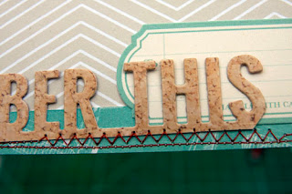
This is followed by the title.  To make this long title, I cut REMEMBER before aligning THIS WEEK to the end to get Remember This.  And you noticed! I have used the cork effect packaging.


I stitched around the edges of the cardstock.  The wonkiness is very intended! I can actually sew in straight line.


I added a few embellishments to the edges. I also took the opportunity to figure out where I want to place my photos. I actually ended up placing the photos higher up on the layout.


I added the photos to the layout.


Next, I ear marked an area for journaling.


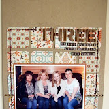
This is the finished layout.  It is about our weekend in the Cotswold at Jamie's Big Feastival.  Did you spot Jamie Oliver in one of the photos ? He is surrounded by a group of girl singers who were performing at the Feastival.

 
I also looked at how else I can use the dies.  Here are a few things I cut out. I even tried cutting out of foam.  The orange, curved, Remember is one.  I like that I can bend it like that.
 
 
That's all from me this month.  See you next ?

Tuesday, 24 September 2013

I've been Glitzing..

Hello

This month I promised myself I would get out and use my alcohol inks as they are just sitting redundant unused and unloved in my craft unit.

Rather than pick papers first and then worry about what I'm going to do afterwards, this month I chose my papers to match the colours of my ink so I knew I had no excuse not to use them.

Sarah has added lots of new products to the shop this month and The Glitz - Wild and free collection caught my eye as the colours were so vibrant but also matched the tones of my inks.

I decided the collection pack would be the best choice for me as I like both sides of a few of the papers and the pack contains two of each design, along with a sheet of alphas and a sheet of fab stickers.

I created my first page using my inks and squirted and drizzled them onto a white background the create this effect.


I also used a lovely Pink Paislee mistable flower that I purchased at the last retreat and added some of my ink to that so it co-ordinated with my background..


After having fun with my inks I had enough time left to make another bright page with this beautiful picture of my children getting along very well for a change :)


I hope you like this collection as much as I do its selling pretty quickly in the shop but the collection pack is still available :)

Have fun Claire xxx


Friday, 20 September 2013

More Cut & Paste

Evening everyone. Just a quick post with a few more pages using My Mind's Eye Cut & Paste

Firstly : yes, he really did go out in public wearing these shoes! 


Moving swiftly on.... 

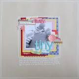
My youngest son has developed a little routine recently when I leave the house. He has to have a kiss, a cuddle, a butterfly kiss and a nose rub! I wanted to record this, but had no photograph of it actually happening. Similarly I had this cute photo, but it was a "just because" photo - it had no particular event associated with it. So I teamed them together with a very fitting title block cut from the Cut & Past "Charm Sweet Treat" paper. I don't want to forget this little quirk of his when he grows out of it so now it is recorded in his scrapbook.

Lastly for today, I scrapped the same "two fingered salute" photo as in my last post again. I have three albums constantly on the go - one for each child. Now and again I can't decide on which album a page should go in. As this photo was so funny and featured all three of them, I decided to use it on three pages - one for each album. So this is version 2 and version 3 will probably be my next project.


Some of you may think I'm crazy. Others may "get" it. Which camp are you in? Let us know and don't forget to leave a link to your own work.


Tuesday, 17 September 2013

Layering Up

Morning everyone. What a cold wet day it is here. I guess summer is well and truly over. Ah well, more indoors time for scrapbooking I guess.

I have been playing with My Mind's Eye's new release "Cut & Paste" Flair Collection.The Decorative Tape particularly caught my eye when I was ordering - not that I have a problem with buying too much Washi Tape at the moment....

This page is all about a tale that a Bowman of Warwick told my sweet, innocent children on our trip there this August. He told them the history behind "The Two Fingered Salute". He then gave the children permission to perform said salute!  It was hilarious. The kids were all looking at their parents with this "really???" expression. The fact that the LO is all about something we were told drew me to the speech marks design on the reverse of  the  Flair 'Snapshots' Paper. The arrow design on one of the washi tapes also lent itself to the fact he was an archer/bowman. 


I noticed that the arrows on the tape are completely see through, which made me wonder what effect I could achieve by layering it up. 
I popped some wood grain washi on the page then covered it with the arrow tape and this is what it looked like:

I much preferred this effect so I added three strips to the page. 

I'm still loving my Project Life cards so I layered up a few from the Jade Collection as a photo mat. 

I have a few more pages using this collection of papers so I'll be back in a few days to share them.

TTFN


Tuesday, 10 September 2013

August winner and new sketch challenge

We had some wonderful entries for our August sketch challenge, and as always, it was really difficult to chose just one.
However, after much oohing and ahhing over all your gorgeous layouts we finally chose this lovely entry from Sonja


we loved the feeling of movement around the page and how well it fitted with the fun photos! A lovely summer layout!

Thank you to everyone who entered, we always love seeing your beautiful work!
Sonja, please email Lianne to collect your £20 shop voucher.

and that brings us nicely onto our September challenge
we would love to see what layouts your create using this months sketch


as usual there is a £20 e-voucher up for grabs for the winning entry, so why not give it a go?

Here's a couple of examples to get those creative juices flowing!

Jen's lovely layout really captures the celebratory feel of her son's special day


Tracie went with an old holiday snap for her summer layout


We're really looking forward to seeing your layouts! Don't forget to add a link to your work so we can all enjoy them!

Saturday, 7 September 2013

You've been framed...

I've been enjoying browsing through the new things in the shop.  I'm a big fan of My Mind's Eye so was really happy when their new ranges arrived.  I was particularly taken with a couple of the blackboard style papers which featured frames and could see a lot of potential in them.  It must be a theme of this season's releases, as a very similar paper is also part of the new Teresa Collins' collection.

These are the papers that I have used:


My first idea was to cut out some of the smaller frames and use them to build a frame around a photograph.  This, along with the arrow sticker and the point of the wooden heart, have the effect of drawing the eye right in to the picture.  I also framed with the page with a doodled swirly pattern. 


For my second page, I again hand cut some frames from a couple of the sheets.  Inspired by framed pictures in a gallery, I arranged the elements as though they were a group of pictures hung on a wall.  The large frame from the MME paper is a perfect fit for a square Instagram photograph.  I also added a Project Life card to this page as the colour scheme and rounded corners fitted in perfectly.


On the following page, I again used the small frames from the MME paper.  This time, I used them to frame the inside of a piece of patterned paper and used the space within the frames as a place to add my journaling, using a white pen.


My last page, and my personal favourite, uses a grid paper as a background and features more of the large frames and another Instagram photo, this time of my daughter at the beach.  I love how the blues and pinks in the papers from the new MME and Teresa Collins ranges enhance the colours in the photo.  This time I added some random frames around the edge of the page and filled them with patterned papers.


For someone that hates handcutting pieces from papers, I certainly did a lot of it this month and loved the effect, even if it did take me ages to do!
by Helen

Wednesday, 4 September 2013

Trial and error

Hello ladies, Tracie here.

I've had a very busy August with my son getting married and the arrival of five kittens which a neighbours cat delivered to us!
So, when I finally got a few free moments to scrap, my mind was still full of weddings and kittens! My mojo was out sunning itself somewhere.

Looking around my craft table in desperation I came across my little travel watercolour set and got to thinking that it had been a long time since I'd used paint in scrapping.
My first four attempts went in the bin! (I refused to give up!!)
After a great deal of trial and error though (and working out that most card and paper isn't designed for watercolour and the amount of water I was adding had to be greatly reduced to avoid ruining the paper!) I finally had something passable for a background.
Mostly scribbles and splotches, granted, but passable all the same!

I then dived into my new and very lovely Teresa Collins stamps! By very carefully dabbing watercolour directly onto the stamp with a sponge I was able to get a something I was reasonably happy with, and adapting the amount of paint I was using meant I could get a lovely soft graduated background.

Sticking with the Teresa Collins memorabilia range I built up my layout around the painted bacground, choosing a photo of me and my other half from the aforementioned wedding!


Here's a close up of the watercolour stamp effect with my random paint scribbling!


For my second layout and deciding to stick with the wedding photos (you may be seeing quite a few more of these in the upcoming months - so I will apologise in advance!!)

I loved how the dappled effect of the sun through the trees was highlighting the happy couple, in this photo taken by the brides mum and wanted to use my watercolours to make it a focus of my layout.

Again, I went with the wonderful Teresa Collins papers but I used white paint dabbed through a stencil to create the suns rays,


 I also had some pearlised paints which I used to further highlight the 'rays'


So that's all from me for now, I had fun playing with watercolour and despite having a few disasters will definitely be using them again,
 I would love to see your watercolour layouts so feel free to leave a link to your work in the comments box so we can all have a look at your creations!
Bye for now!

Tuesday, 3 September 2013

End of Summer...

Hi all, its Louise here. And finally the schools have reopened for the Autumn term... a day I've been counting down to for 4 years! All 3 boys are now in full time education!
And its no more child minding for me... back out into the big wide world of work.
We had a brilliant summer, taking the boys here there and everywhere, and one thing we learnt during the holidays is that Oliver is an adrenaline junkie! I took him to Alton Towers for his first experience on big rides, and he loved it! So much so that we then went to Drayton Manor and back to Alton Towers for more white knuckle adventures!
This month I chose to work with Bella Boulevard - Freestyle Sophisticates in a number of colours, Cosmo Cricket - Summer Love 8" Mini Deck, and Maya Road - Picture Perfect clear stamps. I also used a sheet of Crate Paper - Maggie Holmes - Click.
On our first visit to Alton Towers we went with a couple of friends and managed to ride a couple of the big rides with no queueing, as everybody headed straight for the new attraction first so we headed to the far end of the park first. I don't usually buy the ride photos, but when I saw Oliver's face on this one I just had to have it.


I stamped the names of the 'big' rides we had been on that day directly onto the black card using white ink. I used a mix of fonts from a number of stamp manufacturers... this was a good way to use some alpha stamps I've had for years and rarely use.


I used the Maya Road stamps with white embossing powder to create a photo mat in the corner of my LO. The white was really stark against the black card so I smudged some yellow and green ink on using my finger to make it less in your face.


It was touch and go whether Oliver was going to be tall enough for the white knuckle rides. On our height chart at home he measure 1.41m but there was a chance that the theme park measures would be different. When we went to go on nemesis, they measured him and he was only just tall enough to ride, but they gave him a pink band to wear so that he wouldn't have to be measured on each ride... of course I had to incorporate this onto the LO. I used a pen lid dipped in pink paint to stamp some random circles onto the LO to tie in with the pink band.


When we went to Drayton Manor, Oliver went on the G-Force and Shockwave roller coasters and loved them. At the end of the day just as we were about to leave, I asked him if he wanted to go on the free fall drop Apocalypse. I wasn't very well that day and was unable to ride anything, much to my annoyance, and his dad was on a ride with Thing 2, so I told Oliver to ask the girl in charge of the ride if it was ok for him to ride alone. We meant was it ok for him to go on without an adult, but she must have thought he meant he wanted to go up on his own... so she sent him up ON HIS OWN!!!


I couldn't believe it when he came down and I saw the photo! Every scrap bookers dream... a photo with no strangers on it, so of course we had to have it!


I wanted to echo the drop element of the ride on the LO, so used paper cut into narrow vertical strips, arrows and chevrons.


I also stamped the camera image going the page from dark to light, using black and grey inks. 


A stamped Polaroid frame was perfect to add journaling too, and the picture perfect stamps from the Maya Road set were used on a block cut from the Cosmo Mini Deck.


Not exactly white knuckle, but the following LO was created using the same papers and is the only photo I took of Things 2 & 3 on the day... I really was THAT poorly... lol!
In the background I used a Studio Calico mask with turquoise mist to break up the white area.


I used a couple of embellishments I had left over from ages ago, layered with a stamped images.


On our second visit to Alton Towers (just a me and Thing 1 day), we wanted to do the rides that we didn't do the first time round, either because they were broken down or the queue time was too long.


After Oblivion (I only ever remember how much I hate that ride once I'm strapped into it), and Rip Saw (which sounds like its going to break down with every creak and groan it makes), we got on Rita, the Queen of Speed.


And OMG!!! How fast is she!!! Another great photo of Oliver too... he does like these rides, honest!


 I kept the LO simple, with arrows, chevrons and a monochromatic strip of shades of grey going from light to dark. The wooden floorboard effect paper was just perfect as a base for this LO, with flashes of red used to pick out the colours from the photo.


The alpha thickers were originally pink, but a quick sand and a lick of black acrylic paint made them just perfect for this LO.


I used a Crafter's Workshop template to stipple white paint through, underlining with black pen once the paint had dried. This created a nice area of interest to add a punched circle, a couple of stripes of decorative tape and a stamped camera.
The ride we were most excited about going on was of course The Smiler... the worlds first 14 loop roller coaster!
We were lucky enough to get on it twice that day as the queue times were really short towards the end of the day when everyone heads over to the water rides!
I created a background on white card, first spraying some yellow mist, and splattering some yellow drops too.


 After this I gave the bottom a very light mist with pewter.


 Then used a bubble wrap stamp with yellow and orange ink.


 Before adding some more stamped images. I selected circular designs from stamps from my collection, to keep in with the Smiler images used on the ride.


I scanned the original ride photo to make it smaller, and created a collage of 4 photos of the ride taken at different angles whilst we were in the queue for it.


 I used a circle to draw faux stitches in grey, and used them as a guide to add my journaling.


The title was created using a selection of stamps and I used the 'smile' from the Maya Road set, just adding an 'r' onto the end.
The Smiler logo was cut from the theme park map we had, and layered with a camera image, which had a stamped image over the lens.


I had a lot of fun creating these LOs, and the Freestyle Sophisticates papers are perfect to use as a base for your LO, or to be cut into and stamped onto to. I hope I've inspired you to get scrapping your summer adventures.


Thanks for now


Louise


X