
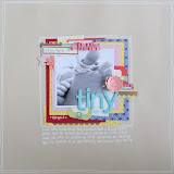
You might be wondering what the blog title is about. No ? Just so we are both on the same page, my blog post is about typography. What's your favourite alpha for scrapbooking ? I adore Jewelry Box Thickers, I have a selection of glittered, diy, foam and chipboard. I hope AC never decides to discontinue this font!
I was inspired to make Type the focus on my layouts after reading an article in the Sunday Times, Style Magazine, "The Writing's on the wall". Apparently the use of Type to decorate your wall is the latest trend in interiors. I love the hand drawn look of the samples shown but I am not confident enough to do the same on my layout. My solution is to use a mixture of alphabet stickers and thickers, mixed with some handwritten...my very own Type Art.

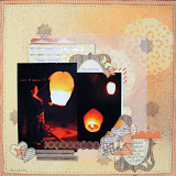
This layout started life without very much promise. As we've been to Paris a number of times, I have done a fair few Paris layouts. What else can I say about Paris ? The photo that I've used in this layout has the Eiffel Tower in the background, trying to steal the limelight so my prose begins "Steel Tower" (though I've since learned that this was a common misconception, the Tower is actually made of iron).
My Type Art says,
steel tower
a golden dome
grand avenues
& long boulevards
an obsession with symmetry
EVERYTHING MEETS & INTERCEPT
glass PYRAMID
more conventional
BRICKS & STONES
too,
NO LESS GRAND !

The letters spelling out Boulevards come from Crate Paper On Trend - Printed Chipboard Thickers. I love the eclectic mix of colours and patterns. I also used a Jenni Bowlin alphabet stamp set.
I also added a few mistable butterfly thickers to the layout. I cut a few different sizes out that I want to use, ink them up with Distress Stain before adding a huge helping of glitter glue. The butterflies then needed a good night of drying before I added them to my layout.


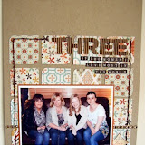
My next layout also features a Type Art though I have ran out of prose for this one. I used a couple of stickers from American Crafts Soho Garden 12x12 Cardstock Stickers to underpin this long title.

This layout is about the day the Duke and Duchess of Cambridge came to town. I arranged to meet a friend there but not expecting a huge crowd, our plan to meet didn't work out. I stood on a disuse fountain to get this photo but alas, I didn't have long telephoto of or step ladder to stand on. The photo quality wasn't great but I decided to use it anyway.

So there you are, Type Art on two of my layouts. I hope you will give this a go and try mixing up your alphabets to make a stylish statement.
That's all from me this month. I look forward to seeing you all next month.
xxx Ifa xxx.


3 comments:
Love the first Lo so much. It also makes me want to run off to Paris right now. Cant believe its been 15 years since i last went.
Great page and a fab way of getting rid of all those odd alphas :)
Really striking Ifa xxx
Post a Comment