Sunday 29 July 2012

Hurrah for the London Games!

Hiya people.  Are you enjoying the sun ? I think I am finally dried out from camping last week. Did you catch the opening ceremony ? What do you think ?

Well, my post has got to feature a bit of the Olympic, doesn't it ? Coupled with that, the post this month is focussing on 2 of my favourite products,

the Heidi Swapp Photo Caption
and Heidi Swapp Sugar Chic Stix.

Since the London Games is officially open, the first layout I am going to share is The Torch Came to Cambridge. The Stixs addded a touch of festivities to the layout.


We got to touch a torch at the local Lloyds Bank ( thank you! ), waited for the torch to arrive ( and got entertained at the same time ) and then waved the torch off the following morning. Next month's post might feature some photos from the Games but that is not a promise.

The next layout is Campfires. 


The "together" photo mat and the stixs are perfect for the photo of the kids around the camp fire, sitting huddled together, chatting ( the dialog stix ). Some kids were busy (the arrow stix) getting ready for the cabaret. I actually dislike camp fires, my journalling went, " I don't mind the early morning bugle but I don't like the campfires".

My layouts feature the stamps from October Afternoon that I've dressed up with patterned paper. I simply stamped the same image on patterned paper, cut out and dress the stamped image on my background cardstock.


Lastly, another layout about the Greece trip where I have used the Epic photo mat to create the title for the layout, Epic Adventure.

I have used the following products for my layouts.


That's all from me this month.  I hope you like the layouts I have shared.  Have a good summer but don't forget your camera.  See you at the end of the holidays.

Thursday 26 July 2012

Hurray for Scrappy Days!

Hi all. At last the summer holidays are here and the sun is shining - wonders never cease! I hope you have all had time to enjoy the sunshine whilst still finding time to play with pretty paper. Helen and I had a scrappy afternoon on Sunday which was heavenly as we had no kids between us. It also means I have plenty of pages to share with you today.

A while ago I had a bit of a stash sulk. You see, the lovely Nat said she was going to use the Basic Grey What's Up range for her blog post - and guess what I wanted to use - yup, the same range. So I had a mini sulk to myself. Nat's post was fab. You can find it here. Reading the post I realised the colours Nat focused on were very different from the colours I planned to use so I still ordered some of the What's Up range but I realised that the PB&J range was just as appealing so I ordered several of those too.

I love red in papers as so many of my photographs of my boys suit reds and blues. These photographs of my eldest at The Lowry Gallery are a perfect example. I used the Toasted paper from PB&J as a background along with White Bread and a Layered Felt Sticker from the What's Up range. The clouds in that packet are so tactile on the page.

The little accent at the top is made from the PB&J Pins and Tags pack. When I ordered these I wasn't really sure what the little pins were for/like. They turned out to be very much like safety pins in the way they open. I threaded a couple of the tiny tags onto the pin then secured it all in place with a little wet glue. I like the way they add a little extra dimension to the page.
 My next page used red as the main colour again. Without realising it I began using the July sketch again. (Have you entered yet by the way? You can do it here.) I used PB&J Creamy on kraft along with some What's Up Friendly Skies and the Hambly  Rain Clouds overlay in white. A couple of accent stickers from the Authentique Celebrate range coordinated nicely with the page also. I love to use bits from my stash that I've been hoarding - don't you? Lastly I added another of the What's Up tags attached with a pin. I pulled out my DIY Thickers for the title, covering them with scraps of Basic Grey paper to make them coordinate perfectly with the page.
Still in a very red mood I moved on to using some more of the PB&J Creamy paper along with Whole Wheat to make the background for this page. I added a strip of the Hambly Rain Clouds overlay then started to look for a few accent stickers. This time I turned to the Simple Stories Summer Fresh range that I had left over from my last blog post. The little wagon, sunshine and phrases fit this page perfectly.
This next page used What's Up Friendly Skies as the background. At this point Helen and I were deep in gossip mode. I had no plan for the page, I decided to just randomly put pieces from the piles of Basic Grey around me onto the page. I loved the Alpha Stickers but thought they may be hard to use, however I think they work perfectly on this page. There are so many little tags in the Pins and Tags pack that I could use 6 more of them on this page and still have left overs! This time the pins don't have anything hung on them, instead they act as little accents in their own right.
My last page of the day features Helen's son Oliver and my Sammy. They are best buddies brought together by our love of scrapbooking and gossiping. Using White Bread as the base I added scraps of the papers I had already used to build up a couple of layers. A couple of Simple Stories Summer Fresh stickers found their way on there but the "O&S" title uses PB&J Alpha Stickers (these can also be seen on Layout 1 above.)
Admittedly none of these layouts are heavily "technique" based. Whilst I love seeing how others use paint and ink etc and I get a little green with envy at their creations, it dosen't work for me. Different strokes for different folks. I could live without ever using another ink pad, but take away my patterned paper and scrapping would grind to a halt for me entirely! What scrapping staple would you be lost without?


Monday 23 July 2012

Summertime: part two...

Earlier in the month, I shared some ideas for some summer scrapbooking pages.  As the school holidays begin, or for me, rapidly approach, I thought that it would be a good time to think about what we would all like to do during the next few weeks off school/work.

* Bucket List - Summer 2012 *

I began by devising a few simple questions to ask the children about what they'd like to do during the next few weeks:

  • Places to go
  • Activities to do
  • Food to eat/make
  • People to visit/play with
  • Things to watch
I typed their answers into MS Word and printed onto some patterned paper.


I also created my own list of places to go and things to do as a reminder when we're stuck for ideas.


These provided three 6x4 inserts for a divided 12x12 page.  The remaining three slots were used for title information and some decoration:


The whole page spread looks like this:


Using the divided page protectors means that once the holidays are over, I can rearrange the inserts and add in details of what we actually did and include some photos too to make a double page spread of pockets to tell the story of our Summer 2012.


Saturday 21 July 2012

Barging Around

Hi,  this month I've been using papers from SEI's new Mayberry range and combined them with some SC mists, stickers, wood veneer shapes and Simple Stories Odds & Ends, along with using up some old chalk inkpads and stamps.  


I love the colour scheme of these papers and I found my old worn out color-stack of chalk inks were perfect for smudging randomly over the card. First though, I sprayed the cardstock with the shine mist and and then rubbed in some pink, yellow and a touch of green with the chalk inks.  I then gave few spritz again over the top, which has given a lovely shimmer to the colours.  I also used a Tim Holtz mask on the pocket, once dry I lighly inked over the top with baby pink.

The butterlies are stamped with Ranger distress inks. 


There will be more with this range soon and more pics of my recent trip on a Barge (no photos of my steering - or rather playing dodgems on the canal!!).  Thanks for looking :) 


Supplies : SEI Mayberry papers, SC Huey Mist (shine), SC Memoir cardstock stickers, SC Wood Veneer die-cut pieces, Simple Stories Odds & Ends, misc chalk inks, black journaling pen and butterfly stamps.

Friday 20 July 2012

Stencils and paint

Hi all

This month I've been playing with my paint again.. I love my white paint!. I also mixed ranges from the same manufacturer with my papers.

I have used the Lovely Heidi Swapp ranges No Limits and Sugar Chic to create my layout.

I started my page with a mask of a brick wall effect. Sara stocks some masks in the shop here.. I used my white acrylic paint on No Limits - Forever patterened paper for my background to get this effect.
The paint was applied thickly with a sponge applicator, it did take a while to dry.


Next I chose a frame from the shop - these Pretty Party - Crate Paper frames are amazing, you get two lovely frames in the packet and a few extra embellishment stickers. I wanted to make my frame more distressed, less shiny and blend it to my page better so this also got a layer of white acrylic paint - applied again with my sponge applicator.


I chose this beautiful floral paper from the Heidi Swapp range - Sugar Chic, Beauty and also the vibrant and distinctive animal print of Drama from the same range to use with my background.
I also used chipboard thickers and Adorn it Alpha stickers, which can be found here.


This is my completed layout, I hope it gives you some inspiration to get your paints out this weekend :)


Tuesday 17 July 2012

Making the Most of Mists

I must admit that, like most people I'm sure, I try to stretch my stash as far as possible, so when I make more expensive purchases I really like to try to get the most bang for my buck as they say! I do love my mists, and barely a page I create escapes a mist or a splatter - but I wanted to know if there was more I could do with the product other than simple spritzing.


So I decided to set about finding out if I could use mists as a painting medium. I began by dabbing some of my selected colours onto a plate (by unscrewing the cap and tapping some ink from the bottom of the spray tube), and grabbing a brush, some water and some cartridge paper.

My first little experiment was in creating colour washes. I found that both wet and dry paper worked equally well, but that a wet brush was (obviously) really important to really stretch the pigments and to blend the different colours nicely. A tiny bit of mist on my brush went really far with the water, and I found I needed to change my water in my bowl often to avoid the colours getting murky. I loved the ways the colours would mix with each other and in places created tone on tone, watermarked effects.

I decided to use a pretty wash I'd created with to make some simple embellishments (for a page I will share with you later in the post), by using a scalloped circle punch to pop out some shapes from my now pastel-coloured paper. You can see below the three mists I used to obtain the wash, and the level of vibrancy I achieved on the punched circles:


This led me to thinking about how the mists could be used just like water colours to colour in images. Grabbing my black American Crafts Slick Writer pen, I quickly scribbled some doodles and coloured them in with the mists. Slick Writers are permanent ink so dry instantly and did not bleed when the water washed over it.
**Disclaimer - I am not by any means an artist!!


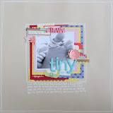
With an idea for a layout forming, I set about drawing and painting a larger cassette tape, which would act as the perfect matt for my title later on:

Next up, I wanted to have a go at colouring some stamped images (as my own drawing skills were proving to be rubbish!). I stamped the images using Stazon ink, again so that they would not bleed when wet.

I actually coloured these cameras the day after my own doodles - the mists I had sprayed on to my palette the day before were easily reactivated with a drop of water from a wet brush.

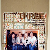
I used all my mist/watercoloured triumphs to create this page - they perfectly complimented the happy, sunny colours of the papers I had chosen, which included pieces from Studio Calico's Hey Day collection, Crate's Little Bo Beep and MME Miss Caroline (all product links can, as always, be found at the end of the post).

 Please click on image for a larger image:

I chose to punch stars form the center of the colour-wash scalloped circles, and add them as a banner tethered together with faux stitching.

Here's my finished cassette tape; once it had dried I added some more details in pen, as well as my title using some cute grey tiny alphas from Pink Paislee:


One thing I totally loved about the "Crush" paper in the Hey Day collection was the decorative area at the bottom that looked like lots of different types of Washi tape layered over each other. I cut this portion away and added it to the bottom of my page, along with some extra pieces of real decorative tape to boost the texture:


This was echoed at the top of my page, with the addition of some torn paper and October Afternoon Little Fliers stickers:

My experimentation didn't stop there though! Ever the intrepid explorer into the world of arts and crafts (!!), I decided to see whether rather than just using the mists to colour in the stamped images, if they could be used to actually stamp with. I must admit, I did have rather mixed results and tried several different techniques, including misting directly onto the stamps (messy and wasteful!) and brushing them on with a brush (murky!), but did find a way to make these interestingly textured stamped embellishments:

The ink coverage was not even, but I loved how the colours blended and gave a soft dappled, shaded effect that you can see more closely here
To achieve this, I added one dot of each desired mist ( a little goes a long way here!) on to a plastic pallette - this doesn't have to be fancy here: I used the discarded plastic packaging from a stamp set. Leave a little space between them - don't be tempted to mix them with a brush - that magic will happen on it's own in a couple of seconds! 

With your chosen stamp attached to an acrylic block, place it down onto the ink,

Then gently move your stamp slightly, and you will see that the colours start to blend themselves as the slippery mist slides around on your plastic palette:
A very slight wiggling action resulted in the colours mixing in this way. 
The wave of purple below started out it's colourful life as a dot of pink and a dot of turquoise!
It's a hit and miss technique - you can't be sure what you will get with each mix of inks and no two stamped impressions will be the same - but it is a whole lot of fun just playing about to see what effects you can acchieve. And when I had finished I had a cute little pile of cut-out stamped images that I can use on pages and cards, which is always a bonus!
Some things I did find useful were to stamp once onto an ink-free part of the plastic pallette before going onto the paper to remove some excess ink, and that sometimes stamping a second time on the paper before reinking gave a nice, more subtle effect. I also found that blocky, solid-effect stamps leant themselves to this technique better than detailed ones - but with a bit of experimentation who knows what you may be able to acchieve?!
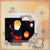
I used some of my mist-stamped images to make the card below, along with scraps from my page earlier:
Go on, have a go at using your mists in a new way - you may be surprised!!
My supplies included: