Friday, 29 June 2012

Love Your Punches

A while back, Nat posted, It's hip to be square. I am going to confess, I didn't give it a go but having recently rediscovered my own square punch  ( rediscovered, as it has been hiding! ), I am going to show you what I did.

I have one of those 2 sizes square punch made by Creative Memories that an agent persuaded me I can't live without. It turns out, I didn't use it much.  I was fortunate she didn't persuade me to go the way of CM too! All those expensive albums...

Today I am using papers from Crate Paper Storyteller collection, DIY Thickers and some Studio Calico Wood Veneer shapes.

What did I do first ? You guessed it, punch a lot of squares out of the patterned papers. My squares are 1 1/2".

I wanted to display the papers in a grid but decided to go diagonally so I marked a few grid lines diagonally.


I decided to use twine as grid lines.  To make it more interesting, I tied some bows along the twine and only to mark out a selection of lines rather than every single grid lines.


I apply a thin line of glue ( I used diamond glaze ) along the marked line and glue the twine.


In a clear area of the layout, I added some stickers and embellishments which forms my title area.


Next I added some photos and some jewels.


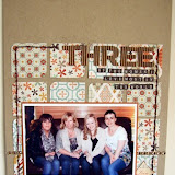
And there you go, a layout about my son's trip to Greece earlier this year with school.  I haven't got a lot of story to tell so the journalling is factual and to the point.


As I was playing around with the squares, I noticed that they look like presents all stacked up. This resulted in the next layout. I was impressed with all the wands at the Harry Potter Studio tour, all perfectly boxed, labelled and stacked up to the rafters...All Stacked Up.


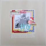
Lastly, I have a layout where the squares are in a conventional grid arrangement. I took the photo on the first day of school but as the new school year is pretty much like another,  I decided to make Yr 8 as an end of school year reflection layout about my son. We still have another week to go so I will reserve my journalling for later.

So, what do you think ?  Should you let those square punches out to play ?


Monday, 25 June 2012

Simple Stories Summer Fresh

Hi all Jen G here. It seems a little depressing that the gorgeous range I worked with this month of June is called “Summer Fresh” due to the distinct lack of summer here in the UK! The papers are so summery they really make you pine for summer – so come on weatherman do your best!
When I saw the images of these papers online I immediately knew what I wanted to do with them. There are several sheets of patterned paper that are made up of “Flash Cards” or 6x4 “Journaling Cards” which are perfect for those of you who are doing Project Life. They are also a great source of inspiration for those of us who are not joining in with Project Life. I saw each one of those Flash cards and Journaling cards as mini layouts begging to be recreated in a larger size – much like following a sketch. The top right Journaling Card on this sheet was begging to be made into a layout – it is very similar to the amazing class Jen N produced for the last retreat.
My eyes settled on the card with the red background – middle left. So, using the reverse of the “Summer Quilt” sheet:

I made this:
I then added some of the “Fundamental” and “Expressions” stickers along with my photo for a simple page about my 3 year old and his beloved new balance bike. 
Moving on to look at the flash cards I was desperate to recreate the little window and window box (middle right):
But none of my photos really lent themselves to this page so I have filed that under “to do” in my busy brain! Instead I chose the top right card as I knew it would work for a photo I did have in my “to scrap” pile. Using a strip of the “Easy Breezy” paper and some card scraps I recreated the flash card in A4 size and again added some of the “Expressions” and “Fundamental” stickers along with my photo and journaling.
Again this is a simple page but I’m all for simplicity as a busy mum with little “spare” time!
The third page I created was from the flash cards again. This time I chose the image second from the left on the bottom row:
This card had a pinwheel on it so I set to work on recreating one. I have made them dozens of times with children. If you haven’t there are really simple instructions here. As I wanted the pinwheel to have 4 different coloured blades I started by piecing together 4 triangles of card like this:
Once positioned, I stuck them down on to a small 1”x1” scrap of card to hold them together in the centre. I then folded one point of each triangle into the centre and fastened them with a brad. Once secure I attached it to my page with plenty of Tombo glue and used scraps of card again to make the stick and flags. I used the reverse side of the Denim patterned paper as it has a clean, simple grid on it. Once again I used the “Expressions” stickers and the gorgeous alphabet stickers that come on that same sheet. My son loves this page of him pulling those ridiculous faces!
After 3 layouts using this gorgeous range, there is still more than enough left over to create several more pages. I am on a mission to take some photos for that window frame page... watch this space!

Saturday, 23 June 2012

* * Journalling with October Afternoon 9 to 5 * *

Hello all, its Laura here and I am here to show you a few ways to include and increase your journalling on your layouts, using the gorgeous October Afternoon 9 to 5 collection.
The whole collection can be found over at Sarah's Cards HERE
I always use American Crafts Precision Pens in 0.3 size for all my journalling.  I have found it to be the perfect pen for me.  It writes beautifully, works on photos and feels really comfortable for long periods of journalling.  I tend to stick just with black for my journalling but Sarah's Cards have them available in a whole host of colours HERE

I love to journal on my layouts and I always handwrite but I haven't always written as much as I do now.  Having recently looked back through several albums of old layouts I realised how little journalling was on some of the layouts, how few details I had included and how opportunities to document stories were missed.  I urge you to write, to journal and to tell those stories that accompany your photos, after all, that is the reason we scrapbook right?

But I know it can be hard, it can be daunting and lots of people talk about feeling uncomfortable handwriting on their layouts.  In this blog post I hope to give you a couple of idea on how to build up your journalling on your layouts so that slowly you can start to incoperate more writing and tell more of your stories.

There are so truly fantastic products to help you journal on your layouts and October Afternoon really excel in this department.  For years they have made the gorgeous cardstock label stickers (pictured above) that are available to co-ordinate all of their collection, but the latest CHA releases have included a few new products that offer new opportunities to incoperate journalling into your layouts.  First up at "Tidbits", small double sided diecuts with room for tiny amounts of journalling.


This layout has minimal journalling on it... but it does have some journalling.  There is some of my handwriting on there, just enough to get used to using a pen and handwriting some small details onto the page.  If you are nervous about somehow "messing up" or "getting it wrong" then using label stickers ot "tidbits" is the perfect way to start to build up your confidence, as you can journal on the piece before you add it to your layout and if you make an error, you can simply replace that piece without worrying that you have somehow ruined your layout.

Start off small... just add a date, a name, a place... some small detail that is part of the story but that might get forgotten as time goes by.  As you can see my handwriting is not the neatest, it's messy but it's mine, so I embrace that reality, I don't try to write extra neatly, I just get the details down and this helps me to relax as I am not worrying about trying to get my writing to look extra special.  I just write in my normal regular everyday style, it's messy but I'm ok with that.


Include tiny bits of writing alongside letter stickers, you don't have to write everything but try to write something!


Another new product by October Afternoon are the "doo-dads" again these are double sided die cut pieces that are the perfect colour match for each collection.  These tend to be larger pieces and are perfect for a larger collection of journalling.


Ensure that you plan your layout well so that you have enough room to incoperate one or more of these die cuts.  In this layout I have layered up a couple of the larger pieces alongside some of the label stickers and tidbits that I used in the first layout.  This stack of embellishments provide the perfect space for a more extending piece of journalling but without seeming too overwhelming.


Again I have also incoperated number stickers here to add details to my journalling.  Often these pieces have lines or grids incoperated into the design which can help to keep your journalling straight and even.  As you can see I have started writing at the top and just continued all the way down writing on several of the embellishment pieces.


 Finally if you want to include a really long story then look out for patterned papers that are plainer or have lines or grids in their design.  October Afternoon often have "B sides" that are perfect for journalling.  I always ensure that I look at both sides of a piece of patterened paper as all too often one side will be a bold pattern that might not be to my liking.  In the 9 to 5 collection there is a wonderful piece of full ledger style paper.  I used the whole piece for the background to this layout so that I could incoperate a really long story down the whole of the layout.


Don't feel nervous about journalling, just start writing and get your stories down.  There are plently of options for everyone if you want to just include a few key facts or document a long story on yourr layouts!

I hope this blog post has given you some ideas on how to use October Afternoon products for your journalling!

Thursday, 21 June 2012

Life is a Journey

Hi all.  I think Claire and me must've been on the same wavelength this month.  I've been thinking about doing a few layouts themed around the journey of my life over recent times, which have been the most challenging for a long time and I thought the papers and embellishments from the Teresa Collins World Traveller range would work well - now in the sale!  (Just love the trims!)

I've been looking up and reading blogs/websites etc which regularly give positive messages a lot of which have really rung true with me.  My first layout is made with one of these images and quotes.

My First layout - Life is a Journey, I decided to blow the dust of my maya road mists and instead of spraying, I unscrewed the lid and randomly dropped the ink over the blank page.   The flowers are made up of papers from the 6x6 World Traveller pad and I used some gloss lustre mod podge over the top.  The finished page is lightly misted over the top with maya road irridiscent.


My Second layout - On my Way (to getting my life back).  This is a short trip I took to Munich with my sister a few months ago.  Again, I dropped ink from the mists bottle and spritzed a tiny bit.  I've used glossy accents over the top of the photo corner and the two labels "Vacation" and "Journey".  Finally, I spritzed irridiscent over the top again.


Thanks for looking and I'll pop back with a few more bits and pieces from the range soon.


Monday, 18 June 2012

Documenting a journey

Hi all

For some time now I've wanted to make a journal about a phase in my life that has been difficult.


Sarah has in the shop some awesome (and I really can't put how awesome into words) Brag Books from Fancy Pants. Now i've looked at these books a few times and put them back down again thinking that's going to be a lot of hard work - but then I got to thinking, well my journey has been long and it's not over yet so I have a lot of things to write about.
So I eventually decided to take the plunge and invest..now these books may look a little pricey at £14.99 but let me tell you, you will not be disappointed. The books are crammed full of pages for journalling, scrapbooking and even photograph pockets.

I then had to make a descision which range I was going to decorate this little beauty with.. Easy choice Pink Paislee She Art collection is perfect and Sarah has the range in the shop :). I chose a few extra embellishments and away I went.

Here is my full stash hoard that I intend to use on my book. (all available in the shop)


Now I realise there are a lot of embellishments there but this book is an ongoing project so i'm going to need them ;-)

So now it's time for me to start playing with my goodies and my first step was to decorate the front cover of my journal (always the best bit). I got out some paints, stencils, alcohol inks, glossy accents, pearl drops, and stickles and away I went - without a clue what I was doing as usual.

Below are the step by step images of creating my front cover..


Step one..

I used white paint and stencils to create a background, I mixed a little pink paint in to add a little colour at the end. I added a few splashes of Alcohol ink Eggplant.


I used a dry black inkpad and stamped a journal frame over the area with the Alcohol ink. I then added another stamp using the dry inkpad just below.
Using a few of the rub ons out of the pack, I added the red and yellow hearts.

At this stage I allowed my work to dry then covered it with Mod Podge, once dry I then went on to add extra embellishments.


So this is my completed front cover. I added the cutout lady and added a little Maya Road ribbon rose to her hair. I attached the sun cutout to the top left. I cut out the little blue scallop border from the backing card that my rubons came in. My title was added and then a lot more Mod podge.
To finish my book I used scraps of ribbon from my collection.

I hope You like my project, tomorrow I will share a little of the inside pages that I have made so far.