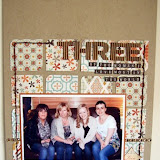
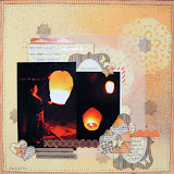
Layering - by building up your page with layers of paper you instantly add depth to your page. You can also layer your embellishments, Nat has used a butterfly rub on and then added a punched butterfly and a Aunty Sarahs Dew Drops on top.
Inking - creating a definite edge to your papers will make them stand out against eachother, especially important when you are using such bright, patterned papers.
Addding Height - Nat has used foam pads to fix some of her chipboard elements onto the page creating different levels.
Distressing - by distressing or ripping the edges of your paper it adds texture to your page increasing the look of depth to your layout.
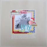
"I created this page to record the fact that my niece’s current phrase is telling everyone that they are her best friend. It’s so touching, until you hear her telling someone else exactly the same thing that is!
I decided to give the chipboard buttons a layer of glossy accents to give them a lovely shine and dimension, and used their label-shaped packaging as a template for the shape I cut from the bird printed paper.I also added a layer of the gloss over the Lime Rickey stickers that I used to create my title"


Don't forget out February Sketch challange, you have until March 12th to either post a link to your entry or email it across to sarah@sarahscardsltd.com. You could be in with a chance to win a £10 e-voucher and join the design team in creating an example layout for the April challenge.


3 comments:
oh this layout is lovely! nice work :)
Oh this is soooooo nice Nat! love how you've used those papers!
how cute nat, love those papers
Post a Comment