Sunday, 29 November 2009

Prehistoric Grub?

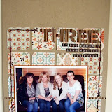
Nat has put together this lovely bright layout using a mixture of papers and embellishments.

This photo was taken over two years ago at my Freshers week at University. I've wanted to scrap it ever since, but the harsh flourescent lighting and bright coloured tiling of the setting (a rather less than classy kebab shop!), made it difficult to find the perfect papers to work with. I love combining papers from different ranges and manufacturers on one page, and this seemed to be the best solution for working with this tricky photograph.
Papers: American Crafts, Junior - Defense (varnished finish)
MME,Bloom & Grow - Polka Dot Punch,
Basic Grey June Bug - Daydreamtitle:
AC Thickers, Salutations
Chipboard Embellies - Sassafrass
Good Times rub on - Pink Paislee

Wednesday, 25 November 2009

Going To The Chapel

With the weather being so miserable it is lovely to scrap photos from more sunny times, Sarah has scrapped a photo of her sisters wedding and created a stunning layout.


This is the only picture I managed to snap of my sister & dad walking towards the chapel on her wedding day. I'm not sure who was more nervous!

I used Scrap Within Reach - Afternoon Tea range. These papers are just perfect for wedding photos - all pink & pretty with a bit of distressing so that they're not too too pink. If you love Basic Grey you will love these papers. I also cut a piece of Basic Grey Lemonade Doilies to create an embellishment, layering onto that a stamped flourish frame (stamped onto acetate), a couple of Aunty Sarah's Bloomers and a Prima Raja Centre in white. I also cut a leaf shape to tuck under this. The title was created using American Crafts Thickers (my favourite alphas!) White Nutmeg and the brand new Salutations in Honeydew. A touch of opulence was added by layering on a Prima Pearl Swirl to the left hand side of the photo

Saturday, 21 November 2009

Team Scrapping.

When it was sugggested that 12 scrappers could put a single layout together by each adding one item of stash I think we all thought the result might be quite...err....interesting!!
We started by all pulling a number out of a hat so that we couldn't plan what we were going to add and then passed the page around the room in number order. The finished result surprised us all, I know it has been mentioned on quite a few of the design team blogs so we thought you might like to see the finished layout.

Don't forget our sketch challange, you have got until Monday 7th December to either link your entry onto the blog or email it across to sarah@sarahscardsltd.com. The winner will be picked by a member of the design team and recieve a £10 e-voucher and be invited to join the design team for the January sketch challenge and have their layout posted on the blog.

Monday, 16 November 2009

Sketch Challenge with prizes!!

This months sketch has been designed by Lianne and we have some exciting news! Link you layout on the blog or email an image of your page to sarah@sarahscardsltd.com by the 7th December 09 and a member of the design team will pick a winner. The winner will not only recieve a £10 e-voucher that can be spent in the shop but will also be given the opportunity to create an example page for Januarys Sketch challenge and have their layout posted on the blog along with the design teams creations.
We really can't wait to see your interpretations of the sketch.
Here is the sketch and a few examples that the team have put together, Lianne and Sarah have both used the November kit so you also get a lovely peek of what will be winging its way to you later this week!

Sarah
Lianne Jen
Rachael Tracy
Rachel

Lou

Vanessa
Nat


Have fun!!

Friday, 13 November 2009

Sweet Marmalade.

Rachel has been creating with the new Sassafras Sweet Marmalade papers


Who doesnt like a bit of hand cutting? These patterned papers are very busy but with such bold patterns they are perfect for handcutting out the designs. This is one of my graduation photos, I often wonder if it was all worth it, Uni that is, not to get too deep but I thought I would document my worries and that despite everything in my mind it will always have been worth it as I met my OH at UNI.


To be fair my OH is a lot more wiling than most to have his photograph taken. But one summers day (in fact the very last day of summer) I pushed him a bit too far he was all snapped out! This is a bright busy page but i think it works. Using multiple photos and embellsiments means that the page doesn't feel too busy.


Tuesday, 10 November 2009

Up Up and Away!

Vanessa has made this gorgeous card using more of the American Crafts Junior range, she has used the rocket pictures on the papers for inspiration and added buttons and ribbon to make the rocket really pop off the paper.

Wednesday, 4 November 2009

American Crafts Junior

The newest memeber of our design team, Vanessa, has been working with the gorgeous American Crafts Junior range. She has produced this fantastic page which just goes to show that you don't need to use heaps of stash to create a stunning page, how about scraplifting this layout using up some of your scraps.

Eat your Veg!
My little boy is always asking for raw carrots, he likes them washed, but not peeled – “just like a rabbit eats them mammy!”, I thought this was so funny, as well as really sweet and a lovely little memory to document in a layout.Firstly, I converted the photograph to black and white to contrast with the bold, funky and bright papers from the American Crafts Junior range and I then I coloured the carrot back in to add to that contrasting effect.I used normal green embroidery thread to stitch up the side and I sponged the centre of the main cardstock with a white chalk inkpad. The little black stars above the journaling sticker are hand drawn.