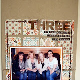
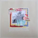
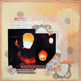
My first page is perhaps more traditional, using the brighter summery sides of the papers. I tore the main sheet of paper on two sides and tried to bury the photo in the page by creating a frame and covering the edges with lots of embellisments, a lot of which I have created by handcutting them out of the paper. Its not always practical you use the same thicker pack on one layout so I try to vary them with other alphabets.


I had been thinking about creating this next page for some time and when I saw the reverse of the 3 Bugs papers I knew they would be perfect. Over the past few months I have started to read the Twilight Books and I am hooked, I thought I would do this page to remind me in the future just how 'into them' I was. As with the previous page I started with a bazzill base, and used the fabulous dotty black paper as a background. Again I used a mixed of thickers and different alphas for the title which is even more effective as the title is much longer. To create the journalling block I used the back of a piece of card that some stickers came on and added little bits of my own stash. This is a completely different look but with the same papers and basically the same design.


No comments:
Post a Comment