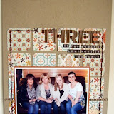
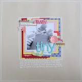
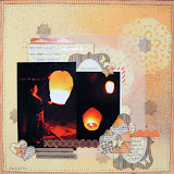
Nat created another beautiful layout for us using the Crate Prudence range. Here she explains how she did it:
I used the “Charity” shaped paper as a base, and added a large piece of “Temperance” centrally on top of this. I then took a strip of “Fortitude” and layered it across my page with my photo on top – however I was careful to stick these in a way that would create a pocket for my journaling card that would hold it snugly in place.
To create the journaling card, I took a small piece of “Virtue”, tore the bottom for a note pad look and inked all the edges. I added the scalloped edge from the “Glitter Borders” pack to create a decorative top that’s easy to hold to pull the journaling out, and decorated it with a couple of rhinestones.
I created my title using some tiny alphas and some of the “alpha twist” letter stickers. To continue the reflection theme, I gave the stickers a glossy appearance by going over them a few times with a clear sakura glaze pen.
As it’s a masculine layout I went easier on the embellishments than I normally would, simply adding a Glitter Border and some rhinestones to mimic the sparkle of water.


1 comment:
this is just gorgeous.
Post a Comment