Hello all. Happy October... can you believe how warm it is at the moment? Hope you all have something wonderful planned for the weekend... but if you don't hopefully I can provide you with a little inspiration to get your creative juices flowing.
This month I chose to work with the stunning
Bella! Paper Boy range from Ruby Rock-It. As soon as I saw the fab designs, and the glitter papers, I knew they'd be perfect for scrapping pics of the terrible trio... lol!
Don't let the fact that these are 'boy' papers put you off buying them, with the exception of a couple of patterns, the range is really versatile and could easily be used with so many photo themes.
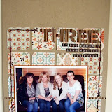
My first LO is of Thing 3 doing what he does best... being incredibly cute, cheeky and funny! We had a fun afternoon in the garden and I got this fab photo of him hiding from the camera. The
Sphere paper is really quite busy as a whole sheet, but the octagonal design makes it really easy to cut into strips, which I did to edge the page. I layered strips of different patterned papers with a couple of the
Fancy Pants, Off to School chalk stickers, and a strip of
Pink Paislee mistables scalloped trim.
When it came to adding a title I had a bit of a 'wardrobe' moment! A cupboard full of clothes and absolutely nothing to wear.... or in this case, a box full of Thickers and nothing that was just right for the LO. So I decided to 'pimp' some pink
pearl chipboard Thickers I was not likely to use any time soon.
Here's a little step by step as to how I changed the alphas to suit my LO.
Firstly I used a fine emery board to sand the pearly finish, leaving a nice matt base.
I then painted the alphas with white acrylic paint... they needed a couple of coats to make sure the pink was covered.
I used black ink to stamp onto the alphas once they were completely dry. I used an alphabet border stamp that I bought from Sarah's cards ages ago and had forgotten about.
I then added a thick layer of glossy accents putting the alphas to the side until they were dry. I left them over night to be absolutely sure I wouldn't be tempted to touch them to see if they were dry yet... you know you've done this too!!!
Once they were dry the alphas were ready to add to the LO. I also used a mix of yellow
teeny alpha stickers and white stickers from Making Memories.
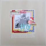
I just love how these turned out, and they were so easy to do. So I had another go for my next LO...
This time I had a 'happy accident' with my title. I used a grid pattern roller stamp and turquoise ink (an ink pad I stole borrowed from the boy's craft cupboard). I gave them a coat of white before stamping, but when I added the glossy accents, the ink bled. Once they were dry they looked like turquoise glass with a feint grid pattern... and actually looked pretty cool. As the grid pattern was now very subtle I used some black ink to roll the same design lightly over the top. I think it works well.

I created a wrinkled/textured background for this LO, by firstly stamping with bubble wrap and acrylic paint onto white card. My original intention was to have that as my background, but when it was done it was just too 'in your face'. I covered the whole LO with a coat of diluted pva glue and added 2 sheets of white tissue paper, not worrying about the wrinkles. To added a bit more texture I also added a sprinkling of
white embossing powder and heated until it melted. I used the same grid roller I used on the alphas on the background, gave the corner a spray of green
mist and machine stitched around the edge before adding any patterned paper.
To complete this LO I used some
Jenni Bowlin Star stickers, and some
Air Mail baker's twine, and dipped a pen lid in paint to stamp random circles onto the page.
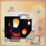
My last LO has a very different feel to the previous 2, even though it uses paper from the same range. I did lots of very random machine stitching over the base of this LO to represent the box designs Etch A Sketch are well know for. By using a poloroid stamp onto red card, and punching some circles from white, I created mini etch a sketch frames for my two photos. I used the
Teresa Collins Stampmaker machine to make my own guinea pig stamp.... I know I've said it before, but if you are in two minds about getting this tool, I'd say do it... it really is a so easy to use and perfect to make the stamp you absolutely do need to complete a LO but might not be able to find to buy. If you are interested in one of these, and they are out of stock, just contact Sarah or Lianne and I'm sure they'll be able to order one for you.
I used the same pink pearl thickers, this time painting them red. I stamped over the red with black and used a grid stamp from this
Glitz distressing set. Once the ink was dry I used a white gel pen to highlight some areas and fill some of the areas in.
With very little effort I have created 3 customised titles for my LOs. This technique would also be perfect to use when you don't have enough letters from one set to make your LO. You could easily mix different colours and different fonts, but create a unified title by 'pimping' them all in the same way.
Why don't you have a go at customising some Thickers... please share with us anything that you create that has been inspired by what you see on the blog, and we'll pop by and leave you a comment.