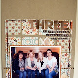
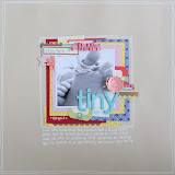
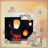
Hi, Vanessa here with my post for this month. I've used the Lucky Charm papers from American Crafts to make a few little projects.
Firstly, I've used the 4 x 8 page protectors to start an album for last years holiday. This is a bit different from me, A4 is my usual scrapping size, but I need a bit of a change without going back to 12 x 12. I've incorporated a bit of embossing and found a way to use some washi tape (go me!) which I just get a total mind-block with.
My second little project is CD envelopes. But, with a difference. I always have receipts lying around everywhere making a mess of the place and I need to keep them until I've done my "housekeeping" budget calculations. I also put vouchers in different places with the intention of using them when I next go to the supermarket etc. But, have a terrible habit of forgetting where they are and miss the deadline date.
I now have handy little envelopes that I can keep them in once place, nice and tidy! Now I just need to train my brain in remembering that I've got them!
Finally, a scrapbook page with some paper rippling (have you still got your rippler from the Sarah's Cards retreat a few years ago?) and a couple of cards.
Thanks for looking.
Vanessa xx
Showing posts with label Flowers. Show all posts
Monday, 22 April 2013
Lucky Charm
Labels:
Adornit,
American Crafts,
Chevrons,
decorative tape,
Embossing,
Flowers,
Glossy Accents,
Lucky Charm,
MME,
pebbles,
Stamping,
Thickers,
Tile Thickers,
Vanessa,
washi tape
Thursday, 21 June 2012
Life is a Journey
Hi all. I think Claire and me must've been on the same wavelength this month. I've been thinking about doing a few layouts themed around the journey of my life over recent times, which have been the most challenging for a long time and I thought the papers and embellishments from the Teresa Collins World Traveller range would work well - now in the sale! (Just love the trims!)
I've been looking up and reading blogs/websites etc which regularly give positive messages a lot of which have really rung true with me. My first layout is made with one of these images and quotes.
My First layout - Life is a Journey, I decided to blow the dust of my maya road mists and instead of spraying, I unscrewed the lid and randomly dropped the ink over the blank page. The flowers are made up of papers from the 6x6 World Traveller pad and I used some gloss lustre mod podge over the top. The finished page is lightly misted over the top with maya road irridiscent.
My Second layout - On my Way (to getting my life back). This is a short trip I took to Munich with my sister a few months ago. Again, I dropped ink from the mists bottle and spritzed a tiny bit. I've used glossy accents over the top of the photo corner and the two labels "Vacation" and "Journey". Finally, I spritzed irridiscent over the top again.
Thanks for looking and I'll pop back with a few more bits and pieces from the range soon.
I've been looking up and reading blogs/websites etc which regularly give positive messages a lot of which have really rung true with me. My first layout is made with one of these images and quotes.
My First layout - Life is a Journey, I decided to blow the dust of my maya road mists and instead of spraying, I unscrewed the lid and randomly dropped the ink over the blank page. The flowers are made up of papers from the 6x6 World Traveller pad and I used some gloss lustre mod podge over the top. The finished page is lightly misted over the top with maya road irridiscent.
My Second layout - On my Way (to getting my life back). This is a short trip I took to Munich with my sister a few months ago. Again, I dropped ink from the mists bottle and spritzed a tiny bit. I've used glossy accents over the top of the photo corner and the two labels "Vacation" and "Journey". Finally, I spritzed irridiscent over the top again.
Thanks for looking and I'll pop back with a few more bits and pieces from the range soon.
Sunday, 27 November 2011
In Vogue with Pink Paislee's - Vintage Vogue
Hi all :) Gems here.
This month I got to play with the gorgeous Pink Paislee - Vintage Vogue. The girly tones are perfect for scrapping photos of my daughter and I got to work straight away on the first of my layouts....
[A love of Words]
[Please Click to View Larger]
Ashton is an avid reader and can often be found with her nose inside a book. One afternoon I popped into the kitchen and found her reading the Secret Garden and decided to snap some photos to record her love of reading.
Purple is a colour I usually avoid in scrapbooking as I find it difficult to work with, but I challenged myself to create a layout using purple as one of the main colours, and I absolutely loved the challenge I set myself, and I am happy with the results.
My second layout I created using the range was....
[In her Element]
[Please Click to View Larger]
Ashton was a flowergirl for my Brother-in-law's wedding back in July and I thought these pretty, feminine papers were perfect for photos taken on the day.
I will be back tomorrow with a couple of cards I created using the same range and a gorgeous, extremely versatile product I adored using!
Below are the products I used.......(Simply click on the picture to take you to the product in the shop)
I will be back tomorrow with a couple of cards I created using the same range and a gorgeous, extremely versatile product I adored using!
Below are the products I used.......(Simply click on the picture to take you to the product in the shop)
Labels:
Adornit,
Border punches,
Flowers,
Gems,
layout,
mists,
Pink Paislee,
Thickers
Wednesday, 16 November 2011
Mixing it some more!
Welcome to day two of my little jaunt into mixing papers from different manufacturers. Today I'm back with a girly layout....although given the photo I used, that is debatable I suppose ;)
Here's my completed page:
After pulling out about 12 sheets of paper form various manufacturers, I settled on this little lot:
1. Spiffy Mustache - I misted it with a spritz of Maya's Pomegranate Pink.
2. "Special" from Authentique's Uncommon range-
The muted pink tone had a perfect vintagey quality to it, and the cream spots with typed print inside them worked well with the background of the Mustache paper.
3. "Handpicked " from Crate's Farmhouse line-
This paper had a range of pink colours in its design, which helped balance the darkest tones on my page through to the lightest.
4. "Farmers Market " also from Crate's Farmhouse line-
The strong red pattern is a good mate for the bold black colours in the Mustache paper, helping to balance my design by adding additional deep colour.
5. "Rose bud" from Studio Calico's Autumn Press range -
This pretty paper's pale background and red flora balances out the range of pinks and red already chosen, as well as adding a pretty, feminine stamp to contrast the mustache images. The shape of the rose buds themselves echo the mustache shapes too - both are roughly triangular in design.
As well as colour, one other factor led me to choose these papers as my final line up from the also look at pattern contenders I pulled out from my stash. If you study each of the papers, they are all made of a diagonal pattern. This is obvious on the two Crate designs, but if you look at the arrangement of the mustaches, rose buds and printed circles on the other papers, you will notice each row of the pattern it offset from the one before, creating a subtle diagonal effect. So in addition to matching mixed papers by colour as we saw yesterday, I have also teamed them up by pattern.
Of course, it is totally fine marry up papers that aren't simply all pink or all red (it just so happens that that's how my particular pages here turned out). The important thing to look for in such a case would be a small element of recurring colour (maybe using embellishment to tie the colour scheme together or one multicoloured patterned paper that can tie several other to it), a similar pattern (e.g. polka dotted paper paired with other spotted/circular designs) or matching by hue (e.g. all soft warm colours, all vintagey hues, all bright colours).
Finally, here's how I created some of the details on my page:
I made the little scalloped border of mustaches by punching out several from the patterned paper, and then sticking them to a spare strip of card (I used the little name strip from the bottom of a sheet of 12x12 - not only was it to hand and the perfect size, but hey, reduce, reuse, recycle people!)
I inked the edges that would be visible to give it a uniform look, and tucked it under one of the papers on my layout to just the bottom half of the circles show, thus giving the scalloped effect.
I wanted to use a mix-mash of overtly feminine embellishments mixed with very bold, black ones, and decided to create the ultimate combination of these two ideas by making a "pretty mustache". I did so by stamping and heat embossing a lacy design in white powder on to some black card as seen below,
before hand cutting a mustache shape from my custom cardstock:
Check out the huge collection of fab American crafts Zing embossing powders here.
I created my handmade flower by punching circles of various sizes from some of my papers already used, and snipping between the scallops to make petals:
I layered them together and away I went:
I also used a variety of stickers, including Authentique Uncommon Diction Mini Word Stickers to create amusing journalling, a gorgeous Jenni Bowlin Bow embellishment and a film strip sticker from the Crate Portrait Border Stickers.
I hope that if it's something you are usually wary of, you'll give mixing up your papers a try! It really is enjoyable and satisfying :)
Here's my completed page:
Please click on any pictures to view a larger, detailed image
The Spiffy Mustache paper from the gorgeous new Times & Seasons line from Echo Park was the instant inspiration for my page - as soon as I saw it I remembered this pic of Lou and I getting a bit hairy at the March retreat, and had to scrap it! That being my starting point, I wanted to create a page with contrasting male/female feel to reflect the ladies in 'taches (!) theme, so in addition to the vintagey bold black print I went riffling through my pile of recently purchased stash with one thing on my mind - pink!!After pulling out about 12 sheets of paper form various manufacturers, I settled on this little lot:
1. Spiffy Mustache - I misted it with a spritz of Maya's Pomegranate Pink.
2. "Special" from Authentique's Uncommon range-
The muted pink tone had a perfect vintagey quality to it, and the cream spots with typed print inside them worked well with the background of the Mustache paper.
3. "Handpicked " from Crate's Farmhouse line-
This paper had a range of pink colours in its design, which helped balance the darkest tones on my page through to the lightest.
4. "Farmers Market " also from Crate's Farmhouse line-
The strong red pattern is a good mate for the bold black colours in the Mustache paper, helping to balance my design by adding additional deep colour.
5. "Rose bud" from Studio Calico's Autumn Press range -
This pretty paper's pale background and red flora balances out the range of pinks and red already chosen, as well as adding a pretty, feminine stamp to contrast the mustache images. The shape of the rose buds themselves echo the mustache shapes too - both are roughly triangular in design.
As well as colour, one other factor led me to choose these papers as my final line up from the also look at pattern contenders I pulled out from my stash. If you study each of the papers, they are all made of a diagonal pattern. This is obvious on the two Crate designs, but if you look at the arrangement of the mustaches, rose buds and printed circles on the other papers, you will notice each row of the pattern it offset from the one before, creating a subtle diagonal effect. So in addition to matching mixed papers by colour as we saw yesterday, I have also teamed them up by pattern.
Of course, it is totally fine marry up papers that aren't simply all pink or all red (it just so happens that that's how my particular pages here turned out). The important thing to look for in such a case would be a small element of recurring colour (maybe using embellishment to tie the colour scheme together or one multicoloured patterned paper that can tie several other to it), a similar pattern (e.g. polka dotted paper paired with other spotted/circular designs) or matching by hue (e.g. all soft warm colours, all vintagey hues, all bright colours).
Finally, here's how I created some of the details on my page:
I made the little scalloped border of mustaches by punching out several from the patterned paper, and then sticking them to a spare strip of card (I used the little name strip from the bottom of a sheet of 12x12 - not only was it to hand and the perfect size, but hey, reduce, reuse, recycle people!)
I inked the edges that would be visible to give it a uniform look, and tucked it under one of the papers on my layout to just the bottom half of the circles show, thus giving the scalloped effect.
I wanted to use a mix-mash of overtly feminine embellishments mixed with very bold, black ones, and decided to create the ultimate combination of these two ideas by making a "pretty mustache". I did so by stamping and heat embossing a lacy design in white powder on to some black card as seen below,
before hand cutting a mustache shape from my custom cardstock:
Check out the huge collection of fab American crafts Zing embossing powders here.
I created my handmade flower by punching circles of various sizes from some of my papers already used, and snipping between the scallops to make petals:
I layered them together and away I went:
I also used a variety of stickers, including Authentique Uncommon Diction Mini Word Stickers to create amusing journalling, a gorgeous Jenni Bowlin Bow embellishment and a film strip sticker from the Crate Portrait Border Stickers.
I hope that if it's something you are usually wary of, you'll give mixing up your papers a try! It really is enjoyable and satisfying :)
Friday, 1 July 2011
Let sleeping dogs lie...
Don't you just hate thinking of blog post titles?!?!? I know this one might sound a bit strange, but when you look at my LO I have to share, you'll see where I'm coming from!
So a whole month has zipped by and here we are on the 1st of a brand new month. July is the BESTEST month, and the BESTEST people are born in July ;-)
So, did you enjoy all that June on the Sarah's Cards blog brought to you? We're loving the new system, and we hope you are too. July will be chock-a-block full of beautifulness too, so make sure you come back each day... or at least every few days to see what's ocurrin!
Cut the circles out. Fold each one in half, and then into quarters.
With a long length of good quality thread, stitch along the curved edge of each folded circle.
Once all 5 circles are stitched, pull the two ends of the thread and tie securely. This is why you need good quality thread... I used cheapo stuff the first time and it just snaps at this stage, which is hugely annoying!
I added buttons to the centres of my flowers, but a smaller circle of contrasting fabric, or a Prima flower centre would work too.
So a whole month has zipped by and here we are on the 1st of a brand new month. July is the BESTEST month, and the BESTEST people are born in July ;-)
So, did you enjoy all that June on the Sarah's Cards blog brought to you? We're loving the new system, and we hope you are too. July will be chock-a-block full of beautifulness too, so make sure you come back each day... or at least every few days to see what's ocurrin!
I just loved this photo of my dog taking an afternoon nap on my new jammy dodger cushion (that's what the kids call it). I decided to create a circular LO, and used pink to match the cushion, white dotted Swiss, and a Hambly overlay cut to shape. I picked out a range of patterned papers that matched the turquoise colours of my other cushions. After punching some circles and cutting an oval, I stuck the shapes under the overlay, using the printed design as a guide. Once the photo was stuck in place, I added a couple of border punched strips below, and hand cut some of the lovely peacock feathers from this paper. I decided to delve into my stash from ye olde days of card making!!! I'm sure I'm not the only person who used to be a card maker, and who bought everything they could lay their little hands on, tried everything, often only once, and as a result has a stash of unused supplies!!! Well, I found a quilling tool, and a heap of quilling papers, and thought why not! I kept it really simple and added a few strips of paper stuck on their edges, and a some tightly coiled circles as flowers. Simple but effective, and cute to boot!
Keeping the floral theme going... hey, I have boys... if I get the chance to use flowers in abundance on a LO I take it and run with it! I saw these cute fabric flowers on Pinterest ages ago, and when I saw this fabric swatch book, I just knew I had to have a go at them. And because I'm kind, I took a few step by step photos, so you too can have a go.
Use a template to draw 5 circles on your fabric. I used a 1.5 inch circle for my flowers.
Cut the circles out. Fold each one in half, and then into quarters.
With a long length of good quality thread, stitch along the curved edge of each folded circle.
Once all 5 circles are stitched, pull the two ends of the thread and tie securely. This is why you need good quality thread... I used cheapo stuff the first time and it just snaps at this stage, which is hugely annoying!
I added buttons to the centres of my flowers, but a smaller circle of contrasting fabric, or a Prima flower centre would work too.
Ta Da!!!! How easy is that?
I can see fabric flowers appearing on LOs throughout galleries and blogs very soon.... and we'd love to see how you use them. Leave us a link to your work in the comments box so we can pop by and have a looksie.
I'll be back tomorrow with another couple of LOs to share.
Bye for now
xxx
Wednesday, 29 June 2011
~*Glitz Design - Afternoon Muse*~
Following on from my previous post, here are my final two layouts using the gorgeous Glitz Design – Afternoon Muse collection.
First up is ‘Almost Five’.
I loved the bunting on the patterned paper, ‘Banner’. I simply created the majority of my layout on the bottom left hand side of the patterned paper to allow the beautiful bunting to be seen. I cut the ‘Block’ patterned paper and layered a strip of ‘Stripe’ (which I edged with an edge punch), and ‘Banner’ (also scalloped using an edge punch) and attached my photos. I embellished using some of the excellent value for money buttons (in the Sherbert Fizz colourway), some pretty Aunty Sarah’s bloomers and a few pearls to add a little sparkle.
[Please click on the image to view it larger]
My final layout is ‘May Angels Lead you in’.
Last Wednesday David and I went to see one of my favourite bands, Jimmy Eat World in Cardiff and we were treated to an absolutely amazing gig and I couldn’t wait to get home and scrap my photos.
[Please click on the image to view it larger]
For this layout, I created some little, extremely easy flowers. They are simply made from four little strips of paper layered over each other with a button centre. I think they are quite effective as a little embellishment created using co-ordinated patterned papers guaranteed to match your layout J I also used some guitar picks which I bought at the merchandise stand at the gig.
Thanks for stopping by the blog! Gems xx
Wednesday, 22 June 2011
Easy Scrunched Flowers
We all love using flowers on our layouts, cards and other projects and I in particular love making my own, especially when they're easy! And this demo, is easy, here is what you will need, your paper, compass, pencil and scissors. The edge distresser is optional and I tend not to use it, you'll see why :-
Using your compass and pencil draw six circles, starting with the largest size you require and slightly reducing each one thereafter. Then, cut the circles out (it doesn't have to be neat) and spritz with plenty of water and/or coloured mists.
Once they're completely soaked, scrunch them up into tiny little pieces - be rough!!
Then, open each piece out and using your nails, scratch the edges to distress them. If you prefer not to do this, use your edge distresser on the circles before you wet them.
Once you're done with all circles, glue each layer on top of each other and allow to dry. Once dry, you can still scrunch the layers a little bit more. Your finished flower should look something like this - I've used a Prima flower centre in the middle and its ready to use on a card/layout/whatever!
Easy as pie! :)
Using your compass and pencil draw six circles, starting with the largest size you require and slightly reducing each one thereafter. Then, cut the circles out (it doesn't have to be neat) and spritz with plenty of water and/or coloured mists.
Once they're completely soaked, scrunch them up into tiny little pieces - be rough!!
Then, open each piece out and using your nails, scratch the edges to distress them. If you prefer not to do this, use your edge distresser on the circles before you wet them.
Once you're done with all circles, glue each layer on top of each other and allow to dry. Once dry, you can still scrunch the layers a little bit more. Your finished flower should look something like this - I've used a Prima flower centre in the middle and its ready to use on a card/layout/whatever!
Easy as pie! :)
Friday, 27 May 2011
Letters
My Minds Eye is one of my favourite paper manufacturers, they always seem to come up with designs that are irresistible and the new Stella & Rose range is no exception.
Vanessa has decorated another old box to store her paperwork using this range. She has combined the papers with a bit of black paint around the edges, a few handmade flowers, thickers and embellishments. The whole box had been sealed with mod-podge and clear spray sealer.
Subscribe to:
Posts (Atom)