Sunday, 12 August 2012

{Collection Pack Crazy}

I love paper.
Of all the many scrapbooking supplies available, paper is my favourite.
Those who have been to one of the Sarah's Cards retreats can atest to the fact that I am usually found clutching a stack of beautiful papers!
Because paper is my favourite supply, I love collection packs and paper pads, but I'm embarrassed to admit that there are a few unopened packets in my stash.

In the olympic spirit I set myself a personal challenge this month - start with a collection pack and keep scrapping until it's gone! Stash busting at it's finest.

I started with the Sunnyside collection from Pebbles Inc. 
At first glance you might think that a lot of these papers are very busy or themed, but take a look at the B sides - full of wonderful and very useable grids, chevrons, polka dots and stripes. My favourite sheet? That wonderful cut apart paper with lots of banners and sentiments, and hot pink ledger on the back! The beauty of the collection packs from Pebbles is that you get 2 of each paper - no more choosing which side to use yay!


I picked out a few more items from my stash to make up a kit to work from - some alphas, mists, stickers, ribbons, tapes, bards, gems and a selection of small embellishments. Don't forget the strips at the bottom of each paper - one side has the collection details and barcode, but you get a cute pattern on the other side. I also added a couple of sheets of cardstock, and a Hambly transparency as I went along.


Working like this allowed me to just keep going, rather than always having to search through my stash for things to match the papers - I'd done it all already. I also cut all the bottom strips off, and cut apart a whole sheet of the sentiments to speed things up! So a little time invested before you start can help you scrap speedily! 

I created seven layouts to share with you today, starting with this one of Benjamin at 18 months. My first impression of the papers was that they were quite pink, so my first mini-challenge to myself was to create a layout using no pink! I stuck to the blues, greens and yellows in the collection. I found the Mr Happy badge in a music shop, and removed the pin at the back to that I could add it to my page using foam pads.


Next up, quite the opposite - a page using only pink! These photos are from our trip to the Harry Potter studio tour. The information sign next to these outfits and sets of the character Dolores Umbridge was entitled "Shades of Pink", so I stole that caption for my title!


The third page I created features photos from Benjamin's first birthday. He really enjoyed opening his presents, and got the hang of ripping the paper open quite quickly! By the time Christmas came around 10 weeks later he was a total pro!


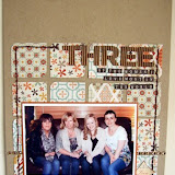
Those of you who came along to the Sarah's Cards retreat in March this year might recognise this photo of the team taken in the grounds of the hotel. I added a little bit of interest to the pink spotty background paper by just adding some white pen randomly to some of the dots.


I went with a strong pink theme again for this silouette photo of my mum and her three sisters which was taken at a wedding last year during a beach photo call! Behind the photo I created a quilted effect sunburst photo mat with faux stitching. This photo makes me smile, so the fun, happy colours of the papers were perfect, and plenty of the sentiments coordinated really well with the feel of the page too.


A couple of my favourite pages came from using up paper scraps when I'd run out of full sheets! This next page is made up of nine 3.5" squares, to which I layered smaller squares of paper, journalling, photos and a title. The photos are from my trip to Kenya in 2006 - we visited Giraffe Manor in Nairobi, and were able to feed the giraffes - quite an experience!


The final page I have to share with you today also uses scraps, but this time punched circles rather than squares, and a photostrip from my sister's wedding last month. The title - just a little bit crazy - refers to both the photos (wedding finery plus silly wigs!) but also the mish mash of patterns and colours on the page! With all those designs close together, not much embellishment is required. I added mist splatters, and layered the kraft sheet on top of a transparency (I gutted it first). 


So, one kit, seven full pages. I have some bits left - just scraps - nothing bigger than about 6x4", but definitely enough for another page if I add more cardstock and maybe a couple of cards could come out of what is left on my desk too.

My top tips for working in bulk with a collection:
1. Add a few sheets of cardstock
2. Cut out any elements sheets before you start
3. Add a selection of embellishments and alphas so you don't have to dig through everything every time you want to ad a detail to your page
4. Work with a variety of photos. I don't scrap chronologically but I do store my albums chronologically. I wouldn't want these pages to all sit next to each other in an album. I have photos here from 2006 right through to a couple of weeks ago so the pages will be separated in my albums. 


Friday, 10 August 2012

***August Sketch Challenge***

It's the 10th of the month, and that can only mean one thing here at Sarah's Cards - time for a new monthly sketch challenge!

Simply create a page using the following sketch as a starting point and add a link to your page at the bottom of the post so that we can see you've entered. It really is as simple as that! The closing date for entries is the last day of the month - that's August 31st 2012 - after which the winner will be selected by the design team, and will win a £20 e-voucher for the shop. Perfect timing with all those lovely new CHA releases starting to hit the store! 

So, without further ado here is your sketch for this month:


We have a few example pages to share with you today using the sketch as a basis. 
Here is my page about our trip to the Harry Potter studio tour and visiting Privet Drive:


I love how Helen turned the sketch upside down to record this gorgeous photo of her three children having fun - don't you love the little wood veneer people from Studio Calico?!


Jen G's A4 sized page shows how easily the sketch can be adapted to different sizes, and uses a square photo as it's focus. How cute is her little one in his police outfit!


We look forward to seeing your creations this month!


Thursday, 9 August 2012

Put it in a pocket...

When I recently saw Jen using the Summer Fresh range from Simple Stories, I knew that I needed to create with it.  I loved some of the bold patterned papers and had an idea of how to use some of the stickers from the 12x12 sheet.  One item that I spotted in the range was a packet of card pockets.  There's six in the pack in a variety of sizes and patterns. 

The pockets would be great for holding ephemera but as I love to journal on my layouts, I thought that they would be an ideal place to hold journaling cards.

Layout 1: Oliver's 4th Birthday Presents

Oliver turned  four recently and I wanted to record the presents that he received.  I typed out a list of his presents which were then printed and stuck onto strips of patterned paper and card. 

I cut the strips into different banner shapes to add some interest.

On the reverse of each strip I handwrote who the present was from.

I also used my electronic die cutter to cut out the man sign to make another tag.

All of the strips fit inside the pocket:

The man/boy tag was added to the front so you could see some of the tags through it.

The finished layout where you can see how I added some embellishments to the pocket too:


Layout 2: Picnic Time

After seeing the sticker sheet, I knew that I wanted to use some of the stickers to make a page about our love of picnics.  I dipped into some old photos from 2007 to document picnics we had during a holiday in France that summer.

This time, I used the pocket to hold one of the cards cut from the 12x12 sheet of journaling cards.  I punched a hole and threaded some twine through it to create a pull.


The red gingham paper was perfect to make a picnic blanket style mat for the photos and pocket.


Page 3: 1st ride on a horse

Evie and Oliver recently had the opportunity to have a ride on a horse.  They absolutely loved it and I had to record the experience for them.  The burlap 12x12 paper was perfect as a background.  I used the pockets in a couple of different ways on this page: as a place to hold some journaling, as a mat for photos and I also opened up one of the pockets and cut it in half before sticking it down on the page.  This can be seen here where the green scalloped section is a mat for the title area and the patterened inside of the pocket adds colour and detail to the opposite side of the page:

A strip of journaling is hidden in the pocket here:
The rosette sticker was perfect for a layout about horses and I used the twine to represent rope/reins.

The finished page:


I hope that I've given you some ideas on how you can use these pockets on your pages.  Please leave a link to any layouts that you have made using these pockets: I'd love to see your ideas too.


Tuesday, 7 August 2012

*July Sketch Challenge - Winner!*

Thank you to everyone that played along with our recent challenge.  We really enjoyed seeing what you had all created and found it very difficult to come to a decision about who should win.  There were so many different interpretations and great uses of product and other items.

There can, however, only be one winner and this time we have chosen Mel.  Please contact Lianne to claim your £20 e-voucher for the shop.  Congratulations!


Look out for details of the August sketch challenge appearing soon.


Saturday, 4 August 2012

So many photos, so little time...

If you're anything like me you will have mountains of photos that need scrapping but you can't seem to find the time to get them all done. Sound familiar?
One way to cut down on your photo pile is to add lots of photos to one layout. Sound simple enough? I thought so too until I actually came to do it!!

The main problem I faced was how to include lots of pictures without the layout looking too cluttered.

For the first layout I decided to create a basic shape in my photo editing software and fill it with photos, although the same effect can be achieved by cutting out your shape (I used a heart as it was a wedding theme) and sticking lots of little photos to it, trimming the edges to fit.

I found that if I was using a lot of photos I needed to keep my embellishments to a minimum or the photos got lost on the page.

The second layout uses one large photo for emphasis and then two strips of 'photo booth' style piccies. The photos are from my granddaughters 'prom' - she's only 11 - when did they start having proms so young? Still, as a die-hard scrapper I can only be grateful for yet another photo opportunity!


My son had a promotional photo shoot done for his magic business and gave me the 'proofs' which I used for my final layout.
I used Authentique stickers to create the circle design, to echo the shape of the fanned cards and the light circle in the photos.


For the card suits I chopped up an old pack of cards, I'd got lying around at home.

So there you have it, three different ways to use a lot of photos in your layouts. I would love to see your own multi photo layouts, so why not leave a link to your work in the comments box.

I used the following products:
Heidi Swapp Sugar Chic paper
S.E.I. Desert springs paper
Simple Stories Year.o.graphy stickers
Simple Stories Year.o.graphy paper
Studio Calico Take note.wood veneer shapes
Authentique Celebrate sticker sheet

Thursday, 2 August 2012

Football crazy, Football Mad...

Hello, it's Louise here after a month a short break away. This month I decided to theme my post around football. Having 3 boys (4 if you include the big one), it was only ever a matter of time before football became an obsession in our house. Rob and Oliver went to see their first football match together when Manchester City played Wolverhampton Wanderers at home at the Etihad Stadium. Up to this point Ol had always been unsure of whether to be a blue like his dad, or follow his friends and be a red. He enjoyed the atmosphere at the match so much, and the fact that City won, that he pledged his allegiance to City.
I misted the chevron mistable paper with Hydrangea Maya Road mist, before laying a black grid Hambly overlay completely over the top. The hexagonal mistable paper was cut to size and the desired shape, but left plain. I hand cut a cluster of 3 hexagons, and a single one, painting them with blue acrylic paint. Once the paint had dried a quick rub over with a piece of kitchen towel, cleaned away any paint from the resistable areas. These painted elements were added to the LO using foam tape to add a little height.


I added my title using the DIY thickers, choosing to leave the paper layer on, and using a black pen to add an outline around each letter.
My second LO was created for Oliver to celebrate Manchester City winning the Premier League Title. We were travelling home from a weekend away listening to the match. Like everyone else we thought City had blown it and the title would go to United again. When the final 2 goals went in in the final few minutes the shouts and whoops in the car were deafening! We are surrounded by City fans where we live and the atmosphere when we got home was electric.
I kept the LO simple, cutting out 3 stars from the backing card and placing a scrap of yellow chevron paper behind. This detail picks out the stars above the city badge.
I used a piece of mistable paper behind the photo, layered with scraps of chevron and star patterned papers.
As with the previous LO, I used DIY thickers for the title, outlining in black so that the letters stand out. The cute wooden people were added along side the photo to imitate the rest of the team celebrating the cup being lifted.
A proud moment for Rob and Oliver, and for every City fan who wondered if the time would ever come again.

Where there is light, there must always be dark. Which brings me to my final LO. A LO to celebrate when Manchester United won their 19th title (insert spitting sound effect). A friend of ours appeared in the papers celebrating in the crowd behind Sir Alex Ferguson, so this LO was a keepsake for him, to remember the moment.

After placing the white Hambly overlay on black card, and adding the main photo, I cut the hexagonal paper to the desired size and shape.
After giving it a very light misting of blue and splattering some red ink, I stuck it into place, placing pieces of red chevron paper behind a couple of the cut out areas. The title was created using a mix up of small red alphas from my stash.
A 'believe' rub on that had been in my stash for years, was the perfect size to be added to a Jenny Bowlin ticket, which was then tucked behind one of the smaller photos.
The mistable papers are a lot of fun to use, and it's only once they've had colour added that you can see just how stunning the designs are. If you haven't had a play with them already, I recommend you give them a go, you never know, you may just fall in love with them as I have done.

Well that's all from me for now. Remember to pop back every few days to see what the rest of the team create. We also love to see how you use products brought from the shop, or how we have inspired you to try something new. If you leave a link to your work we will come and have a look. And don't forget to play along with our monthly challenge for your chance to win a £20 e-voucher to spend in the shop. And with all the new goodies arriving from CHA, you'd be mad not to have a go.