It's the end of the month again so it is Ifa again with you. Happy Halloween for tomorrow! I have a couple of layouts to share with you.
I used to love Fancy Pants but I haven't been drawn to buy a range until I saw Summer's End. I love the stylised tree and those birds with curly tails. I have got to have some of those rub ons!
Even though this is an autumn range, as you can see, you don't have to limit yourself to autumnal pictures. In fact, both my layouts used summer photos.
There are quite a few journalling spot-like circles in the rub ons. I tend not to use journalling spots so I have decided to turn them into the canopy of a tree, perfect for the photo of my guys, sitting under a tree.
I started by drawing a tree on Oak using a brown marker pen (ok, I drew with pencil before going over with pen! ) which I cut out.
I cut out the elements that I want to use from the rub on sheet and arranged them around the tree.
I also added a few buttons. I embellished a large button with rub on. I used the "wrong" side of the button as this side is flatter.
You might have spotted a twine circle on my tree too. To make the twine cirle, I started by is punching a circle(mine is 1")out of scrap paper. Run this through a xyron machine so it has one very sticky side. We are going to apply the twine to the sticky side! To make this easier, turn the circle sticky side up and with a temporary glue, stick to a piece of paper. Start the twine circle in the middle and continue until you have all the sticky stuff covered.
Now that I have all the elements for the tree ready, I started applying them to the background cardstock. The tree canopy (or the circle rub ons) first, then the tree followed by the buttons and twine circle. I also added some oak leaves rub on to the edges of some tree canopies.
I cut out a frame from Fall Frames and added to the background cardstock. This is followed by my photo. Next I added a little bird rub on to the side of the photo and some flowers to the journalling spot. I had a yellow frame lying around so that jumped aboard.
And here is my layout, "Under a tree", in Rosenberg Castle, Copenhagen.
I also made this layout, "Bird's eye View" using the same range.
Can you spot a button embellished with rub on ? And a twine circle pretending to be a tree ? I have also used another sheet of paper, Falling Leaves for this layout.
Sunday, 30 October 2011
Friday, 28 October 2011
~*Studio Calico - Memoir*~
Hi all, its Gems here with some gorgeous Studio Calico papers from the Memoir collection. This collection was my most favourite release from the last CHA show and I couldn’t wait for it to come into the shop!
[Red Arrows]
The first of my layouts I created to remember the fabulous day we spent at the Welsh National Air Show where we enjoyed a spectacular performance from the amazing Red Arrows.
[Please Click to View Larger]
This is how I created my layout:
1. I used the neutral graph paper called ‘Linen’, as the background for my layout. I love to use a patterned paper as the background to base my layout on. I misted the top left hand corner with some Mister Hueys in ‘Calico White’. I absolutely loved this mist! The white colourway is a fantastic way to add a little interest and texture and I am sure it will be making its way onto lots more future layouts.
2. There are some gorgeous patterns in the Memoir collection, and I used my favourite piece ‘Heirloom’ as the base layer.
3. I added a narrower strip of patterned paper, ‘book jacket’ to layer upon the base layer which I edged using a border punch.
4. I then placed my photos onto the layout and once I was happy with the arrangement glued them in place.
5. I stamped one of the label stamps from the MME Stella & Rose Hattie – ‘Remember’ Stamps onto ‘Homestead’ and added a subtitle using Adornit tiny alphas.
6. I added my title using Thickers and some tiny alphas in colours to co-ordinate with my red arrow theme.
7. I slipped a little journaling card I had stashed away in my collection for an age behind a photo.
8. Finally I embellished with a few of the absolutely gorgeous wood veneer asterisks, and finished them off with a pretty little gem to add a little sparkle.
[Lion King 3D]
A couple of weekends ago we went to the cinema to watch the release of Disney’s Lion King. It was Ashton’s first experience of 3D and she loved it. During the trailers before the movie, one of the characters appeared to ‘smash’ through the screen, Ashton jumped to the back of her seat shouting about all the glass all over the floor in front of her seat.
I find that sweet little things happen every day and I think it is important to remember and document them. So this is my little way of remembering that funny little occurrence.
[Please Click to View Larger]
The gorgeous woodgrain sheet of paper is from another new release from Studio Calico and can be found here.
In addition to a gorgeous selection of patterned papers, Studio Calico released a great selection of co-ordinating embellishments such as the tags I used in this layout. They are a fantastic way to add dimension and can be used to mount titles, incorporate journaling or simply act as a layer.
I added my journaling by simply printing out from the computer and cutting into strips. I find this technique to be the perfect way to add journaling to a layout without having to handwrite, as I sometimes feel my handwriting spoils the look of my layout.
Again I used the wood veneer asterisks. I seriously love these little embellishments. They provide a wonderful alternative to the usual flower, heart or butterfly and are perfect for more masculine layouts.
Thanks for stopping by x
Tuesday, 25 October 2011
* * More travel layouts using Boarding Pass * *
Hello again, it's still Laura here with day two of travel layouts using the gorgeous "Boarding Pass" range from October Afternoon.
First up another excuse to scrap a handful of New York photos... this time four 2.5 x 2.5 photos. I always use photobox for ordering my prints as I think the quality is fantastic and I love the quick service. I also love to use Picasa to create collages of photos to upload to Picasa to enable me to get the size photos that I am after. In this case I created a grid of these four photos in Picasa and then ordered the collage as a 5 x5 print, enabling me to cut them down into the perfect 2.5 inch squares.
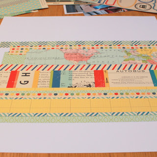
I am so not a fan of measuring my patterned paper and totally tend to go for the "eyeballing" approach when it comes to patterned paper size selection. I find that this helps me to work quickly and suits my style of scrapping. So for this layout I chopped several strips of patterned paper of various widths and lengths.
I added these to the middle of a 12 x 12 sheet of white cardstock and then my photos were added ontop.
For this layout I added some details by labelling each of the four photos that I was scrapping. My trusted American Craft Precion Pen came out I wrote out a couple of journalling boxes. It's easiest to write your title/journalling first and then add a box around your writing and then cut out. This saves you trying to squeeze your writing into a box that you have alreday drawn.
Again with this layout, I then added details to my layers by finding little gaps that I could add some word stickers and a couple of bling stones.
The title was made up of these thickers and some mini market alpha stickers. The thickers were given some extra details with a pen and the whole title was layered on a piece of patterned paper that was raised up from the page using 3d foam pads.
oh and you can see that another button and some ribbon have also sneeked their way in there! They were both from the Miscellany pack that I showed you yesterday but you can also get a whole pack of matching buttons if they are your favourite embellishment!
Third and finally for me... a change of location for this layout as now we are in Paris. One of the things I love about the "New York" piece of patterned paper in this collection is that it comes with loads of ready made titles! If you have been to the place in question that is!
Luckily for me... Paris was the destination for our 'mini-moon' the weekend directly after our wedding. So I started to create my layout using this title cut from the "New York" sheet of paper, alongside a 5x5 photograph and a selection of 2x2 patterned paper squares.
Onto each of these squares I added small amounts of details using the die cut shapes from the Miscellany pack and stickers from both the word and label sticker sheets.
To keep the page from looking too flat, some of these stickers were stuck directly onto the patterned paper squares and some were raised up slightly using 3d foam pads.
Some ribbon, mini market alphabet stickers and hand journalling also found their way onto this layout and meant that I could add some very brief 'key fact' journalling!
I felt that the whole layout needed to be mounted onto a piece of coloured cardstock to add a border to the whole page. So I trimmed a little off the sides and mounted the whole layout onto a co-ordinating colour.
A quick layout that is fantastic for using up your scraps and those odd stickers that you have left over on a sheet.
Monday, 24 October 2011
* * Travel themed layouts with October Afternoon * *
Hello all, it's Laura here with some October Afternoon goodies for you today. This month I have been catching up on scrapping some honeymoon photos using the travel inspired range "Boarding Pass" by October Afternoon.
I was drawn to this collection by something new from October Afternoon and that was their pack of "Miscellany" which is essentially a multi pack of die cut shapes, chipboard, tickets etc all designed to co-ordinate with the patterned papers of Boarding Pass.
I am going to show you three layouts that I made with this collection and how I used the goodies in this pack to add interest and detail to my pages.
Firstly... my favourite die cut of the bunch was this... a cute old fashioned viewing dial. I didn't realise that this came in the pack but I was pleased to discover that my thumbnail pics that came with my Photobox order were the perfect size to add some tiny photos to this embellishment.
So once I had that assembled I moved onto my layout, this one about our honeymoon in New York, over a year ago now. (insert wistful memories) I used two photos for this layout, a larger one overlapped with a 6x4 with a white border. I always make a habit of ordering some of my photos with a white border to give me something to different to work with every now and again.
The background are large pieces of patterned paper, in this case, they are "Venice", "Tokyo" and
"Berlin"
"Berlin"
I then used elements from the Miscelleny pack to build up some layers and interest on top of this base. In order to add dimension I inked the edges of some pieces, I distressed the edges of some, some pieces I crumpled up in my hand then uncrumpled and stuck down.
Label stickers and Mini Market alphabet stickers were perfect for continuing to add details on other parts of my page. As the page was starting to look a little busy I decided to journal right on top of my photo and fit my journalling around my page title. I always use American Crafts Precision Pens and find that they write really smoothly on photos.... just make sure you give your journalling a couple of minutes drying time before you move on with your scrapping.
Now for the final touches of detail... the October Afternoon word stickers are the perfect size for adding into your layers as you near the end of your layout. I find little gaps to add them in, inbetween patterened paper layers and on top of photos, sometimes adding in some handwritten journalling too.
I ripped and distressed a couple of my elements a little more at this stage and sewed on the buttons that came with the Miscelleny pack.
And very finally.... just a few hand stitches added with embroidery floss and then some ink splatters added with spray inks. There are three gorgeous colours that come with the Boarding Pass range.
Plus a little ribbon added at the bottom and thickers on top of my patterned paper title!
Ok.. but that's it... finished! I love to add lots of details to my page and layers and stickers are all part of my obsession. My advice to you would be to stick down as you go along!!! Don't try to create the whole layout and then remove it all and work backwards. This never works for me. I like to stick and go. So create your base... stick... next... photos... stick... then start to add your layers and details around what you have already committed to. The final details will then naturally fit in at the end.
Tomorrow - Two more travel inspired layouts!
Sunday, 23 October 2011
2012!!
Its getting to that time of year when we're all thinking about christmas cards and presents. A few weeks ago I bought some little calenders (for 15p each) and thought, I could put my spare chipboard to use and create some handmade calendars for the family.
Here are the calendars.
I couldn't find my chipboard, however, I did stumble across some pieces of mountboard that I had tucked away somewhere totally forgotten about!
Here are the calendars.
I couldn't find my chipboard, however, I did stumble across some pieces of mountboard that I had tucked away somewhere totally forgotten about!
And voila, the finished calendar:-
Thanks :) Vanessa x
Friday, 21 October 2011
As Time Goes By
Hi everyone. I don't know about you, but I feel like my kids are growing up far too quick. It only seems like yesterday that I was holding my now nine year old in my arms!
When I saw Echo Park's new Victoria collection, it got me all sentimental and my layout today is somewhat appropriate for me at the moment - where is the time going??? I particularly like the sticker sheet with this collection :-
I've used a selection from the sticker sheet on the background. Cut out a few simple elements from the papers and doodled around. I've covered an old chipboard frame I found lurking around with the Garden Gate paper to frame the two pictures.
I've also used Tim Holtz Idea-ology Spinners, but I've set them in the position of the arms of a clock.
Check back tomorrow, for another piece of work from me, which will be my last for Sarah's Cards as sadly I've had to make the decision to leave the DT :( Its been absolutely fantastic and I've loved every minute of being on this DT. Sarah, Lianne and the girls are the loveliest!
xxxxxxxxxx
Tuesday, 18 October 2011
Beautiful Trims
Hello all.
This month I have chosen some beautiful trims to play with and have managed to make some simple yet very beautiful flowers.
I'd love to see your variations on this as the possibilities are endless.
So here's how I created these flowers.
1. Cut a small circle of fabric (I used scraps of felt) approx an inch diameter, I found drawing around the lid of a pop bottle was perfect.
2. Take a length of trim (approx 12"), I have used Ric rak, Small pompom trim and rouched ribbon.
Sarah has a great selection of trims and lace in the shop here.
3.You will need a needle and a thread that co-ordinates. Starting frome the outside of your fabric circle, start a running stitch attaching the bottom of the trim to the outside edge of the circle, continue to work your way to the centre and secure with a few stitches.
4. Add a pretty brad, center or even a fancy pin to finish off your flower.
Here is my completed layout with my flowers attached.
I have use the Sassfrass Crush Papers and stickers to create my page.
Have a lovely day !! xx
Wednesday, 12 October 2011
Let's talk chalk!
Jen here!
Chalkboard (or blackboard as I remember it from school!) is hugely on trend right now across the home furnishings and papercrafting worlds. American Crafts have released a selection of chalkboard goodies in one of their latest lines - Nightfall.
Chalkboard (or blackboard as I remember it from school!) is hugely on trend right now across the home furnishings and papercrafting worlds. American Crafts have released a selection of chalkboard goodies in one of their latest lines - Nightfall.
You may have overlooked this collection, thinking it was too themed. Although this range is a mixture of halloween and autumn themes (& the embellishments are split into those two themes, rather than mixed), it also has loads of generic patterns - great stripes, dots & grids that are really versatile.
Anyway, the thing that really caught my eye was the chalkboard papers- they come in lots of different designs and are such fun to work with!
For this page I stuck with the theme and used a picture of Benjamin from last year, dressed as a pumpkin, and sat atop one! He was a little bit unsure about being perched so precariously (the embellishment cluster in the top left covers up my mum's arm!), but he sat very still & looked super cute for me to take a few photos. He was just 3 weeks old here. I'm hoping he'll be amenable to me dressing him up in cute outfits for several years to come!
I love the Ranger Inkessentials White Gel Pen - it's the best white pen I've found, and works great for journalling straight onto the chalkboard papers - the white stands out beautifully against the strong black.
Tuesday, 11 October 2011
October 'Pinterest' Challenge
For months, I resisted taking a look at the Pinterest website even though I could see that it was becoming really popular. I did not need to find another online place to be addicted to! However, during the summer holidays, I decided to take a peak. As soon as my invitation came through, I did indeed become pretty addicted! It's basically like a great, big, online scrapbook: somewhere to store pictures of things that you like. As a visual person, I love being able to bookmark pictures and see lots of pretty things together in one place. I've used it to save ideas for birthday presents, somewhere to store up recipe ideas, party planning and of course, for creating a board of ideas for scrapbooking.
When it came to thinking about what to choose for the challenge, I knew that I wanted to use some of the ideas that I had seen on Pinterest and so, created an inspiration board just for the October Challenge. The DT girls have added a selection of pins that we have used to help us come up with layouts and for you to use too.
The challenge is to use one or more of the 'pins' on our board as a starting point or inspiration.
You could, for example:
*use something as a sketch
*use a colour combination*pick out shapes to include
*be inspired by text
*pick a theme (eg. things I played with as a kid)
*use a technique
Even if you aren't a member you should be able to view the board. If not, I have added pictures of the pins that we used to this post so that you can see them here too. Becoming a member is easy too; you either request membership through another member or follow the link on the Pinterest homepage.
So here are the three pins that I used to inspire me:
...and this is the layout which I created:
Here are Nat's pins. The map butterfly idea is so adaptable and she's also used the same heart flower idea as me:
and this is her 'inspired by' layout with printed maps showing where they went:
This is what caught Ifa's eyes:
and this is the layout that she made based on her pins, using the doodled word art to such brilliant effect:
Lou's pins also included the paper aeroplane embroidery pin:
but she created a totally different idea from it on her layout here (love the mini-paper aeroplane!):
These were the two pins which Gems used:
and her gorgeous layout with a little close up of that cute 3d flower:
So, all you need to do to enter, for a chance of winning £20 to spend in the shop, is to use at least one of our pins as inspiration for your layout. Then leave a comment below with a link to your layout and let us know which pin you used. The closing date for entries is 31st October. I hope that it all makes sense, but any questions, then just ask.
Looking forward to seeing what you come up with.
Subscribe to:
Comments (Atom)


