So i thought i would show you how i lift things, now this post certainly isnt to stop using the dt's ideas or the booklet that comes with the kit but to show you how you can 'lift' and change little bits.
I have used stacks of different products for this post.
sassafras sunshine broadcast papers
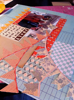
You know when you see someones layout and you are like, oh i want it, so off you go to make one, well i thought that when i saw this
This is one of Jens pages from the April kit and its cute & lush. So here is what i did to have one of my own.
I 'lifted' the portrait photo and the general composition of the page, but did it backwards and did everything on a angle.
Something i added was these beauities, they are by Maya Road, they are just chipboard colour but i used my fabby new mist- Iridescent pearl (if you were at the March retreat you will know how crazy people went for this 'colour' '
I sprayed them a few times and they look so pretty
I loved the section on Jens with the ribble effect on the cardstock, again we got ribblers at the March retreat so i thought i would bring that to my design too.
These chipboard bits are from a really old sassafras pack, im into using up old things at the minute.
This collection of paper is completely gorgeous, its so neutral and i dont normally do neutral but i completely love it, perfect for girl/boy etc
So there you go while it looks similar its not identical, if i blogged this i would link up jens blog having taken inspiration from her work.
So next up is....
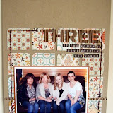
Lou's page (lou helpfully hasnt blogged this but i think its from the latest kit)
I love multi photo pages so it thought this would be perfect, so i got started.
i used Sassa again for this page, a bit i love out of the collection is these banners a 56 piece cardstock stickers, i used them on nearly every page and have stacks left.
So you see i have used the multi photo aspect & bunting bit, so again while its not identical you can see that i have 'lifted' chances are if Lou read my blog she wouldnt notice but its always nice to hear someone liked your work so much they have used your work to help them along.
I used my trusty new mist again on this page
I was going to put my title on the patterned paper but thought it might be a bit lost so instead of just sticking them on strips of card, i did a bit of inking around the edges and then a bit of iridescent misting cute right?
So i thought i would end todays post with a complete steal!
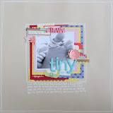
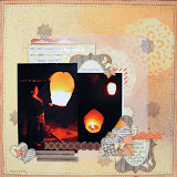
I loved this page by Claire

I have used a crazy mix of papers here
MME (used seen the new papers right)
Sassa
Jenni Bowlin bingo cards
(im sorry my links are terrible my mouse and my keyboard are not happy)
So you can see here its a 90% 'steal' obvs i would link vanessa up on my blog.
I think i will leave it there for today and be back tomorrow with another lift and a couple steals, i hope this has helped in looking at a page and seeing how you can keep some things the same but change some things at the same time.
Thanks
Rachel x


3 comments:
Wow Rachel, there is certainly some inspirational ideas in your LOs, they are gorgeous! Jill x
Love how you have used the original LOs as inspiration. Your LOs are gorgeous
x
fab! Love them all!
That iridescent mist is just gorgeous isn't it.
Post a Comment