Tuesday, 29 September 2009

Lily Bee

The newest member of the design team, Emma Trout, has been working really hard to put together a few layouts to share with you using the new Lily Bee French Couture range. I am sure you will agree that they are stunning!

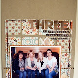
"One of the highlights from our recent holiday was working out which person was ‘Jelly’ and which one ‘Jolly’. Of course, with a couple of beers this joke was funnier!

I used a Chatterbox doodling template to make the swirls and add a new look to the patterned papers. The gems were coloured using a drop of alcohol ink."


"On the second day of our holiday we walked into the nearest village. This was the first time we experienced the severity of some of the hills in Wales. So it was a welcome distraction for G’ma to stop and take in some of the views and catch her breath! My son, as always, was on hand to offer words of comfort and a cuddle.
I made the paper flowers by rolling a spiral of patterned paper in on itself, working from the tip inwards."

Wednesday, 23 September 2009

Same Paper Different Look

Rachel was given the lovely 3 Bugs in a Rug Spread Your Wings collection to play with, when I first looked at this paper range I thought lovely bright summery papers. Rachel has produced two layouts using the same paper range but that look so totally different.

My first page is perhaps more traditional, using the brighter summery sides of the papers. I tore the main sheet of paper on two sides and tried to bury the photo in the page by creating a frame and covering the edges with lots of embellisments, a lot of which I have created by handcutting them out of the paper. Its not always practical you use the same thicker pack on one layout so I try to vary them with other alphabets.


I had been thinking about creating this next page for some time and when I saw the reverse of the 3 Bugs papers I knew they would be perfect. Over the past few months I have started to read the Twilight Books and I am hooked, I thought I would do this page to remind me in the future just how 'into them' I was. As with the previous page I started with a bazzill base, and used the fabulous dotty black paper as a background. Again I used a mixed of thickers and different alphas for the title which is even more effective as the title is much longer. To create the journalling block I used the back of a piece of card that some stickers came on and added little bits of my own stash. This is a completely different look but with the same papers and basically the same design.


Saturday, 19 September 2009

Earth Love

Cosmo Cricket have released some gorgeous new ranges of paper at CHA, Earth Love is my favourite with lovely muted tones and fab patterns.
I have put together this really quick and simple layout using some of the Earth Love papers and chipboard.

Stash needed.

Earth Love ...Reuse
Relieve
Repeat
Borders
Elements
12x12 chipboard
Background paper, scenic route worn blue grid
Foam pads
Black inkpad and pen
Alphabet stamps
2 6x4 photos


Method.

Cut out a semi circle from the reuse paper and scallop the edges on the curved side. Ink the edges and stick it onto your background paper.

Cut a rectangle of paper out of the relieve paper 7" x10", ink the edges and fix this across the centre of your page on top of your scallope.


Matt your two 6x4 photos onto the repeat paper, ink the edges and stick them onto your rectangle.
From the borders paper cut out the sentence "it is hard to measure simple pleasures", stick this down in between the two matted photos. Put to one side the strips of paper that you trimed from the edges you will need them to create your title.

From the elements paper choose one of the journaling blocks, cut it out and stick it slightly underneath the edge of the right hand photo and add your journaling.

Choose a strip from the borders sheet trim it to 11" long and add it along the bottom of your matted photos.The borders sheet also has a strip with the alphabet on it, cut out the letters to form your main title, you will need to choose a title which only needs to use each letter once. Ink the edges and fix them onto your page using foam pads. Use the leftover strips from earlier to stamp the remainder of your title onto.
Add your chipboard bird and heart, cut out one of the hedgehogs from the borders paper and one of the little flowers. Add these to your page.

Hope you enjoy putting this page together :)

Wednesday, 16 September 2009

3 Bugs In A Rug

Rachel has put together this great layout using 3 Bugs in a Rug paper, Spread Your Wings. I love how she has managed to use five photos and kept the page feeling uncluttered.


Friday, 11 September 2009

Crop Class

Sarah put this gorgeous class together for the crop last Sunday so we thought it would be great to share it with everyone! The class kit can be found here in the shop.


1. Adhere the scalloped circle paper to the middle of the Kraft cardstock, ensuring that your adhesive is at least 2" from the edges of the scallops
2. From the Imagine a Forest – Get the Camera paper, hand cut one of the scalloped edges which back onto the polka dot strip & save this to tuck under the top of your photos
3. Tear a strip from the same paper (from the reverse) which will go beneath your photos
4. Turn the Happy Trees paper over and hand cut one of the pink vines out – the full 12" and put to one side
5. Cut 7 (or more) trees from the Happy Trees paper and put to one side
6. Punch or cut a 2 ½" or 3" circle (scalloped or plain) from the Happy Trees paper to create your paper flower (as seen beneath the green paper butterfly). Divide the circle into 8ths (fold in half, turn through 90 degrees & fold again then fold in between each of these folds). Cut ¾ down each of these 8 lines, leaving the centre intact (i.e. don’t cut all the way through). Crumple up the flower & open back out then draw faux stitching along each edge  
7. Cut a heart shape from the back of the Happy Trees paper (this will go at the top of your layout by the title)
8. Now we’re ready to assemble. Stick your photos across the middle of the layout, making sure there is no adhesive at the top or the bottom
9. Slip the scalloped edge paper under the photos at the top and adhere
10. Slip the green dotty paper beneath the photos at the bottom and adhere
11. Weave the pink rick rack in through the cotton lace and adhere this beneath your photos
12. Take 5 of the trees you have cut out and adhere these in a cluster on the bottom left of your photos, using foam pads to add height & dimension. Add the 3 Dew Drops around this cluster. Adhere two more in between the two photos, as shown – again using foam pads on one of the trees to add dimension
13. Take the 12" vine you have cut and adhere this to the right hand side of the layout as shown, patterned side up. Doodle faux stitching along the centre of this vine
14. Cluster your paper flower (stick your button in the centre, add a stitch to the middle of the button if you like), the paper butterfly & paper flowers provided at the bottom right of the photos, as shown. Twist the silver wire provided to create a body & antennae for the butterfly & adhere using Glossy Accents or another strong glue or using a stitch through the layout and tie down on the underside of your card
15. Curl up the scalloped edges of the scalloped circle paper and the scalloped edge above the photos
16. Add your title to the top of the layout as shown and your journalling beneath the photos.

Tuesday, 8 September 2009

Note Book Look

There are some great punches on the market that enable you to create a note book effect on the top of your paper, here is one example. If you don't have one of these punches or don't want to have to spend out on one how about using stitching to create a similar look? I have matted my photo and added stitches down one side and also cut out a notebook shape and stitched across the top. A very simple technique but very effective.


I have used Pebbles Inc, Skipping Along range, bazzill just the edge strips and AC foam thickers.

Thursday, 3 September 2009

Butterfly Kisses

Here are two more of Jens creations using the 3 Bugs Butterfly Kisses range, I just love the simplicity and use of white space on her layout "Love to Twirl". It also demonstrates that you don't need to have piles of patterned paper to create your layouts why not try using up your leftover scraps.

Twirl: There always seem to be lots of photos of me twirling around, I think my inner child enjoys the freedom of spinning around. This is one from Hawaii. this kind of design is perfect for using up you paper scraps, and can easily be adapted to suit the size of scraps you have. Try using different sizes or shapes- circles also work well.
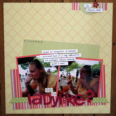

Ladylike: we spent some if our honeymoon in Hawaii where with every drink you get a slice of delicious pineapple. Tasty it may be, but eating it without making a lot of mess is quite a challenge! I addedlots of sparkle with gems, stickles on the dots of the background paper and foam thickers coloured with An American crafts glitter marker.

Tuesday, 1 September 2009

Beautifully Calm

Jen has been using the 3 bugs Butterfly Kisses range and produced some lovely layouts.


Calm moments: our dog misty is bounding up and down a lot of the time, so it's nice to capture a portrait of her when she's having a slightly less crazy moment! I used a black and White photo, and lots of brightly coloured patterned papers to emphasise the two sides of her personality.